A single botanical sprig on the forearm takes an hour or less, while a Japanese sleeve covering shoulder to wrist means multiple sessions spread across weeks or months.
Realism needs smooth shading and a steady hand, American Traditional relies on bold outlines that hold their shape for decades, and blackwork goes heavy on solid black fill with almost no way back if you change your mind.
1. Botanical Sprig
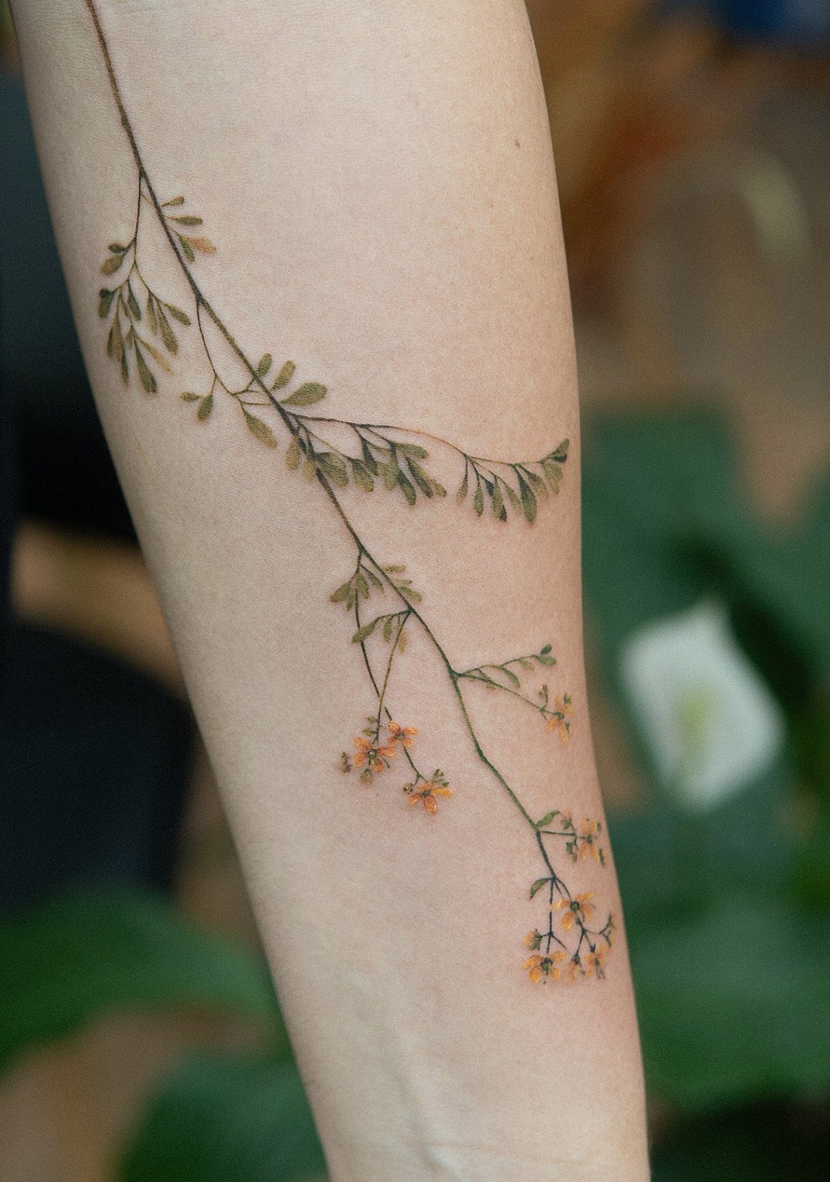
A single stem running down the forearm, thin enough to move with the bone line without wrapping. The leaves fan out slightly where the wrist curves, and small clustered flowers fill the top end.
This works best when the plant has a recognizable shape.
Common choices are lavender, rosemary, eucalyptus, or wildflowers with visible seed heads. Monochrome holds the sharpest silhouette, but adding one or two accent colors, like the orange here, pulls the design forward without turning it into a full bouquet.
Expect about an hour in the chair and a simpler heal than anything dense or wrapped.
2. Mountain and River
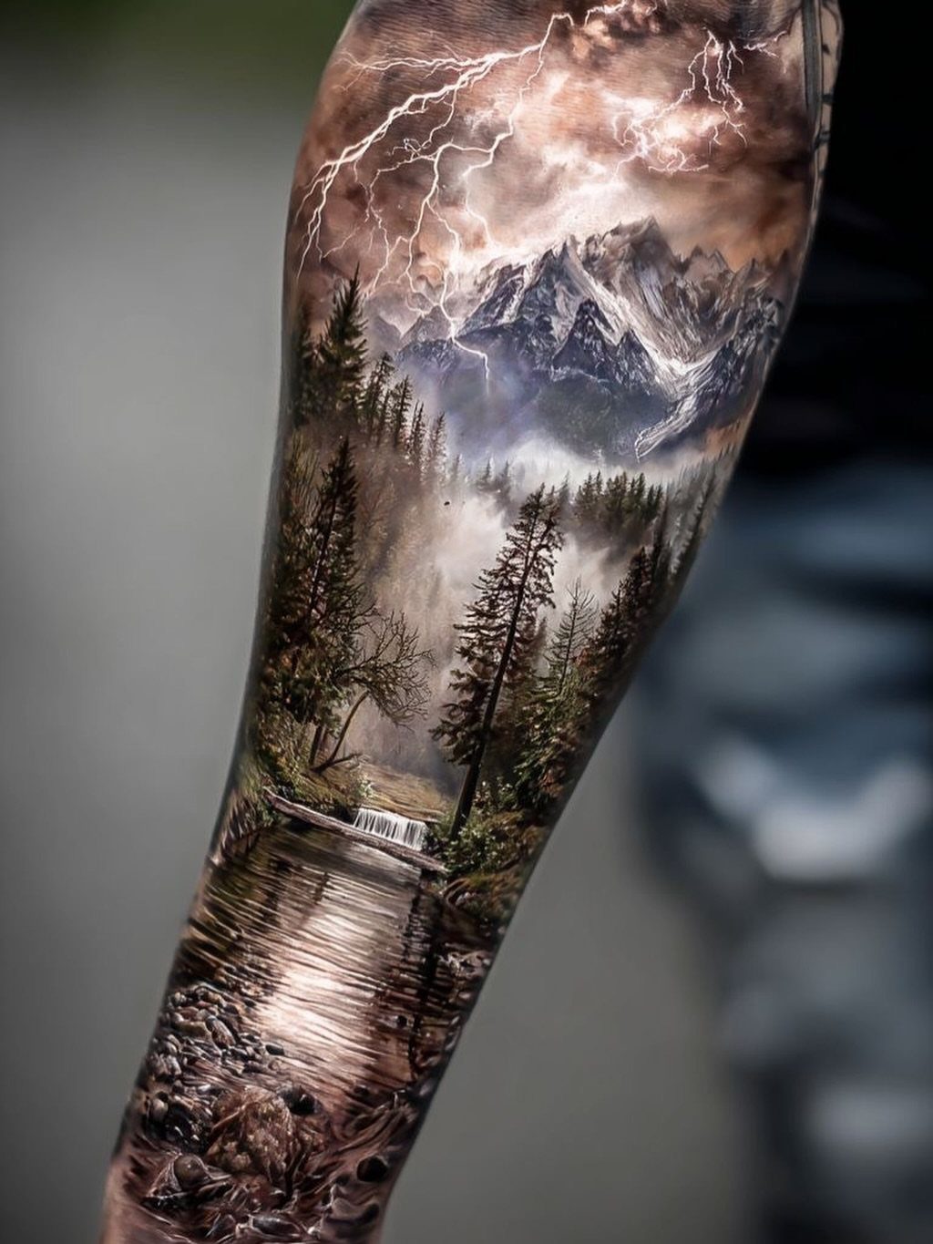
A full landscape condensed into one frame: peaks at the top, treeline through the middle, water cutting through the bottom. The version here adds lightning, which breaks up the sky and keeps the top half from reading flat.
Realism at this scale needs solid black shading and clean contrast between layers.
If the mountains, trees, and river all run into the same mid-tone grey, the design loses depth. The design should stack clearly, foreground to background, and the water benefits from white highlights if your skin takes them well.
3. Lion or Wolf Portrait
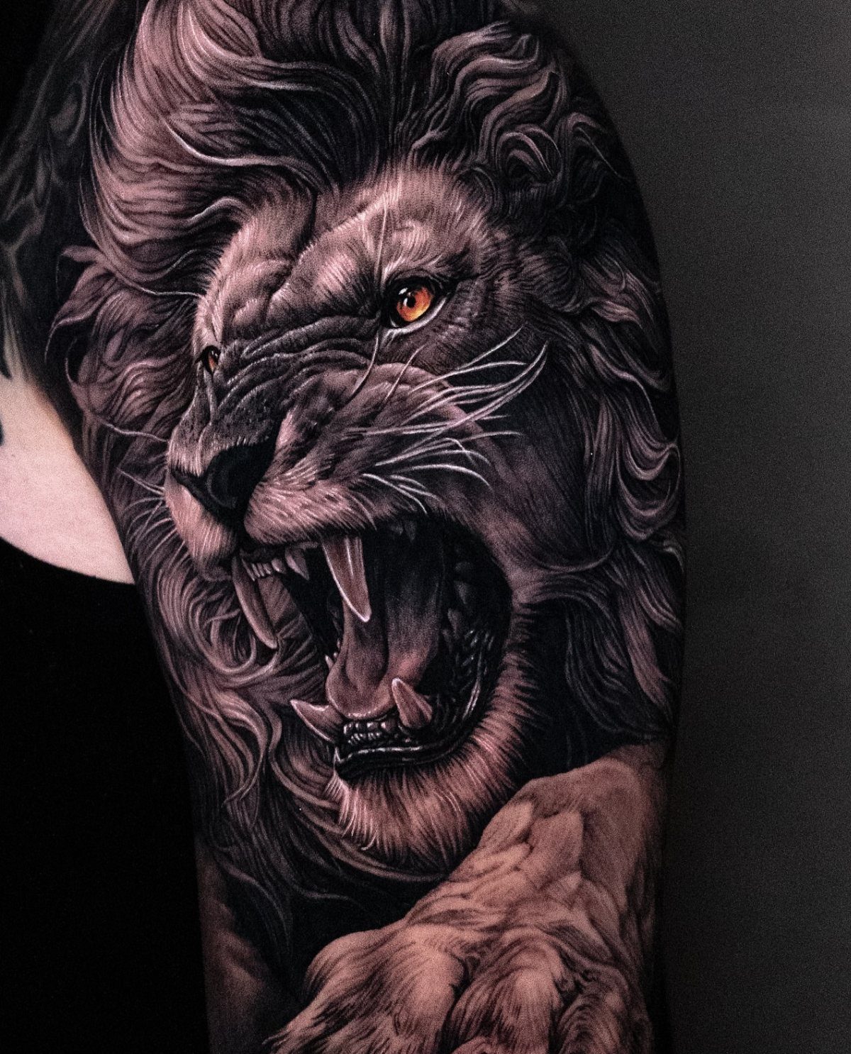
A head-on portrait of a lion or wolf, sized to fill the upper arm or outer forearm. The animal’s expression does most of the work: a lion mid-roar reads aggressive, a calm wolf with direct eye contact feels controlled.
Monochrome realism is the standard approach, and it ages better than heavy color on fur.
The placement matters. Upper arm gives you more room for the full head and part of the shoulders; forearm keeps it vertical and tighter.
4. Traditional Rose and Dagger
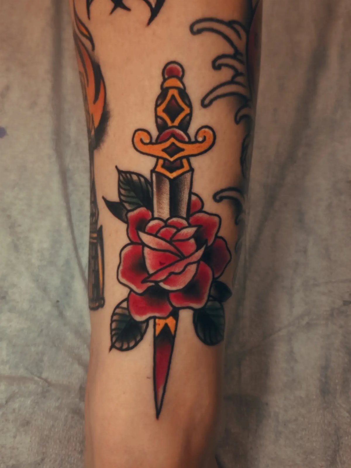
A dagger piercing a rose, petals folded around the blade.
The style was built to last, and decades later these still read clearly. The same pairing works in fine line or softer shading if you prefer less contrast, but you give up visual punch.
5. Koi and Waves
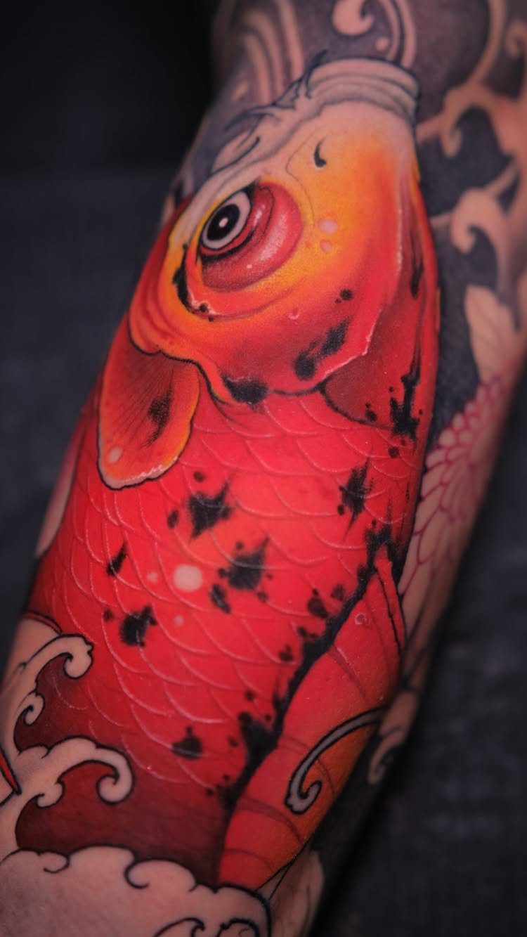
A koi swimming through stylized water, fins spread and body curved to follow the arm’s shape.
The waves wrap and flow in a way that suits the forearm or upper arm, and the fish itself can point up or down depending on where you want the visual weight.
Japanese-inspired koi designs typically layer monochrome waves behind bright orange, red, or white fish. The contrast between the soft water movement and the sharp scales on the fish keeps the design from blurring together as it heals.
This style scales well.
6. Half Sleeve Tattoo
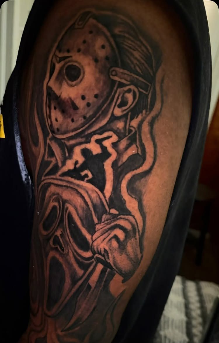
The coverage gives you room to combine multiple images or build one large scene, like the horror movie characters here, without cramping the design.
Upper arm half sleeves sit under a shirt and show when you roll up your sleeves.
Lower arm half sleeves are harder to cover in professional settings, so consider that before committing. Both placements heal well since the skin is relatively flat and takes ink evenly.
Plan for 6 to 10 hours across multiple sessions, depending on how much detail and color you add.
7. Armband Tattoo
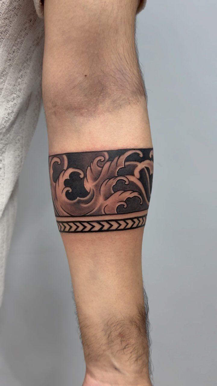
A continuous band of pattern wrapped all the way around the bicep or forearm. Scrollwork inside geometric borders holds the line clean as the arm moves, especially when the symmetry runs tight.
Armbands suit placement on the upper arm where the circumference stays consistent, or on the forearm if you keep the band narrow enough to avoid distortion when the muscle flexes.
Thick bands with heavy blackwork can take time depending on width and detail.
Single-session coverage makes this one of the simpler arm commitments.
8. Arm Tattoo of Personal Mantras
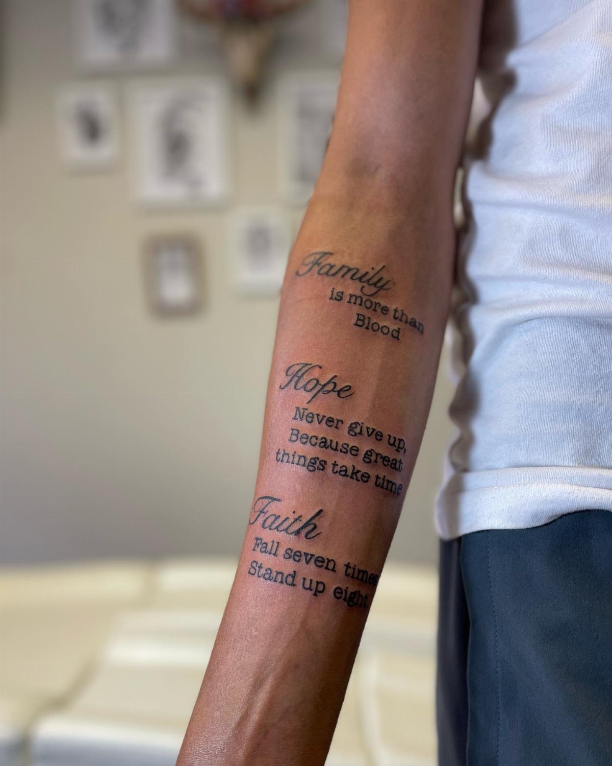
Text laid out in readable lines, running along the forearm where sentences fit without wrapping awkwardly. The 3 quotes here stack vertically and use different sizes to separate ideas.
Legibility depends on font choice and letter size. Script fonts blur faster than clean sans-serif or serif, and anything under a quarter inch tall becomes hard to read within a few years.
Forearm placement keeps the text visible to you, which matters if the reminder is part of the point.
Black ink on light skin holds contrast longer than grey.
9. Interlocking Geometric Patterns
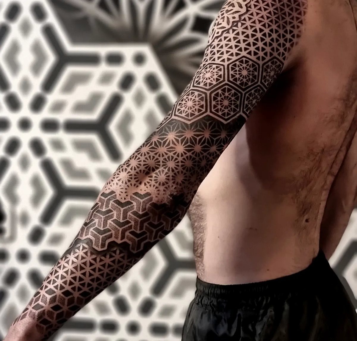
Repeating shapes locked together, covering the shoulder and arm in one continuous geometric field. The pattern here uses hexagons and internal line work, and the uniformity gives the sleeve a technical, architectural feel.
Placement on the shoulder and upper arm suits this style because the surface is large enough to show the pattern repeat without cramping.
Forearm placement works but limits how much of the grid you can fit before it starts to look like a fragment.
Blackwork geometry takes less time than realism at the same scale.
10. Japanese Sleeve Tattoo
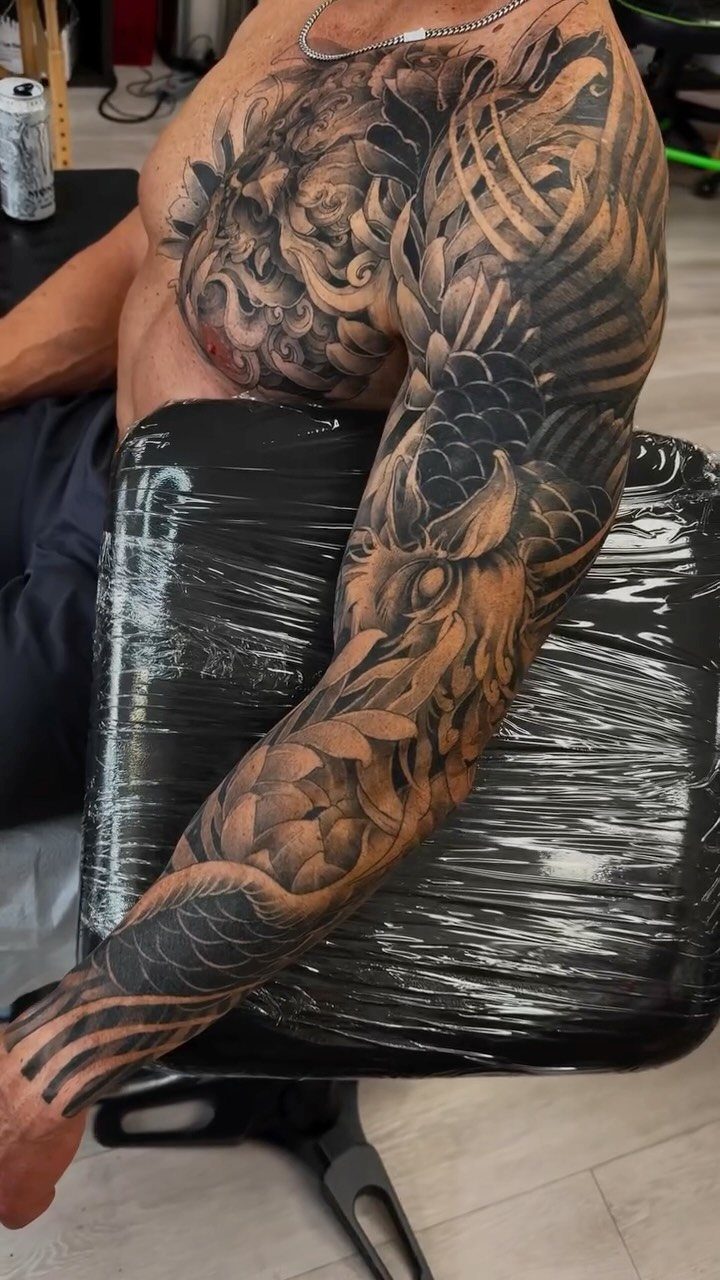
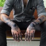
Full coverage from shoulder to wrist or shoulder to elbow, built around traditional Japanese imagery like dragons, koi, waves, cherry blossoms, or figures from folklore.
Black and grey with heavy contrast works best when you fill the negative space with wind bars or clouds to keep the composition tight.
Japanese sleeves are designed to wrap the arm and read from multiple angles, so placement across the shoulder, bicep, and forearm is standard. Sessions add up quickly depending on how much background fill you include.
11. Blackwork Arm Tattoo
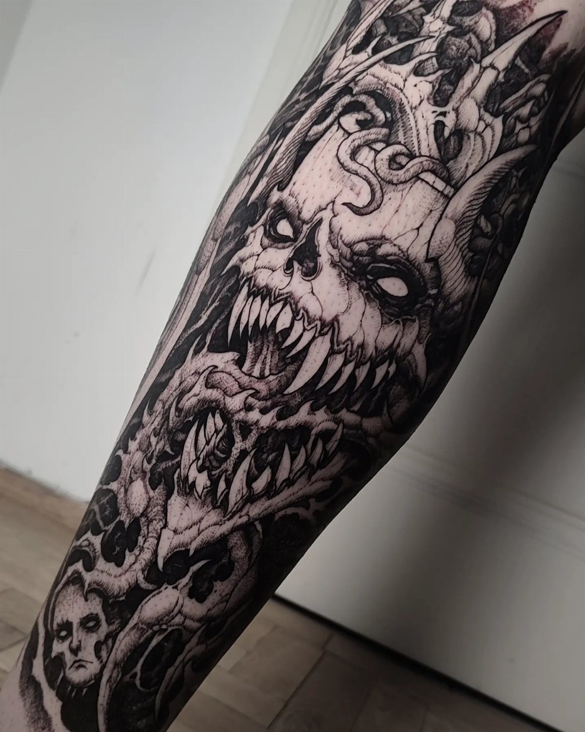
Solid black ink with no shading gradients, relying on contrast between filled areas and bare skin. The skull and demon imagery here stays graphic and high-contrast, and blackwork suits bold subject matter that reads from a distance.
Placement on the forearm or upper arm works equally well.
Blackwork heals faster than color and holds its edge longer, but heavy saturation means any touch-up or cover-up later is harder to manage. If you want flexibility to add or change elements, leave some negative space around the design.
12. Resting Leopard Forearm Tattoo
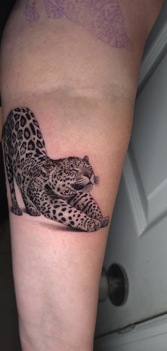
A single animal portrait, sized to fill the forearm lengthwise, with the leopard lying in a resting pose rather than mid-action.
The black and grey realism here uses soft shading to build the spotted coat and muscle definition without heavy outlines.
Forearm placement suits a horizontal composition like this because the shape follows the natural taper of the arm. A resting pose reads calmer than a snarling or lunging animal, which changes the tone if that matters to you.
13. Fox with Botanical Wreath Tattoo
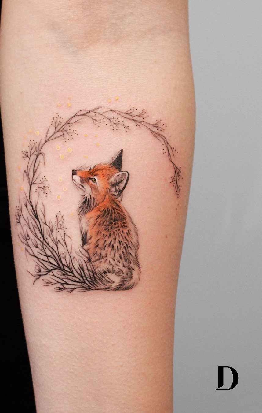
A fox centered inside a ring of thin botanical branches, sized to sit on the outer forearm. The orange tone on the fox pulls focus while the wreath stays light and linear, so the animal reads first.
The circular frame keeps the composition contained without needing a background fill.
Placement on the forearm works because the wreath sits flat against the arm’s taper, and the fox can face forward or to the side depending on how you hold your arm.
Color on the fox means touch-ups every few years if you want the orange to stay bright.
14. Colorful Raccoon and Tropical Flowers
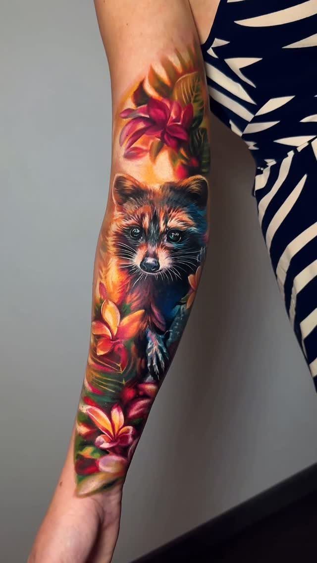
A raccoon surrounded by tropical flowers in full color, covering most of the forearm.
Warm tones hold together better on skin over time than cool ones, and stacking red, orange, and green side by side keeps the piece readable even as the ink settles.
Full color takes longer than monochrome and fades faster in sun exposure, so plan for touch-ups if you want the saturation to last.
Choosing the Right Style
Realism puts a photograph on skin and needs an artist who can handle fine detail and smooth shading.
American Traditional uses bold outlines, limited color palettes, and simple shapes that age cleanly. Neo Traditional keeps the bold lines but adds shading, dimension, and flowing compositions that follow muscle contours.
Japanese Traditional builds full body suits with dragons, koi, waves, and folklore figures in saturated color, designed to tell a story across connected panels. Tribal relies on heavy black ink arranged along muscle lines.
Bring reference images to your consultation. Your artist can tell you which style will hold up at the size and placement you want, and whether your skin tone works better with color or monochrome.
Design Principles
A design should follow the arm’s natural taper and the direction muscles run. A wrapped design on the upper arm accounts for how the bicep changes shape when flexed.
Fill the space without cramping it. A small subject floating in the center of a large area looks unfinished, but packing too many elements into one frame turns the tattoo into visual noise.
Each part of the design needs enough room to read on its own before you add the next.
Avoid placing fine details where skin folds or stretches heavily during movement.
Planning for Future Tattoos
If you plan to add more tattoos later, talk through how the new piece will sit next to existing ink or leave room for future work.
A forearm design can expand into a half or full sleeve, but only if you leave space at the edges and pick imagery that connects.
Walk into your consultation with the spot picked, rough measurements in mind, color versus black-and-gray decided, and a clear answer on whether this piece stands alone or grows into something bigger.
Print or sketch each design at the actual size you’re considering so you can see how much detail survives.
A design that works as a standalone piece might not connect cleanly to other tattoos, so resolve that with your artist before the first session.
Confirm actual fit and spacing during the stencil placement.
Tattoo trends come and go, but no matter what you choose to ink on your arm, make sure you’re in it for the haul.
Frequently Asked Questions
What is the best tattoo for the arm?
Pick something that fits how your arm tapers and how the muscles move, whether that’s a single animal portrait, a wrapped armband, or a design that follows the forearm’s length.
A design works when the shape suits the placement and the subject matters to you personally. Blackwork and American Traditional hold their outline longer than styles that rely on fine detail.
What is the newest tattoo trend?
Geometric patterns and minimalist botanical designs are showing up more often, along with single-subject portraits in monochrome realism. Smaller, contained compositions that don’t require background fill have gained traction over the last few years.