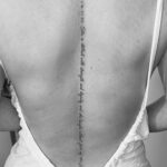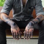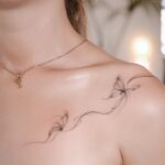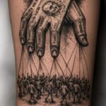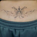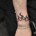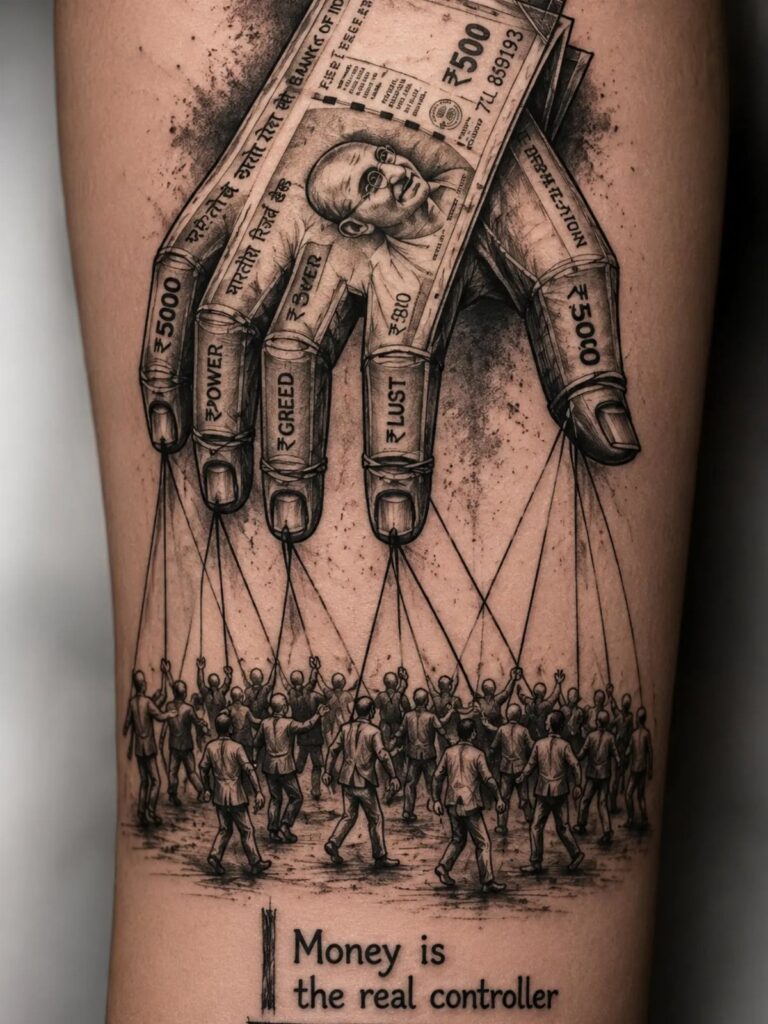
Where you put it and how much space it needs matter more than style.
A sleeve tattoo wraps the entire arm in one continuous design and takes multiple sessions to finish, while a small symbolic piece on the collarbone stays visible in most shirts and leaves room to add more ink later.
1. Nature-Inspired Tattoos with Trees
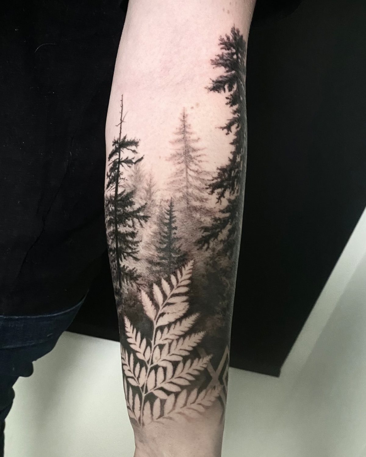
A forest scene wraps the shapes of the forearm in a way that lets you add detail without making the piece heavy.
The vertical lines of the trees follow the muscle, and smaller elements like ferns fit into gaps while keeping the composition clean.
Grayscale suits this subject because it reads as atmosphere rather than decoration. The shading holds depth across years of sun exposure better than color would.
If you want something large enough to feel substantial but not committed to a full sleeve, this format gives you that middle ground.
2. Minimalist Tattoos with Small Symbols
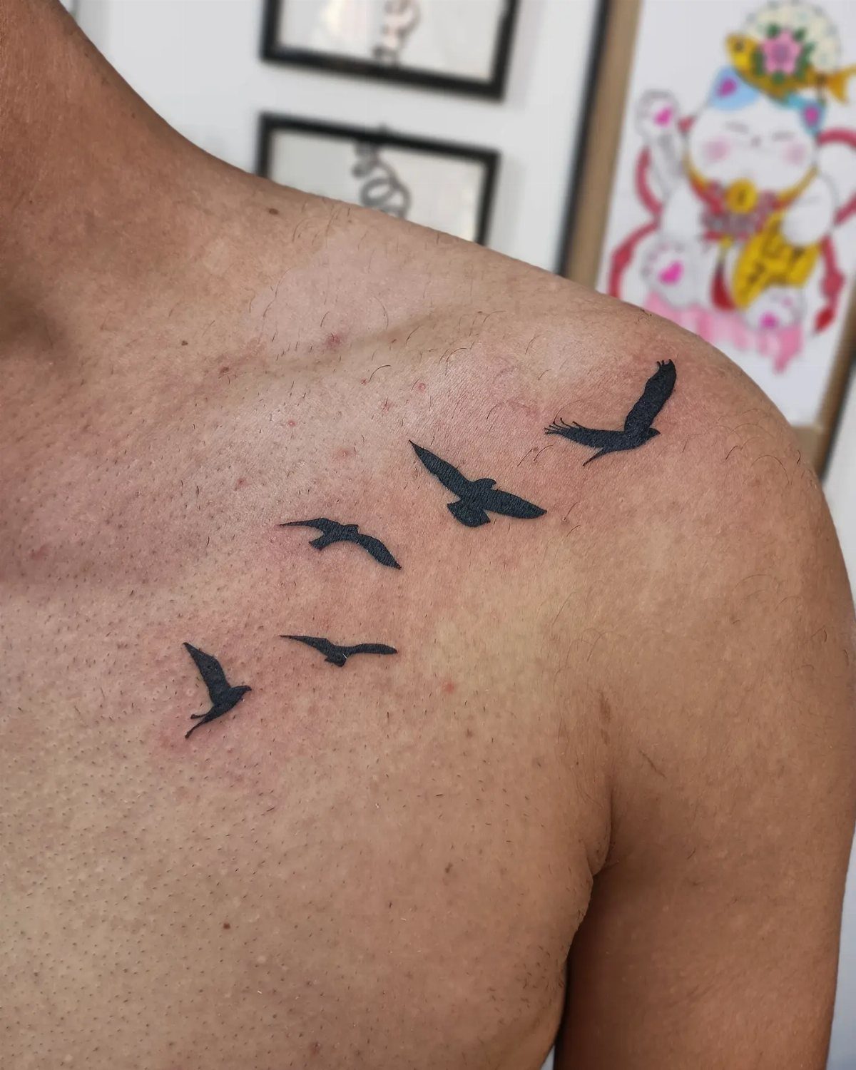
A row of small symbols placed along the shoulder or collarbone moves with the body and stays visible in most shirts.
Birds, arrows, stars or geometric marks work because they stay legible at a small scale and don’t need shading to read clearly.
Placement matters here.
A line that follows the bone structure looks intentional; scattered placement can read as indecisive. I’d keep them all the same size and spaced evenly.
This format scales well when you add more later without redoing the original piece.
3. Family Portraits Tattoos
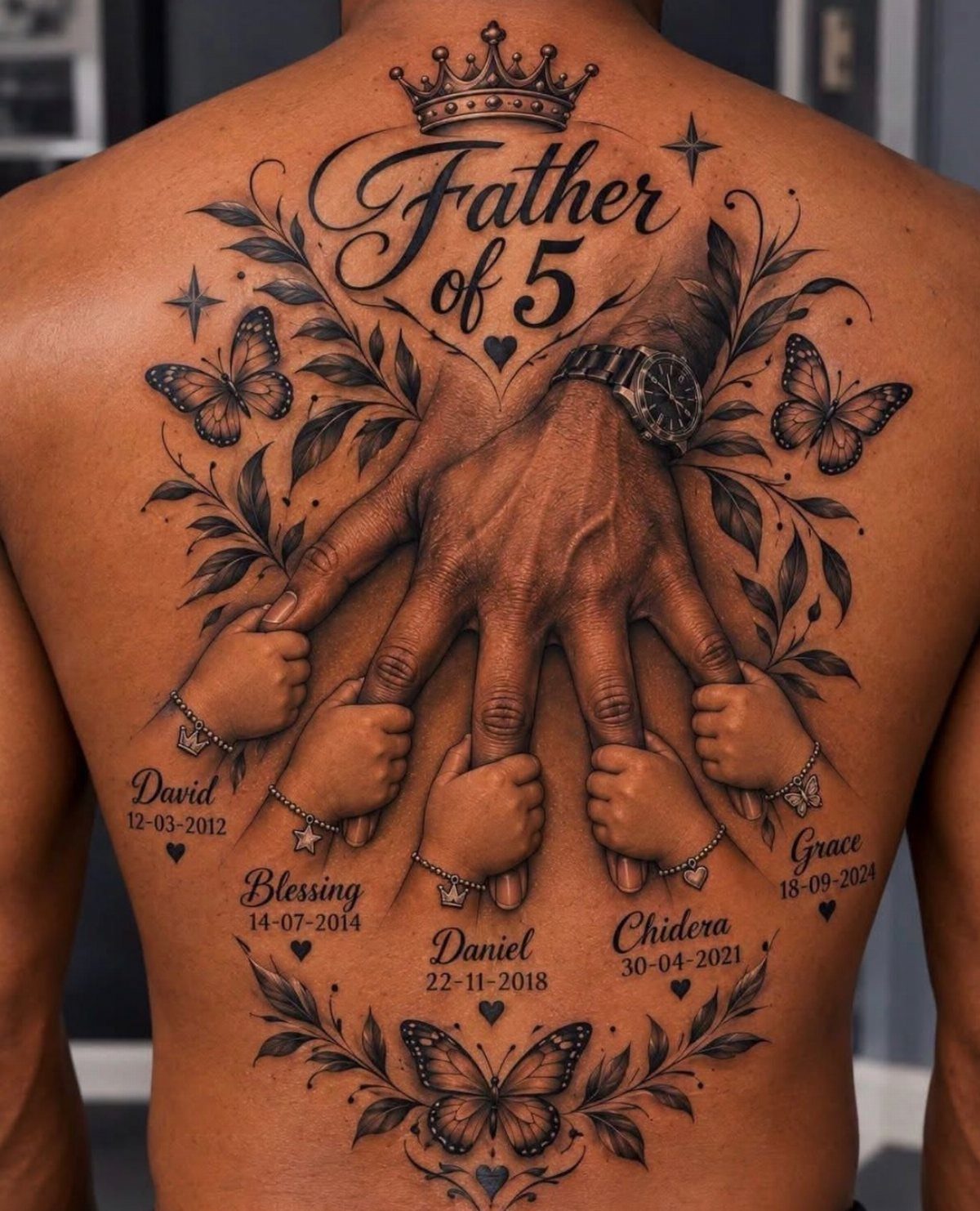
A family portrait translates best as hands, silhouettes or names rather than realistic faces, which age poorly in tattoo form and demand someone experienced in portraiture.
The hand design visible here works because hands are recognizable without needing fine detail, and the names and dates anchor the symbolism without relying on the image alone.
Back placement opens up room for a large composition that includes multiple children without cramping the layout. Butterflies, dates and text elements fill the space in a way that feels complete rather than sparse.
This is a piece you commit to for scale and meaning, not something to test on a small spot first.
4. Sleeve Tattoos
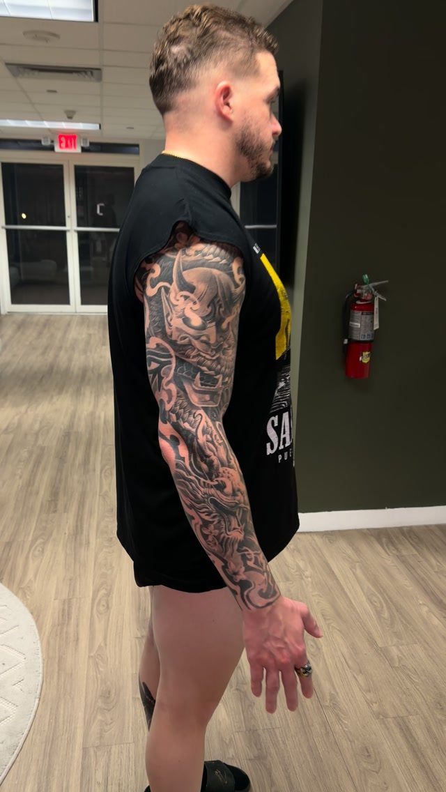
A full sleeve covers the arm from shoulder to wrist in one continuous design, and it takes multiple sessions to finish.
Black and grey realism, Japanese imagery, geometric patterns and American traditional all work at this scale because they hold clarity across a large surface.
The arm’s shape means the design wraps, so you see different parts of it depending on the angle.
Start with the major elements on the outer arm where you’ll see them most, then fill the inner arm and underside as you go.
Trying to plan every inch before the first session usually doesn’t survive the reality of how ink sits on your arm.
5. Abstract Tattoos
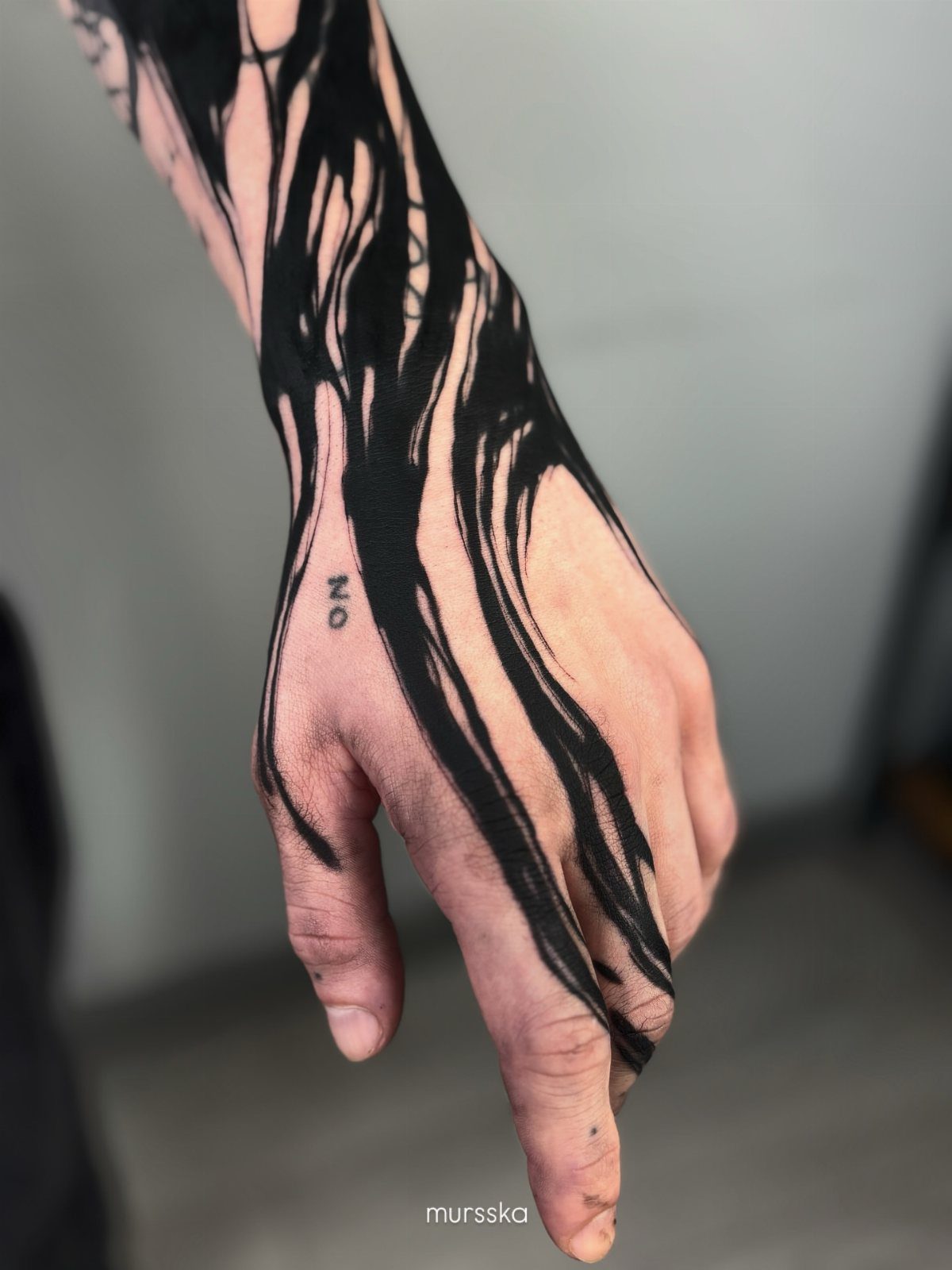
Abstract ink strokes place emphasis on movement and form rather than representing something literal. The black brushwork style visible here mimics calligraphy or graffiti, with thick and thin lines that feel spontaneous even though the artist planned them.
This style suits you if you want something that reads as artistic without needing to explain what it depicts.
The hand and wrist are high-visibility spots, so the design needs to be bold enough to hold attention without fine detail that will blur over time.
Text elements can go in, but keep them small and sparse so the abstract work stays the focus.
6. Family Crest Tattoos
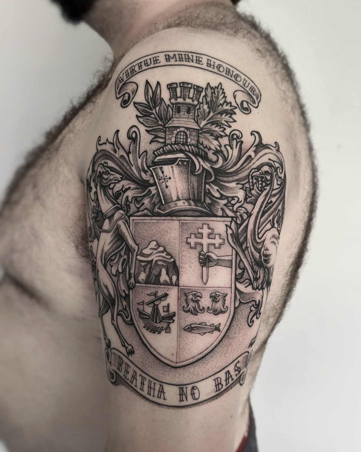
A family crest pulls from heraldic tradition and usually includes a shield, helmet, banner and motto that represent your lineage.
If your family has a documented crest, that design is the starting point. If not, you can work with an artist to build one using symbols that reflect your heritage or values.
Upper arm placement suits the vertical shape of most crests and gives enough space for the details to stay legible.
Black and grey shading brings out the depth of the shield and the texture of the helmet without adding color that might conflict with the historical aesthetic.
This is a piece that carries weight, so get the research right before you sit down.
7. Religious Symbols Tattoos
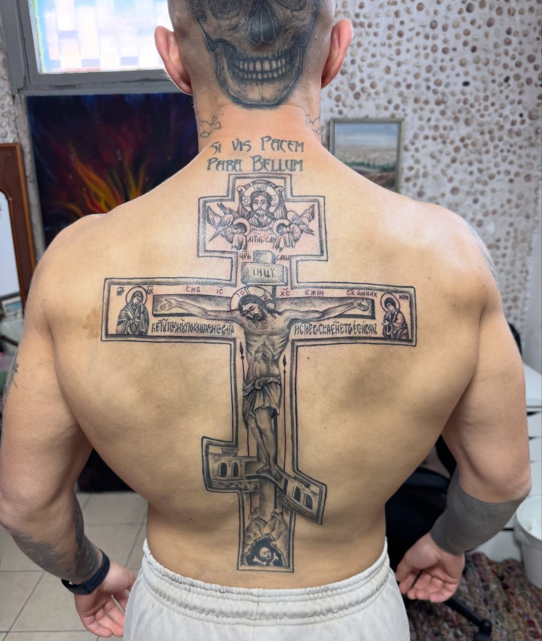
An Orthodox cross placed on the back gives the vertical symmetry room to sit at full scale without competing with other elements.
The Latin text here translates to "if you want peace, prepare for war," and that combination of cross and military phrase is a recurring pairing in Eastern European tattoo culture.
Black ink keeps the focus on the geometry of the cross itself rather than adding color that shifts the tone.
Back placement means you control when it’s visible, which matters for workplace or family settings where religious ink might complicate things.
If you’re considering text, check the translation twice before the session.
8. Blackwork Tattoo
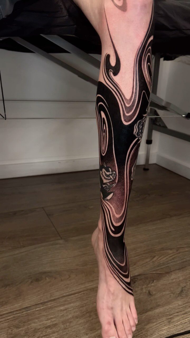
Solid black coverage in organic shapes gives you a bold piece that ages well because there’s no fine detail to blur.
The skull anchored in flowing patterns here uses negative space to define the form rather than relying on shading, and that’s a technique that holds up across decades.
Lower leg placement works for blackwork because the calf has a flat surface that shows the design clearly when you’re standing. The foot extension makes it feel like one piece rather than stopping abruptly at the ankle.
This style demands confidence in the design since covering or lightening solid black takes laser sessions most other styles don’t.
9. Tribal Tattoos
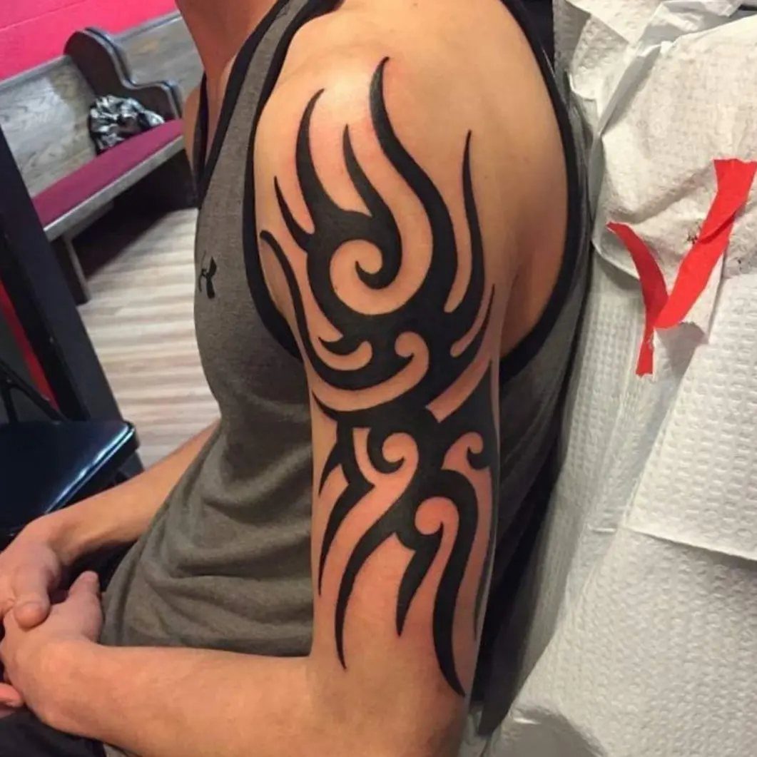
Tribal designs use thick black lines and negative space to create patterns that follow the muscle, and the upper arm is the original placement for this style.
The curves here wrap the bicep in a way that moves when you flex, which is part of the appeal.
Modern tribal often strips out the cultural context and focuses on the graphic quality of the shapes.
If you’re pulling from a specific tradition like Polynesian or Maori, work with an artist who knows that style and can do it correctly.
Placement on the outer arm keeps it visible in short sleeves without needing a full sleeve commitment.
10. Skull Tattoos
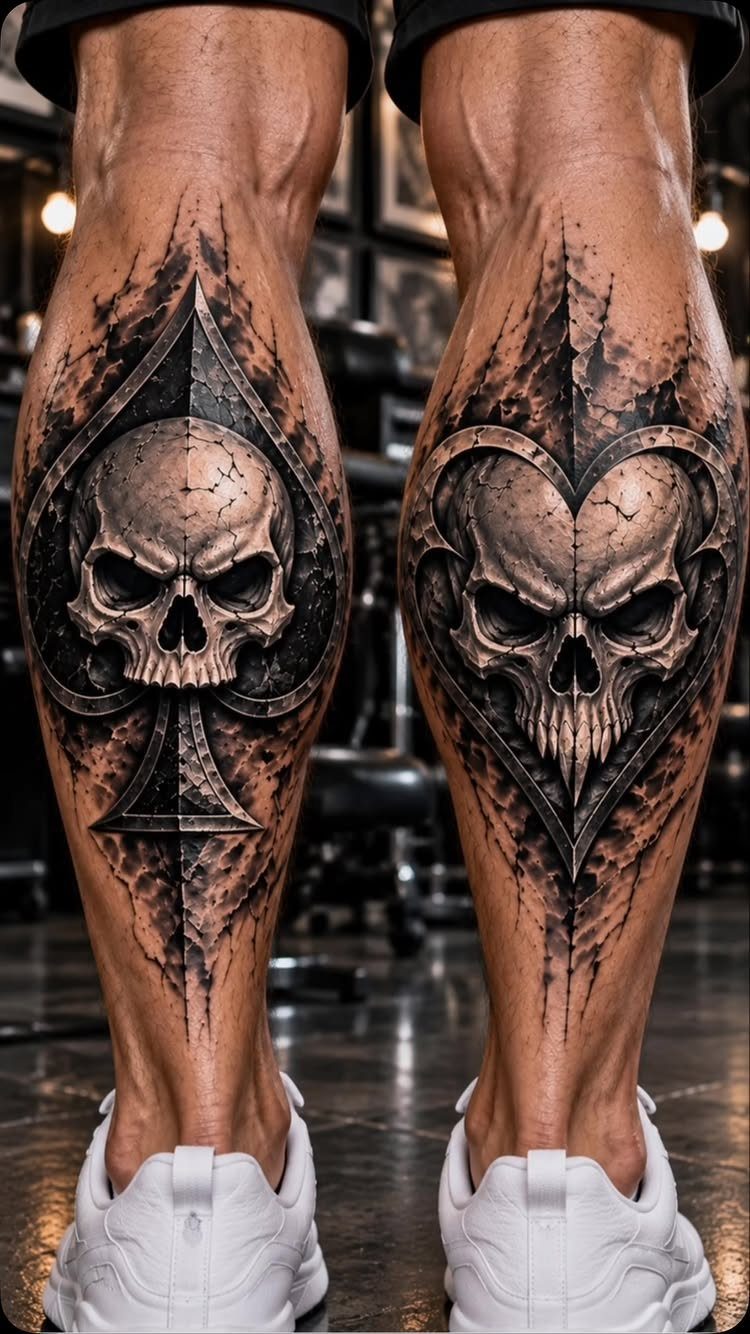
Framing each skull inside a playing card suit keeps the composition balanced and gives the design the clean symmetry traditional tattoo collectors look for on matching legs.
The spade and heart here anchor the composition, and the detail in the shading makes the skulls dimensional rather than flat.
Calf placement suits symmetrical designs like this because you can mirror the layout on both legs without feeling repetitive.
The skulls themselves carry different meanings depending on who you ask, mortality and risk being the most common, but the card suits add a gambling or fate angle that shifts the read.
This is a bold choice for a visible spot, so consider how it fits with your usual pants length.
11. Geometric Tattoos
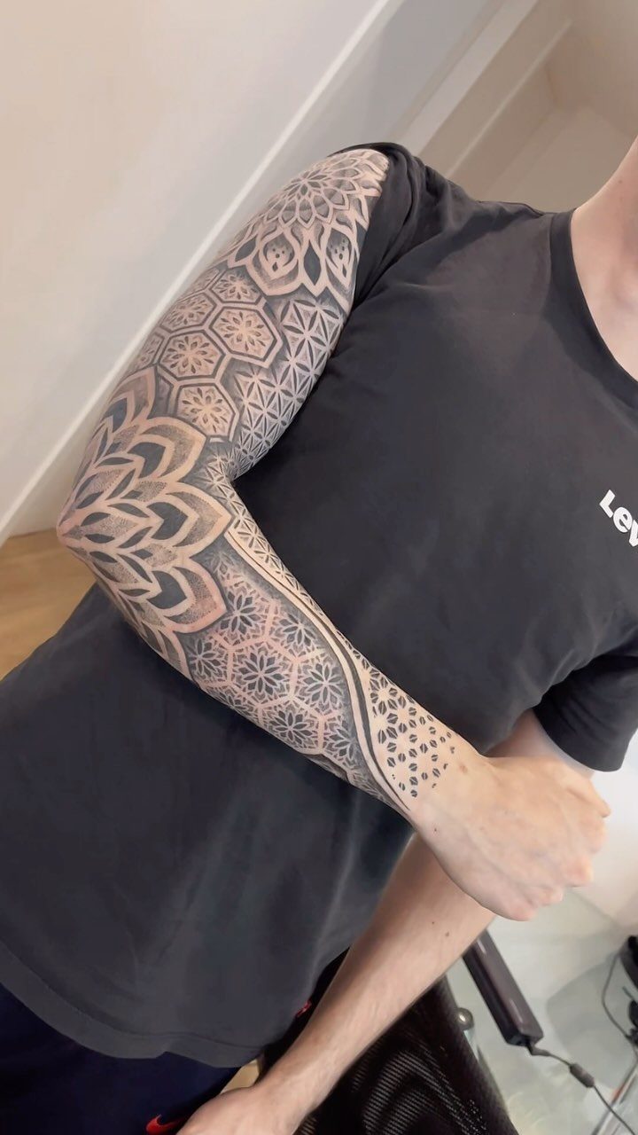
A geometric sleeve builds from repeating shapes like mandalas, triangles and hexagons that lock together across the arm’s surface. The precision here depends on stenciling and straight lines, so this style needs an artist who works clean.
Black ink keeps the geometry readable, and the symmetry makes the design feel complete rather than in progress. The mandala at the shoulder acts as an anchor point, with smaller patterns radiating down toward the wrist.
If you add to this later, the geometric structure makes it easier to extend without disrupting the existing layout.
12. Clock Tattoos
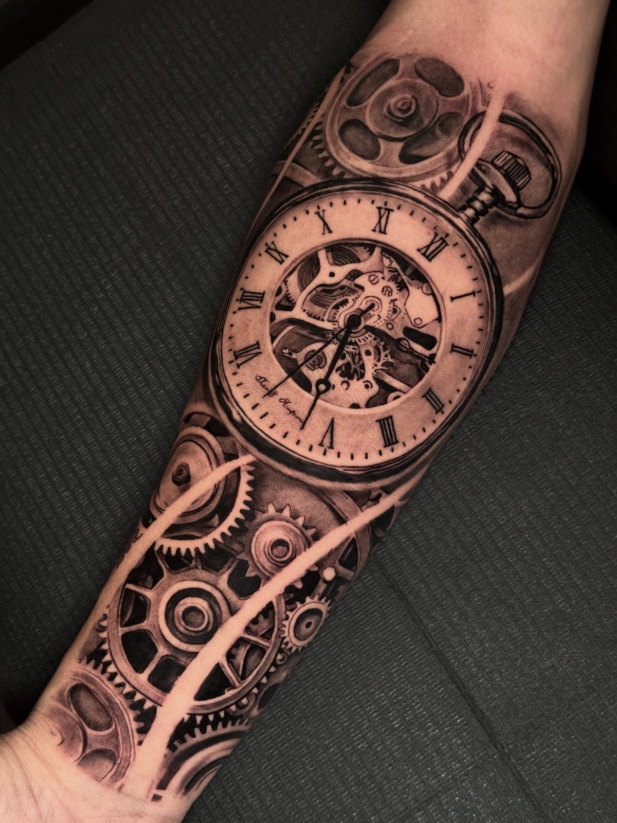
A pocket watch with exposed gears captures a specific moment in time while showing the mechanics that measure it.
The black and grey realism here brings out the metal texture and the depth of the gears without needing color to separate the parts.
Forearm placement keeps the watch face upright when your arm hangs naturally, which matters for a design this detailed. Adding a date or Roman numerals personalizes the piece, and most people tie it to a birth, loss or turning point.
This style demands someone skilled in realism because the gears need to look functional, not decorative.
13. Spider Tattoos
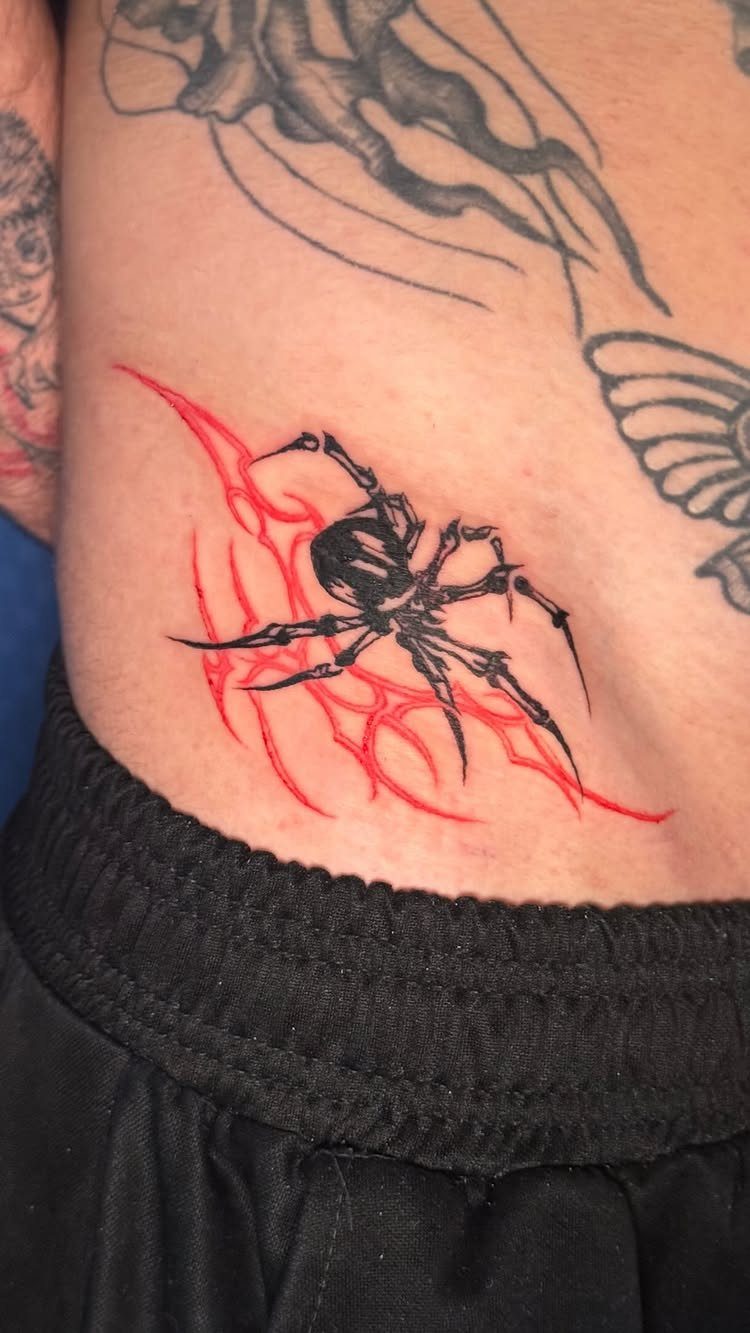
A spider placed low on the torso or ribs sits where clothing covers it most of the time, which suits anyone who wants the piece for themselves rather than for display.
The black body with red accents here keeps the design bold without adding so much color that it softens the impact.
Spiders work at small and medium scales because the legs give the composition movement without needing background elements to fill space. Ribcage placement hurts more than the outer arm, so go in prepared for that.
14. Black & Grey Realism
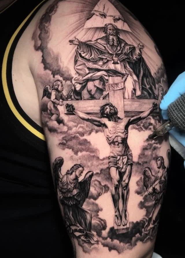
Photographic detail in black and grey holds up better than color realism because there’s no fading to manage, just the tonal range.
The religious imagery here uses light and shadow to bring out the figures without needing outlines, and that’s a technique that depends on the artist’s ability to control gradients.
Upper arm placement gives enough surface area for multiple figures without cramping the composition. This style takes longer per session than traditional or illustrative work because the shading has to be smooth.
15. Eagle Tattoo
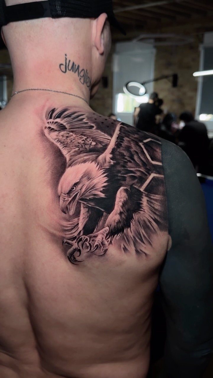
The black and grey shading here brings out the feather texture without adding color that would shift the tone away from the strength the bird represents.
Back placement means you won’t see it yourself without a mirror, but it’s a spot that ages well because the skin stretches less than it does on the arms or ribs.
This is a large piece that takes multiple sessions to finish.
16. The Wolf
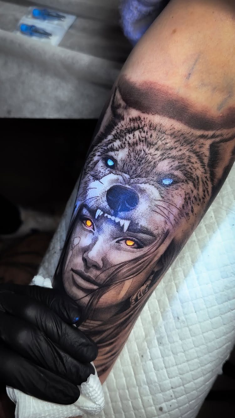
Merging a wolf’s head with a human face in one composition adds a layer of meaning that goes beyond the animal alone.
Forearm placement keeps the piece visible in short sleeves and gives the vertical space needed for both faces to sit without feeling cramped.
This style needs an artist experienced in realism because the proportions have to align for the merge to read clearly.
17. American Traditional
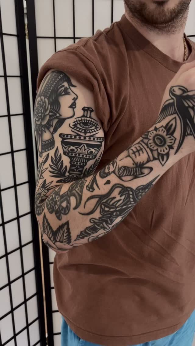
Bold outlines, solid black fill and limited shading define American traditional, and those qualities mean the design stays legible for decades.
The woman’s face and the bird here use the same line weight and flat color approach that makes this style instantly recognizable.
Upper arm and forearm placement lets you build a collection of separate images that sit next to each other without needing to connect into one scene.
This format works if you want to add more pieces over time without planning the entire layout upfront.
18. Quote Tattoo
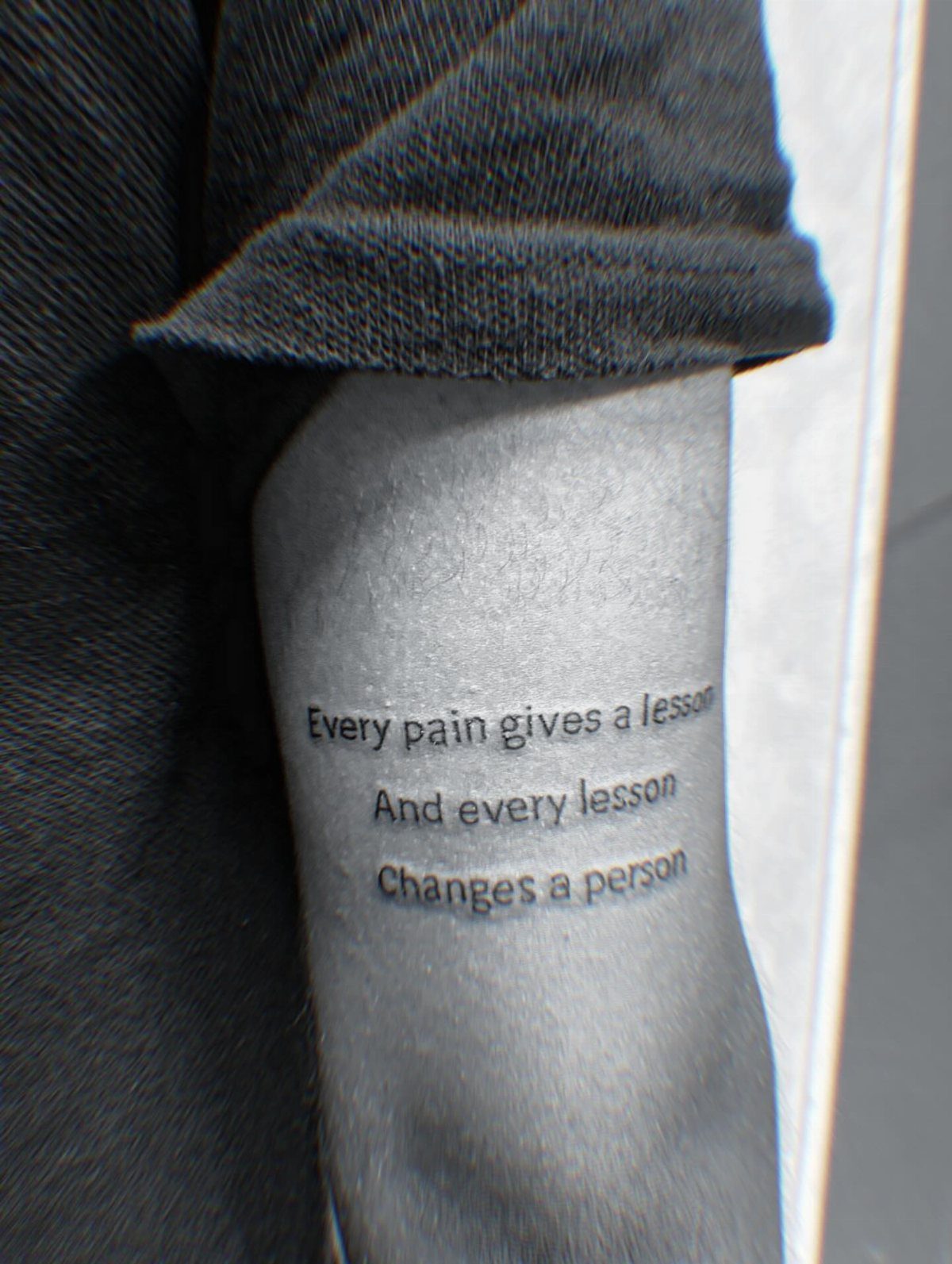
A quote wraps the upper arm in multiple lines, and the curve of the text follows the muscle in a way that keeps it readable from most angles.
The black script here stays legible because the letters are large enough to hold their shape as the skin ages.
Placement on the outer arm means you see it when you look down, which suits a piece meant as a personal reminder.
Keep the font simple and avoid anything too decorative, since fine details in lettering blur faster than solid shapes do.
19. Nautical Tattoos with Anchors
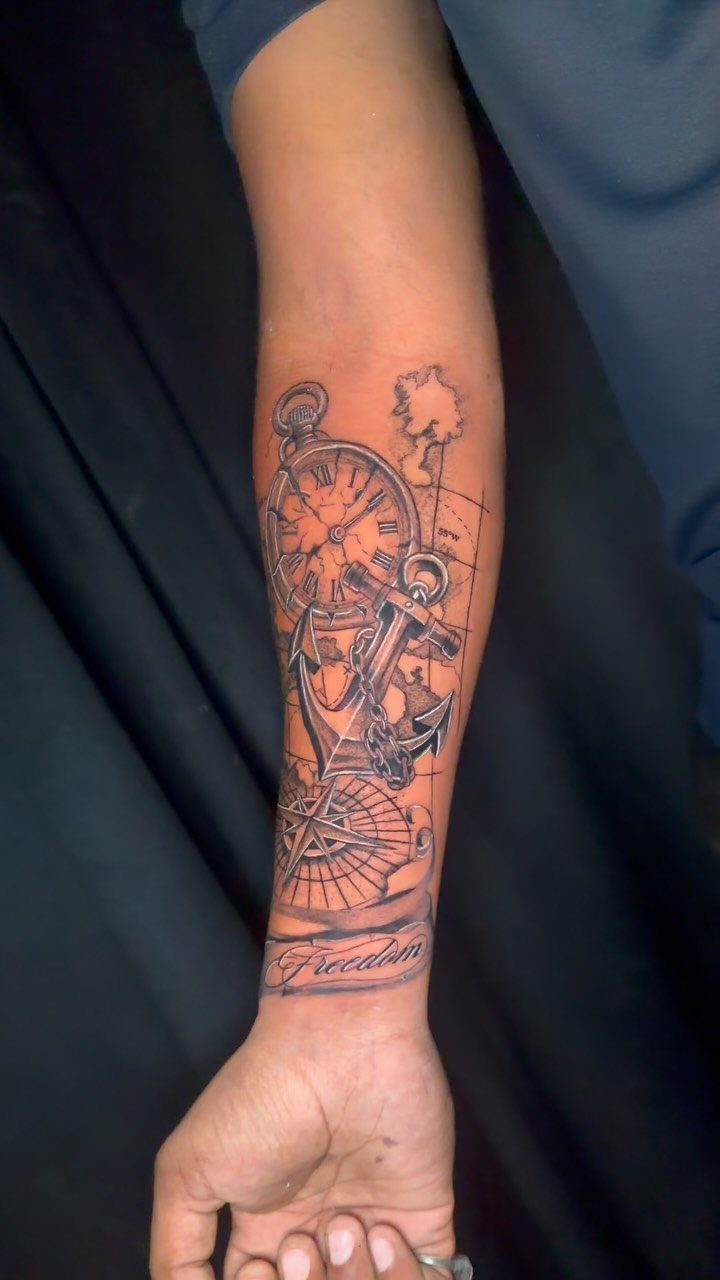
Anchors combine with compasses, pocket watches and script to build a nautical theme across the forearm in one session.
The map background here ties the separate elements together without needing a full scene, and black and grey keeps the focus on the objects rather than adding color that would date the piece.
Forearm placement suits this grouping because the vertical space fits multiple items stacked or arranged side by side. If you’re adding text, keep it short and position it where it won’t compete with the main images.
20. Dragon Tattoos
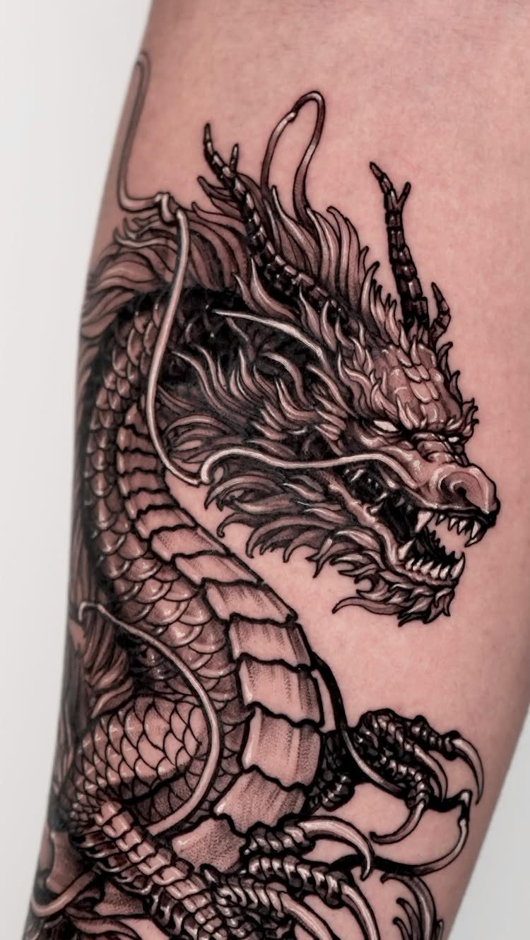
Scales, claws and the curve of the body give a dragon tattoo the detail it needs to fill an arm without feeling empty.
Black ink here brings out the texture in each scale and the definition in the head, and that level of shading takes multiple sessions to finish.
Arm placement follows the muscle and lets the dragon wrap naturally rather than sitting flat.
This design works best at a large scale because shrinking it down loses the detail that makes the piece read as a dragon rather than a generic reptile.
21. Ocean Wave Tattoos
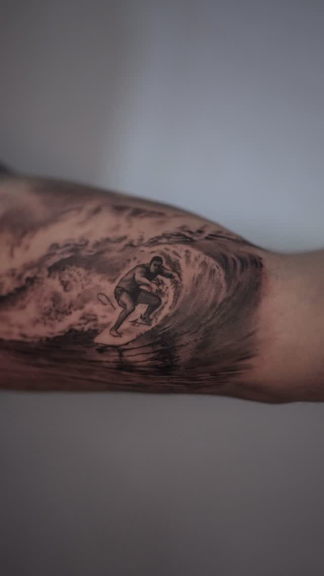
A surfer inside a curling wave gives you a scene that feels dynamic even though the ink doesn’t move.
Black and grey realism relies on contrast and shading rather than color separation, which keeps water and skin tones distinct without muddying the image.
Forearm or upper arm placement gives the wave enough horizontal space to curl without feeling cramped.
If you’re tied to the ocean or surfing, this reads immediately. If not, it still works as a strong image that holds up at a distance.
22. Gaming Tattoos with Video Games Characters
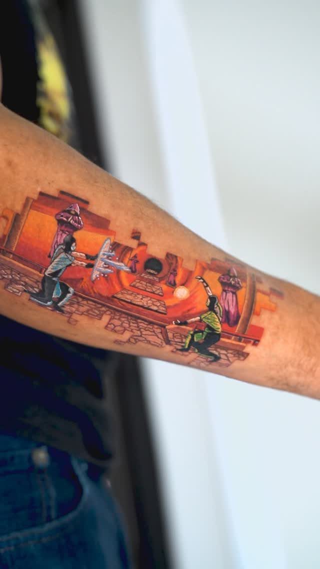
Characters and environments from video games translate into tattoos when the source material has strong visual design.
The color here pulls directly from the game’s palette, and that bright orange and green combination makes the piece stand out in a way black and grey wouldn’t.
Neo-traditional gaming tattoos age differently than traditional or blackwork because color fades faster, so plan for touch-ups if you want the vibrancy to last.
23. Samurai Tattoos
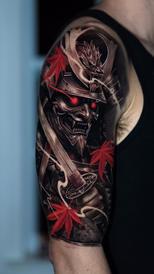
A samurai mask paired with maple leaves brings together two icons of Japanese imagery in one composition.
This style needs an artist familiar with Japanese tattooing because the proportions and details follow specific conventions.
24. Arrow Tattoos
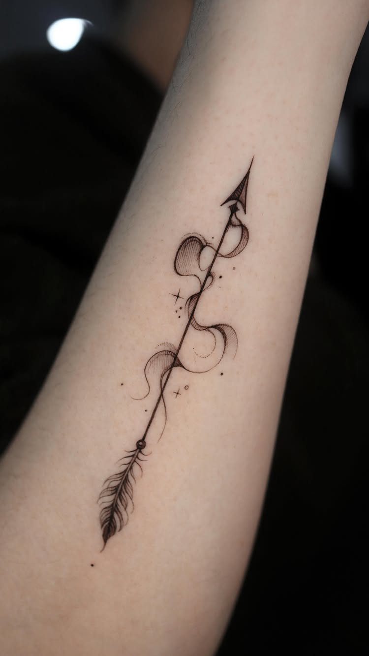
An arrow with smoke or abstract swirls wrapped around the shaft adds movement to a design that would otherwise sit static.
Small accent marks like stars or dots around the main subject balance the composition when one side would otherwise sit empty.
Forearm placement keeps the arrow pointing in one direction, which reinforces the idea of moving forward. This is a medium-sized piece that works well on its own or as part of a larger collection.
25. Cross Tattoos
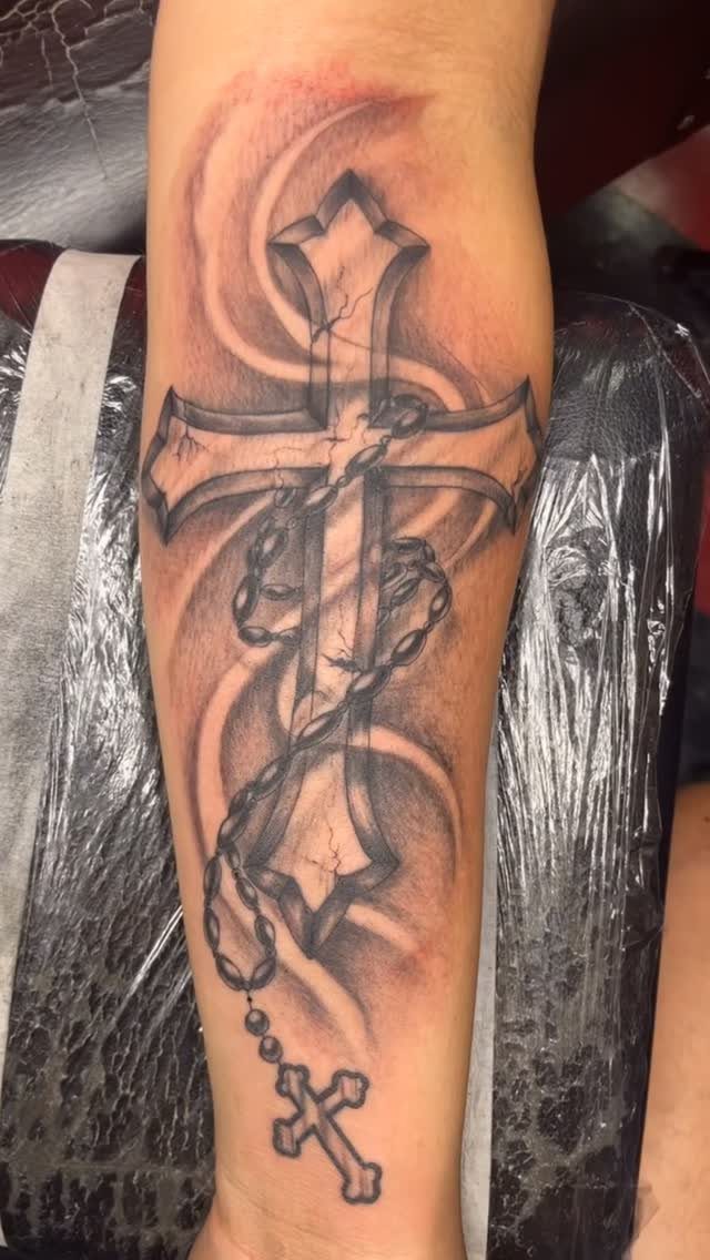
Forearm placement keeps the piece visible when you want it and covered when you don’t.
Adding cracks or weathering to the cross itself makes it feel like a relic rather than a clean icon.
This is a straightforward piece that most tattoo artists can handle, so focus on finding someone whose line work stays consistent across larger fills.
26. Celtic Tattoos
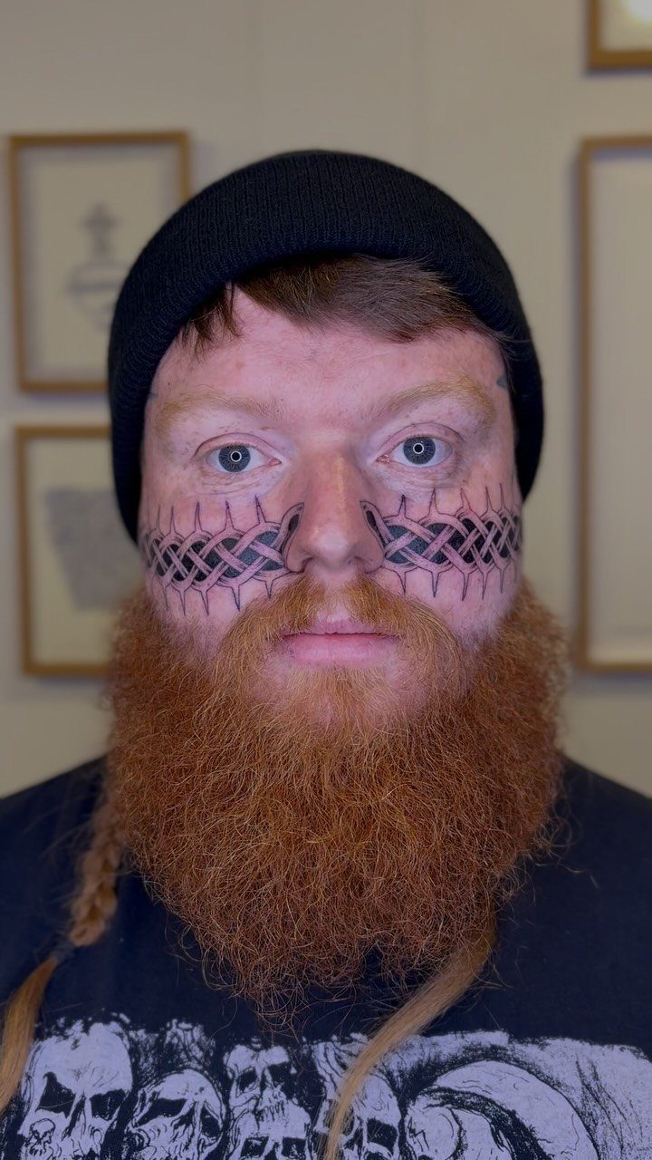
Knotwork on the face commits to visibility in a way few other placements do, and the symmetry across the cheeks and nose keeps the design balanced.
The continuous lines here follow Celtic interlace patterns that loop without breaking, which gives the piece the complexity this style is known for.
Facial tattoos close doors in most professional settings, so this suits anyone already past that concern.
Black ink on the face ages differently than it does on covered skin because sun exposure is constant, so touch-ups will be part of keeping it sharp.
27. Star Tattoos
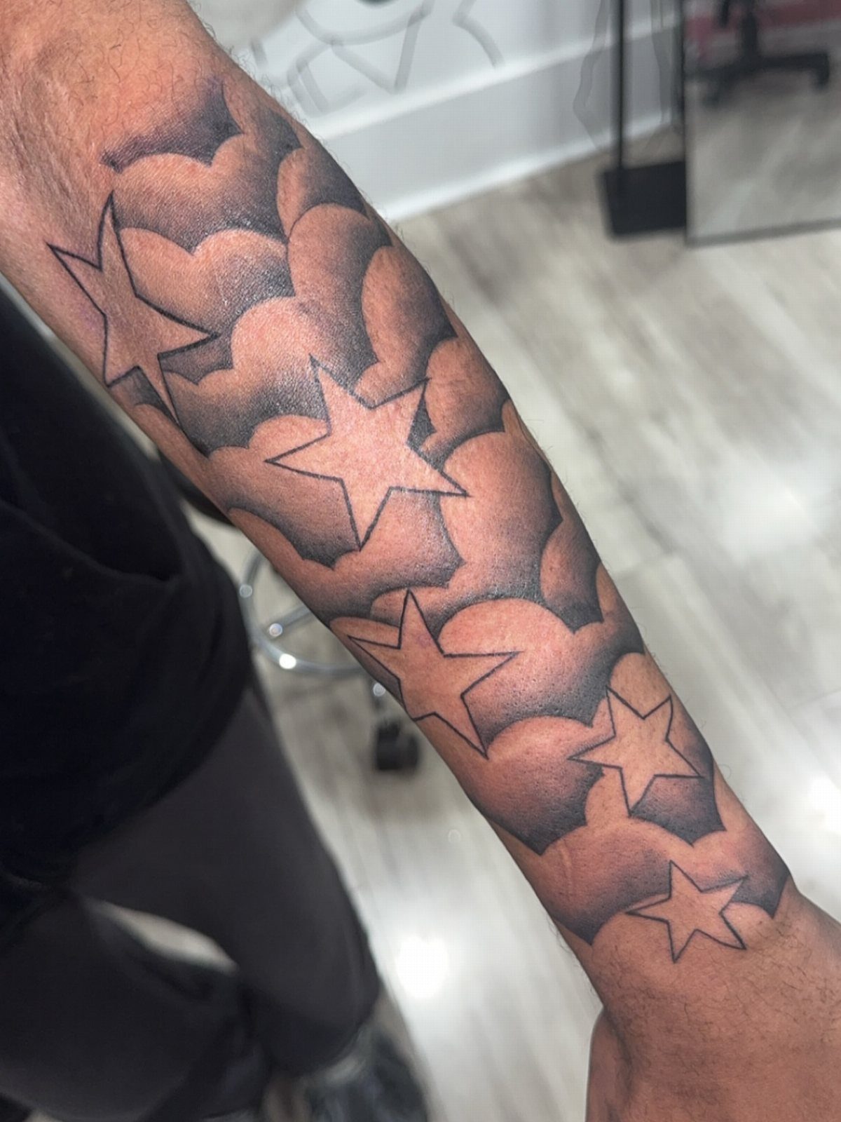
Five-pointed stars grouped with clouds give the design depth without needing a full background scene. The black and grey shading here keeps the stars dimensional rather than flat, and the clouds soften the composition without taking over.
Forearm placement works for stars because the design scales down easily if you want something smaller, or you can extend it into a larger piece by adding more elements later.
28. Octopus Tattoos
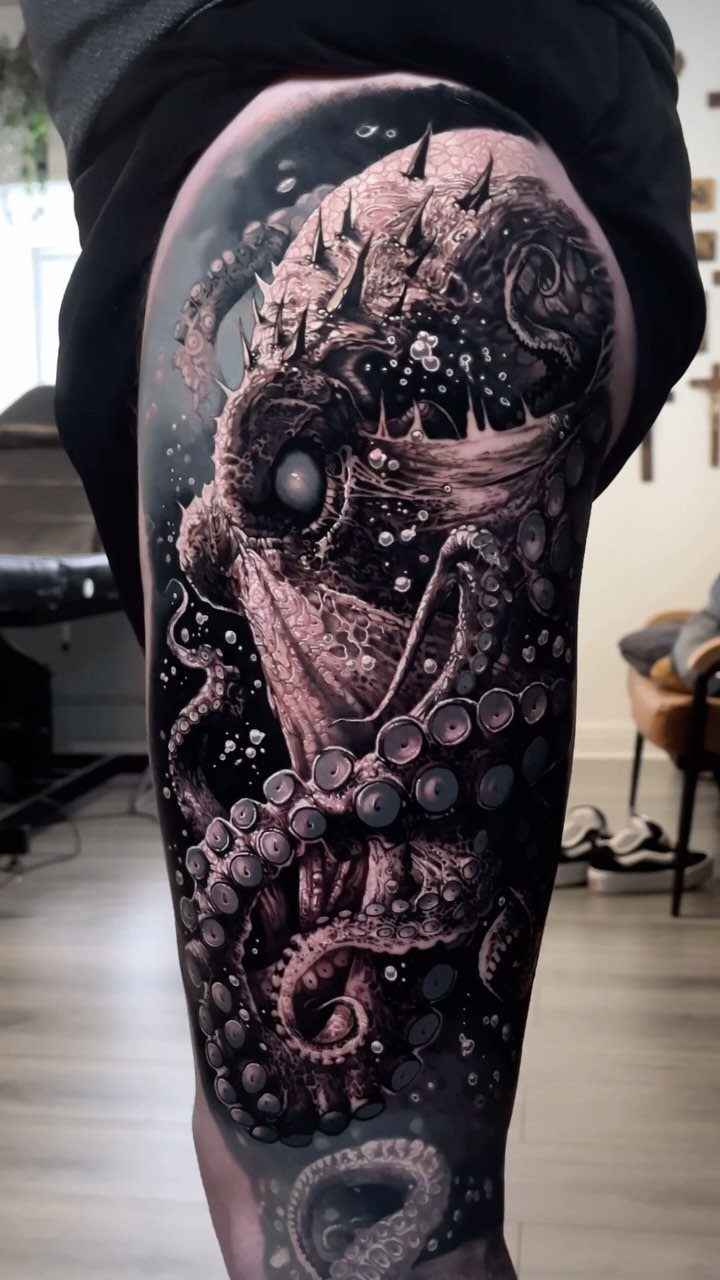
Thigh placement gives an octopus the room it needs to spread tentacles across the leg without cramping the design.
The black and grey realism here brings out the suction cups and skin texture in a way that makes the creature feel three-dimensional, and that level of detail takes multiple sessions to finish.
The organic curves of the tentacles follow the muscle and wrap naturally, which is part of why this animal works better on the body than geometric shapes do.
Choosing the Right Tattoo Artist
Portfolio review tells you more than years in business.
Look for healed work in the style you want, not just fresh photos taken the day of. An artist who posts follow-up shots months later is confident the piece still looks right.
Black and grey realism, geometric precision and script all demand different skills. Someone who excels at traditional bold lines may not be the right choice for fine portraiture, and trying to do both in one sitting usually compromises the work.
Ask about their stencil process and how they handle corrections during the session. A good artist will talk through placement and scale before the needle touches skin, and they’ll stop to check alignment as they go.
Book a consultation before committing to a deposit. You’ll know within 10 minutes if their approach matches what you’re after.
The tricky thing about tattoos is that you still see the ones that are “out of style”, because they’re permanently on the wearer. So, Dowdell’s point is that he’s doing far fewer of these types anymore, in favor of the aforementioned ones.
— GQ
Tattoo Placement Considerations
Upper arm and shoulder placement keep the piece out of direct sun most of the day, which slows fading compared to hands or forearms. The skin stays stable there as you age, so fine details hold longer.
Chest and sternum sit over bone with less cushioning, which makes the session harder to sit through. Pain levels hit 7 out of 10 or higher near the collarbone, but the broad surface suits large centered designs like crests or mandalas.
Forearms show in short sleeves and feel manageable during the session, rating around 2 to 3 out of 10 for pain. That visibility cuts both ways in professional settings, so consider how much your workplace tolerates visible ink before you commit.
Full back pieces stay covered in most clothing and give the artist room for complex compositions without cramping the layout.
Tattoo Aftercare Essentials
I clean mine 2 or 3 times a day using lukewarm water and a gentle antibacterial soap with no fragrance. Pat it dry instead of rubbing, and keep your hands clean before you touch it.
For the first 3 days I use a thin coat of tattoo ointment, then move to an unscented lotion after that. Thick over-application traps moisture and can pull ink out during healing.
Stay out of pools, hot tubs and standing water for 14 days. Chlorine and bacteria both interfere with healing, and soaking softens scabs before they’re ready to come off naturally.
Once healed, UV exposure fades ink faster than anything else. Use SPF 30 or higher daily on visible tattoos, and reapply if you’re outside for more than 2 hours.