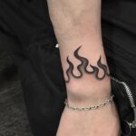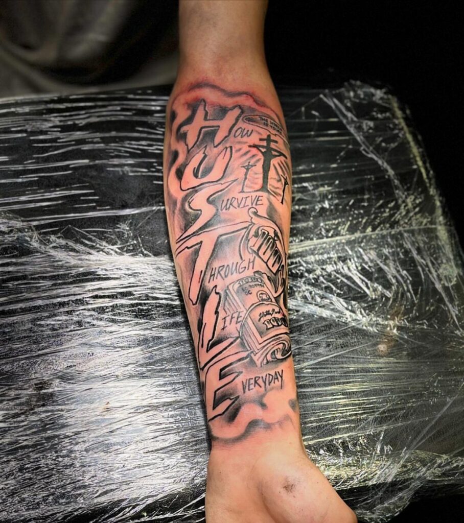
The lower arm offers enough space that fine-line work stays readable, which makes it one of the better spots for delicate designs that hold their detail.
1. Floral Tattoo
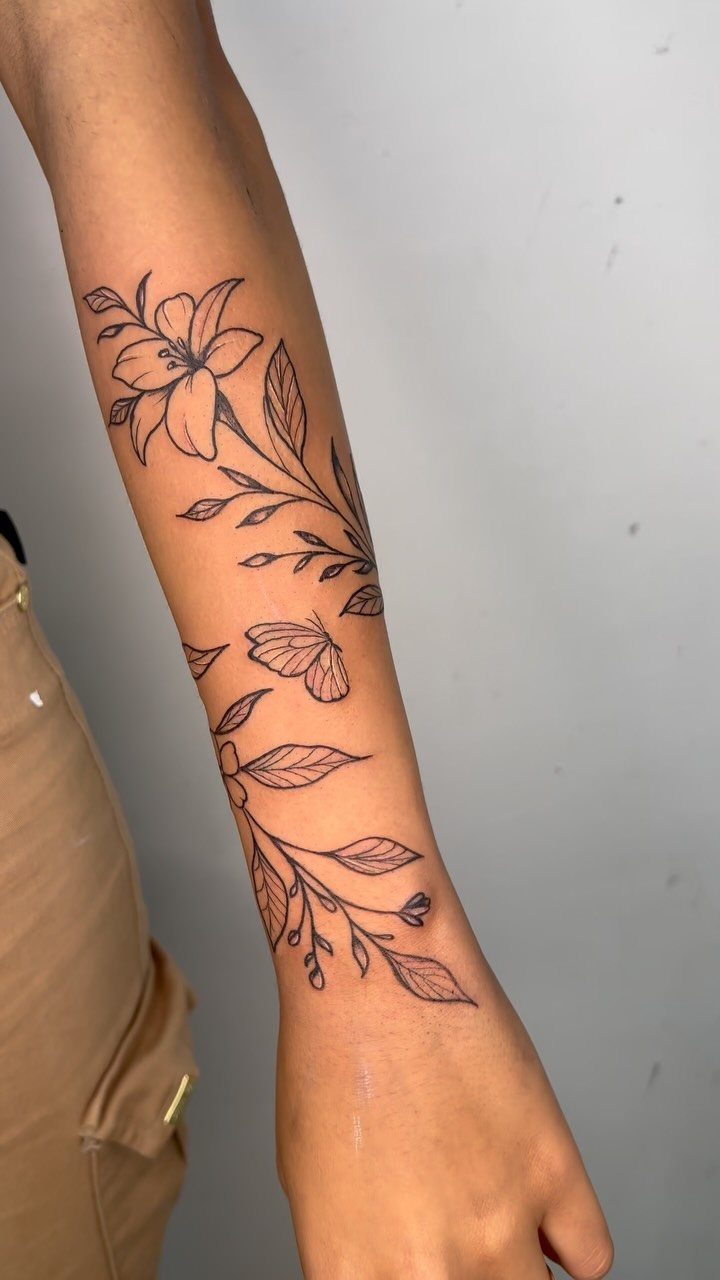
Flowers carry different meanings depending on the type, and lilies often point to purity or renewal.
The lower arm gives you a flat canvas that shows the design clearly when you want it seen and disappears under long sleeves when you don’t.
Floral work scales well here, whether you keep it to one bloom or add stems and smaller elements around it.
Black ink reads sharply and ages cleanly. Line weight matters: too thin and the detail can blur over time, too heavy and the piece looks muddy from the start.
2. Forearm Sleeve Tattoo
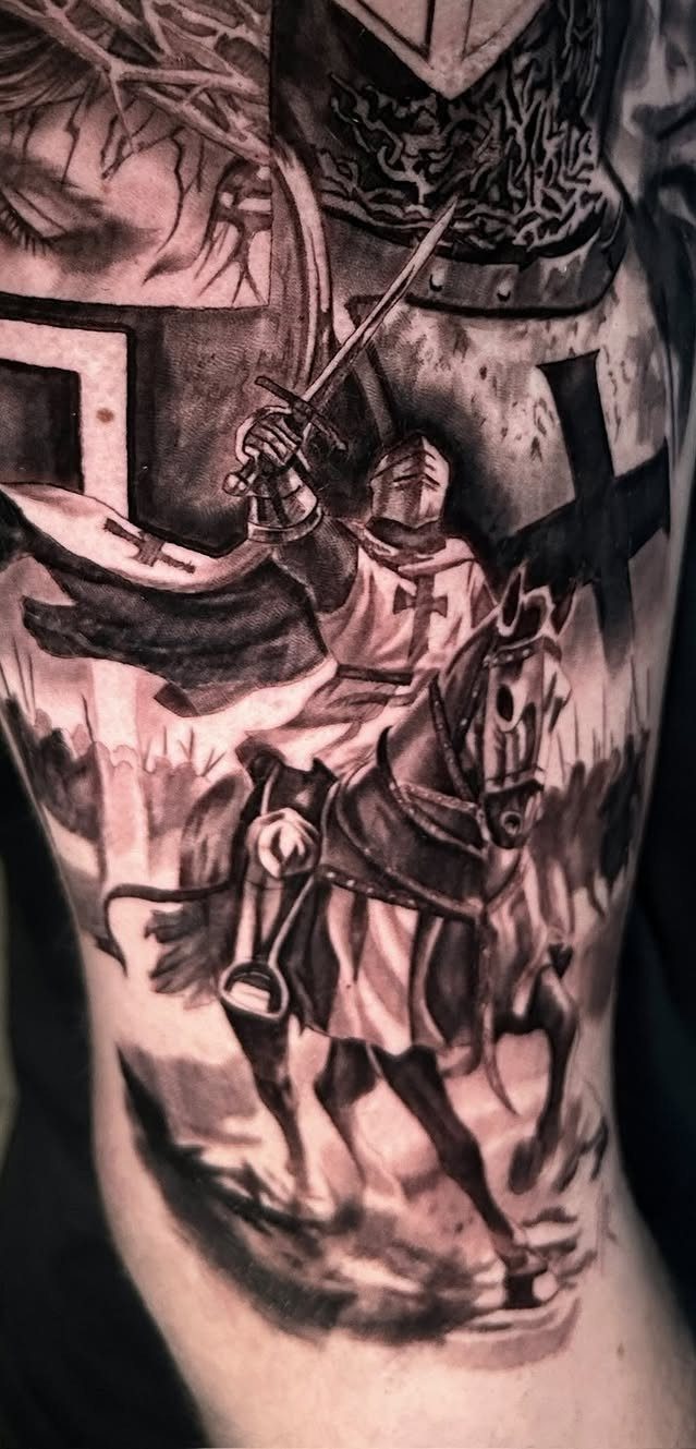
A sleeve from wrist to elbow locks in a complete scene. The knight on horseback here fills the space with shading, crosses, and layered detail that wraps around the arm.
Sleeves take multiple sessions. The timeline stretches with shading and fine detail, and solid work costs more per hour than most walk-in flash.
Black and grey heals faster than color and holds detail longer, which is why I lean toward it for pieces this dense.
The forearm shows more than the upper arm, so a sleeve here is a commitment to visibility. Long sleeves cover it for work, but it’s out the rest of the time.
3. Butterfly Tattoo
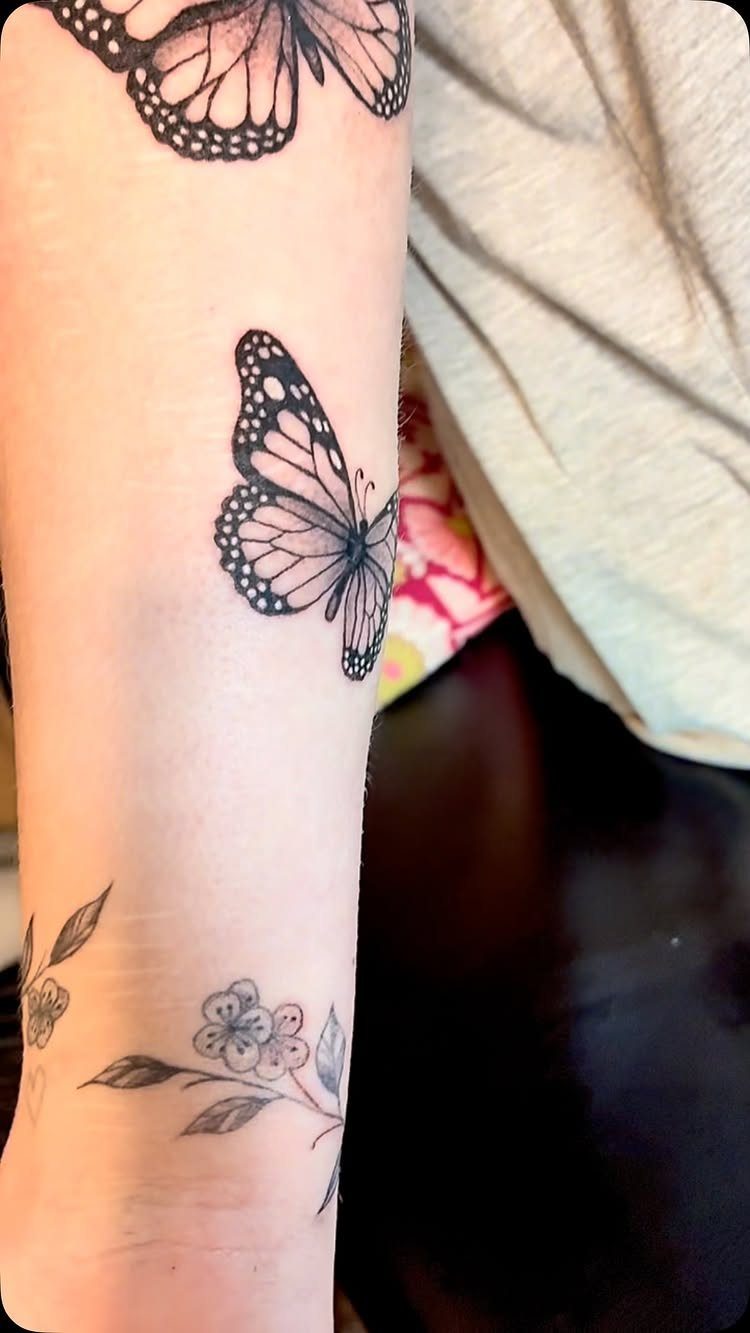
2 butterflies land on the lower arm above a small floral branch near the wrist. Butterflies work as standalone pieces or paired with flowers, vines, or script.
Placement lets you control how much the design wraps. Flat on the outer forearm keeps the butterflies fully visible from one angle; wrapping them slightly around the arm adds movement when you turn your wrist.
Fine-line butterflies stay delicate, but the wings need enough ink to hold up as the tattoo settles. I’d keep the lines a bit heavier than you think you want, especially on the wing edges.
4. Video Game Tattoo
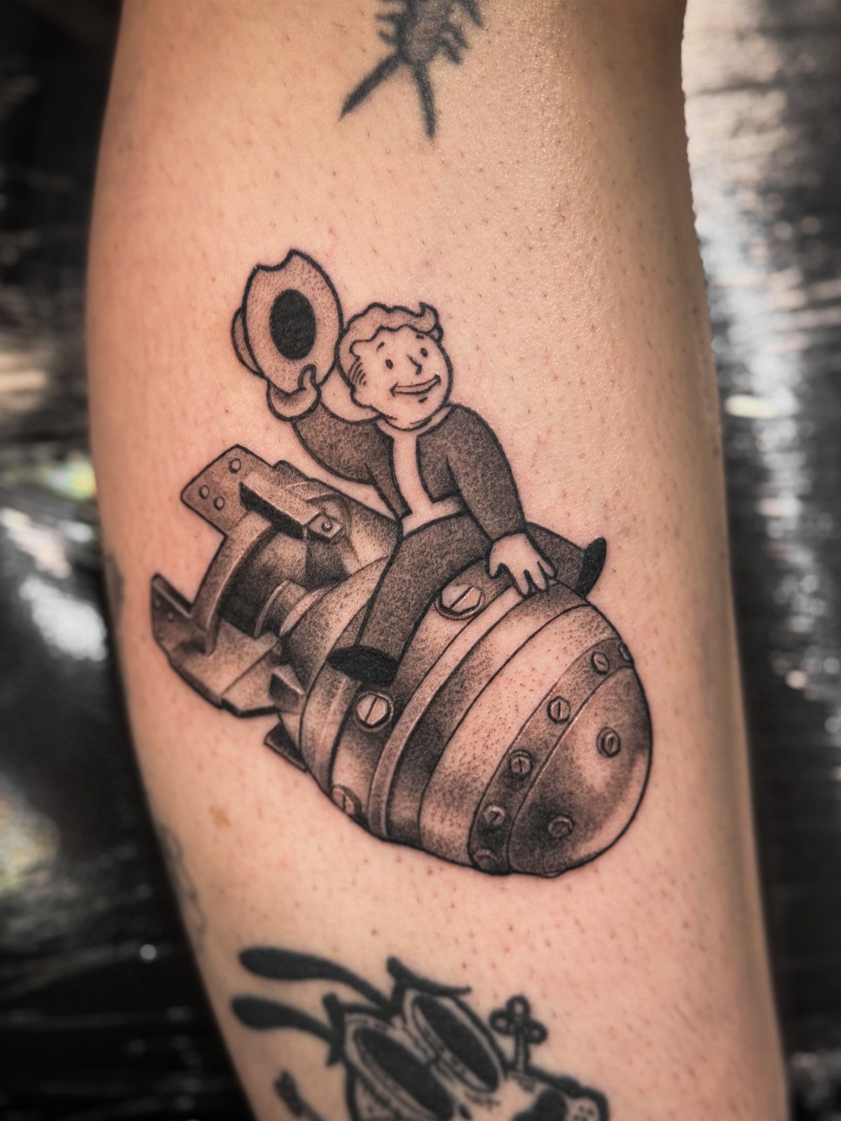
Video game tattoos pull from the art, characters, or symbols that mattered to you, and Fallout’s retro mascot reads clearly even at this size.
The lower arm works well for characters with simple outlines and strong silhouettes. Shading adds depth without needing color, which keeps the piece from fading unevenly over time.
Game tattoos age best when the design is iconic rather than detailed scenery. A character or logo holds up; a screenshot of a level usually doesn’t.
5. Pet Portrait Tattoo
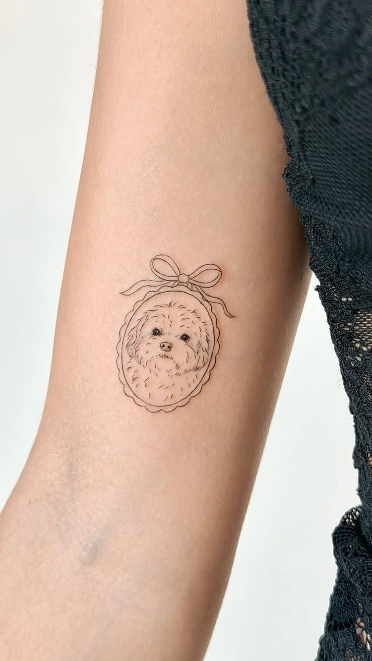
Pet portraits work best when the artist has experience with faces, animal or human, because the proportions have to be exact or the likeness falls apart.
Size matters here.
Too small and the detail blurs as the tattoo heals; too large and a realistic portrait can look heavy on the forearm. This version stays small and reads as a cameo rather than a full portrait.
Bring a clear, well-lit photo to your artist. Blurry snapshots don’t give them enough information to pull a good likeness.
6. Heart-shaped Tattoo
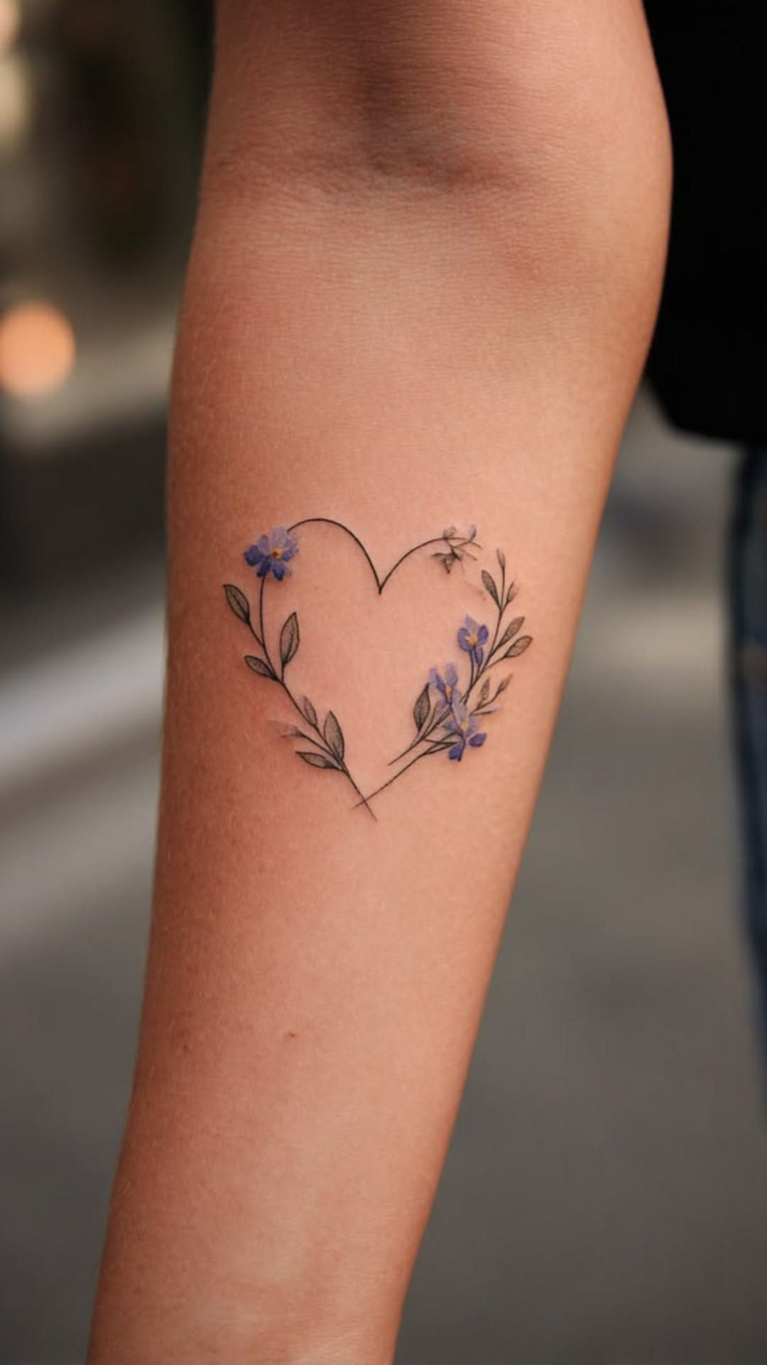
A fine-line heart wraps with small purple flowers and green leaves on the lower arm. Hearts work as standalone pieces or paired with names, dates, or other symbols, and adding florals softens the shape without losing the meaning.
Color heals differently than black ink. Purples and greens can fade faster, especially if you’re in the sun often, so plan on touch-ups every few years if you want the color to stay bright.
The lower arm is flat enough that a design like this won’t distort when you move your wrist. That makes it a good spot for delicate line work that needs to stay readable.
7. Tree of Life Tattoo
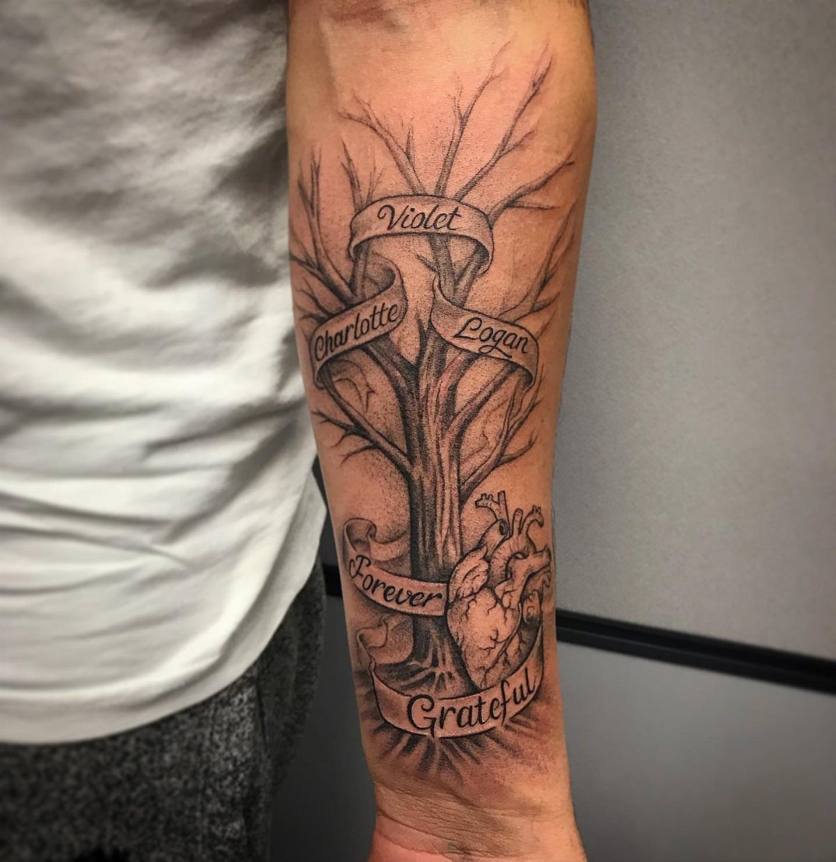
The tree roots wrap into an anatomical heart at the center, with names on ribbon banners threaded through the branches. Tree of Life designs layer personal meaning into a symbol that already carries weight.
The lower arm gives you room to add names, dates, or other elements without crowding the tree itself.
Banners are the most common addition, and they read clearly when the script stays simple and the ribbon has enough contrast against the shading.
Black and grey holds detail better than color on a piece this layered. Too much shading in the leaves or roots can make the whole thing look muddy, so I’d ask your artist to keep the contrast high.
8. Minimal Sagittarius Tattoos
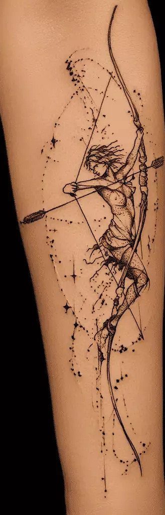
Zodiac tattoos work best when the symbol reads clearly without needing explanation.
Too thin and the details blur within a year or two, especially on small elements like the dots.
Sagittarius suits this style because the archer’s pose is simple and the silhouette stays readable even at a small size.
9. Black Ink Line Art Arrows Tattoo
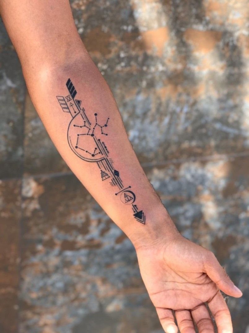
Arrows and geometric lines stay sharp over time because the design has clean edges and no soft shading to fade unevenly.
This version adds small dots and intersecting lines, which keeps the piece from looking too rigid without adding complexity that won’t age well.
Minimalist tattoos work on the lower arm because the space is flat and visible.
You can place arrows pointing up, down, or across the arm depending on the meaning you want, and the lines won’t warp when you bend your wrist.
Black ink is the only choice here. Fine-line work in grey or color won’t hold the same contrast, and the piece will lose its sharpness within a few years.
10. Family Silhouette Forearm Tattoo
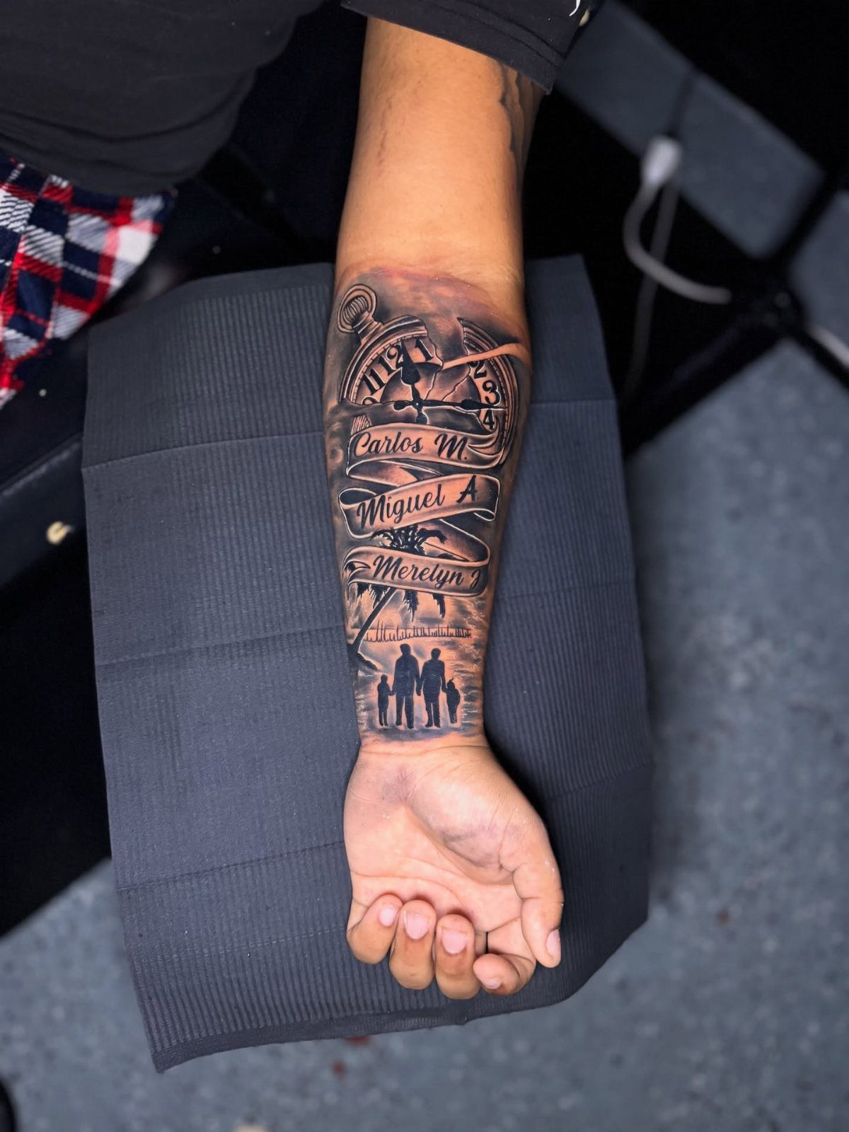
Silhouettes work when the outline alone tells the story.
This piece layers a family of 4 with names in script and a compass at the center, which gives the tattoo structure without needing realistic detail that can blur as it heals.
Script placement matters.
The names sit along the curve of the arm here, which keeps them readable when your arm is at rest. Horizontal text across the arm can warp depending on how you position your wrist.
Black and grey keeps the focus on the shapes and text rather than adding color that will need touch-ups.
The lower arm is one of the better spots for script because the skin is flat and the lettering won’t distort over time.
11. Wrapping Vine Tattoo
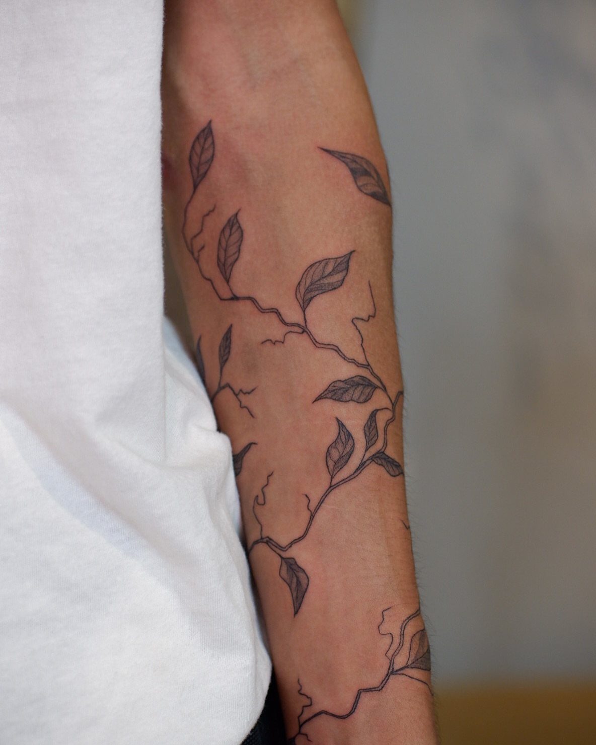
Vines wrap naturally around the arm because the design follows the curve without forcing it.
Wrapping designs take more time to place than flat ones. Your artist will need to mark the vine’s path before starting, and small adjustments in how it curves can change how the whole piece looks when your arm moves.
12. Greek Mythology Lower Arm Tattoo
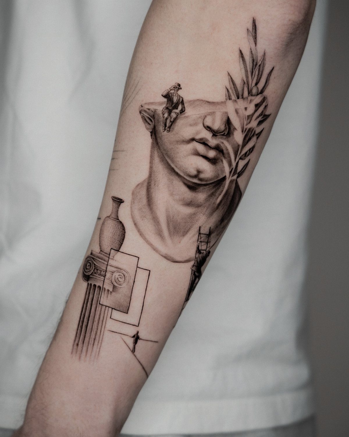
Classical Greek pieces pull from statues, columns, and laurel branches, and they read as one cohesive design when the elements stay in the same style.
The statue face here anchors the piece, with the column and laurel adding structure around it.
The lower arm gives you vertical space for a design that stacks rather than spreads. A column works well because it follows the natural line of the arm, and the shading can wrap slightly without distorting the architecture.
Black and grey is the standard for this style. The shading needs to be smooth to mimic marble, and heavy contrast in the shadows adds depth without needing color that can fade unevenly.
Frequently Asked Questions
What’s a good tattoo for your forearm?
Pick something that holds personal meaning, whether that’s a symbol tied to your heritage, an interest that matters to you, or an image that marks a specific memory.
The forearm shows the design clearly when your arms are visible and hides it under long sleeves when you need it covered, so it works for pieces you want seen most of the time but not all of the time.
Designs with strong outlines and clear shapes age better than soft shading or tiny detail that can blur over the years.
Is a lower arm tattoo painful?
The outer forearm hurts less than most spots because the skin runs thicker and the nerve endings sit farther apart.
The inner forearm stings more since the skin thins out and the nerves run closer to the surface. Pain level also depends on how long the session runs and how much shading or line work the design needs.
Is $1000 a lot for a forearm tattoo?
A full piece from wrist to elbow costs enough that dense shading or layered detail will push the price higher, and you may need more than one session to finish it.
Smaller pieces on the lower arm cost less, and walk-in flash runs cheaper per hour than custom work.
Artists with more experience or a strong portfolio usually charge higher rates, but the piece lasts your whole life, so hourly cost matters less than finding someone who can pull the design you want.