The designs here range from small single-element pieces like a lightning bolt or arrow to layered sleeve compositions with eagles and celestial symbols, and what you pick depends on how much skin you’re filling and whether you want it visible in short sleeves.
Flat, stable skin holds detail better than curved or mobile areas, which matters when a line is thin enough that movement and stretching affect how it heals and how sharp it stays over time.
1. Geometric Mountain
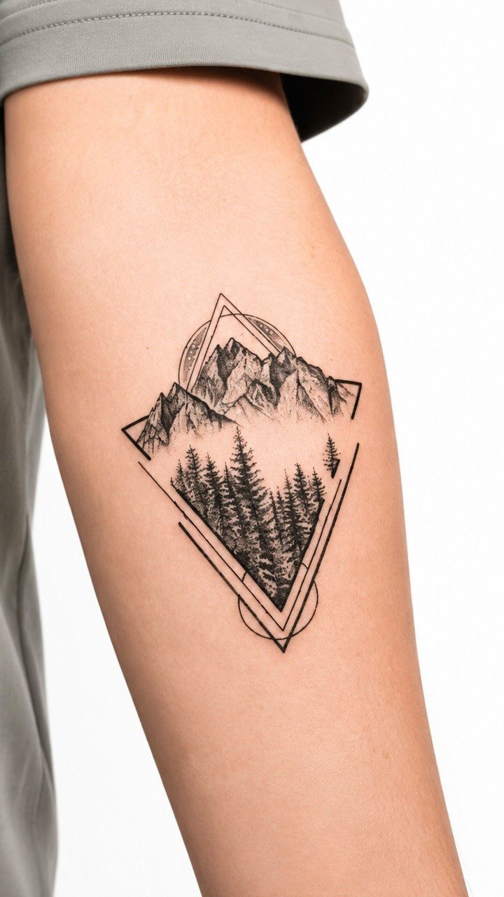
A mountain range framed by geometric shapes, the lines meeting at hard angles rather than flowing free. The diamond or triangle border locks the scene in place and gives the whole piece symmetry.
Forearm or upper arm work best.
The frame needs clean edges, so a flat surface keeps the lines from warping as your arm moves. Single-needle shading inside the frame adds depth without thickening the design.
The composition reads clearly from a distance, which matters if you want something recognizable but not bold.
2. Wolf Portrait
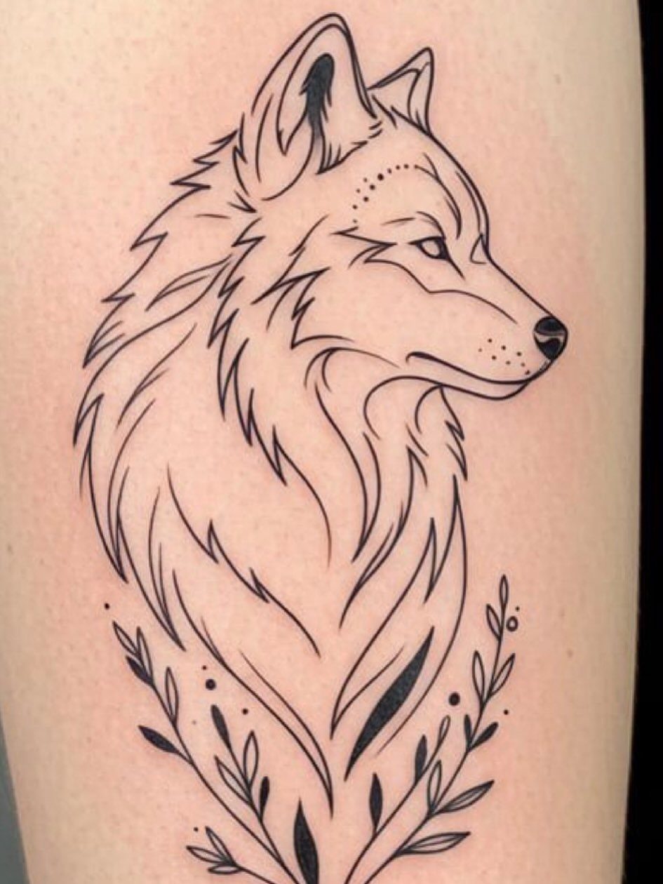
The wolf’s face in profile or head-on, rendered with thin lines that pick out the fur texture and the planes of the skull. Adding botanical stems or leaves around the portrait softens the predator image without losing the animal’s presence.
Placement depends on how much space the portrait demands.
A head-only version fits the forearm; a neck-and-shoulder wolf needs the outer bicep or calf. Fine line work shows detail but fades faster than thicker ink, so expect a touch-up in 5 to 7 years if you want the fur definition sharp.
The wolf carries enough weight on its own that you can skip the surrounding elements if you prefer the animal alone.
3. Geographic Coordinates Tattoo
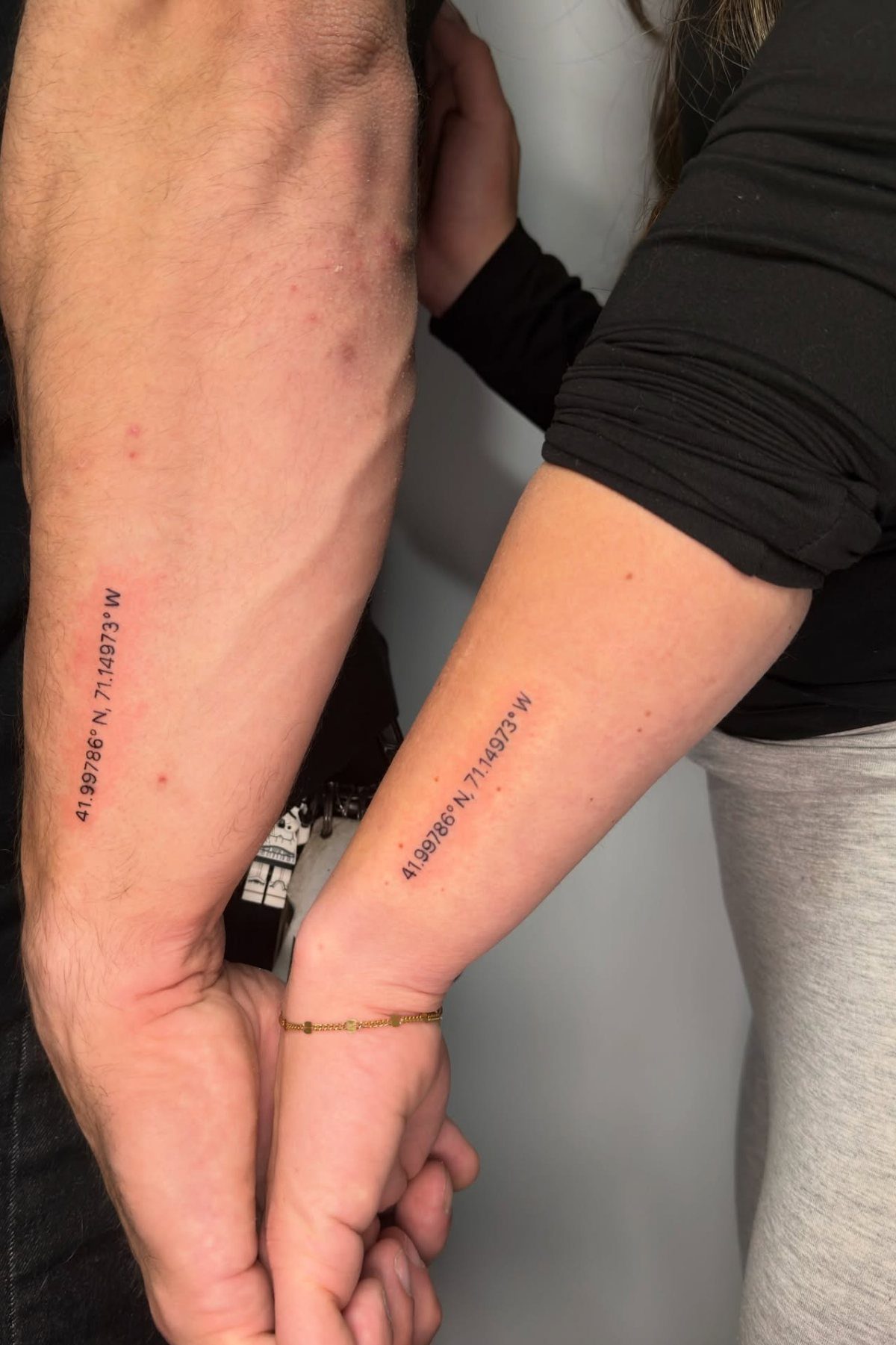
Latitude and longitude of a place that matters, inked as a string of numbers and degree symbols. The coordinates sit vertically or horizontally depending on the limb, and the fine line keeps the digits readable without taking up much skin.
Inner forearm is the standard spot because the numbers stay visible to you. Matching coordinates with a partner, sibling, or friend turns a location into a shared reference without spelling it out.
Double-check the coordinates before the session. A single digit off puts the mark in the wrong place, and numbers are harder to fix than images.
4. Roman Numeral Date Tattoo
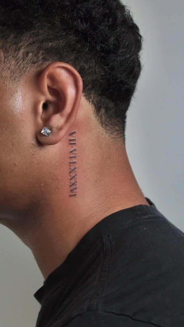
A date in Roman numerals, usually a birth, a loss, or a day that redirected everything. The vertical format fits the neck, ribs, or forearm, and the numerals read formal without the bulk of standard digits.
Behind the ear or along the side of the neck keeps it subtle.
Roman numerals compress better than Arabic numbers, so a full date fits in a narrow column. Pain is sharper on the neck than the arm, and healing calls for careful washing to avoid infection near the hairline.
Convert the date yourself before the appointment. Some numeral sequences get long, and you want to see the layout in advance.
5. Small Lightning Bolt
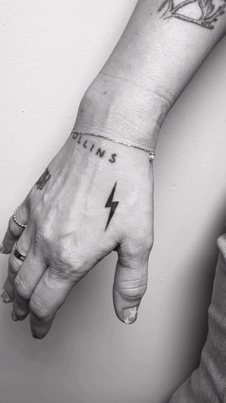
A single lightning bolt, small enough to fit the hand, wrist, or behind the ear. The shape is immediate and the symbolism flexible: speed, power, a moment of clarity, or just a graphic you like.
Back of the hand or the outer wrist shows it off, but both spots fade faster because the skin there regenerates quickly and sees constant sun exposure. A touch-up down the line keeps the lines crisp.
The design is simple enough that most artists can fit it into a walk-in session.
6. Simple Arrow
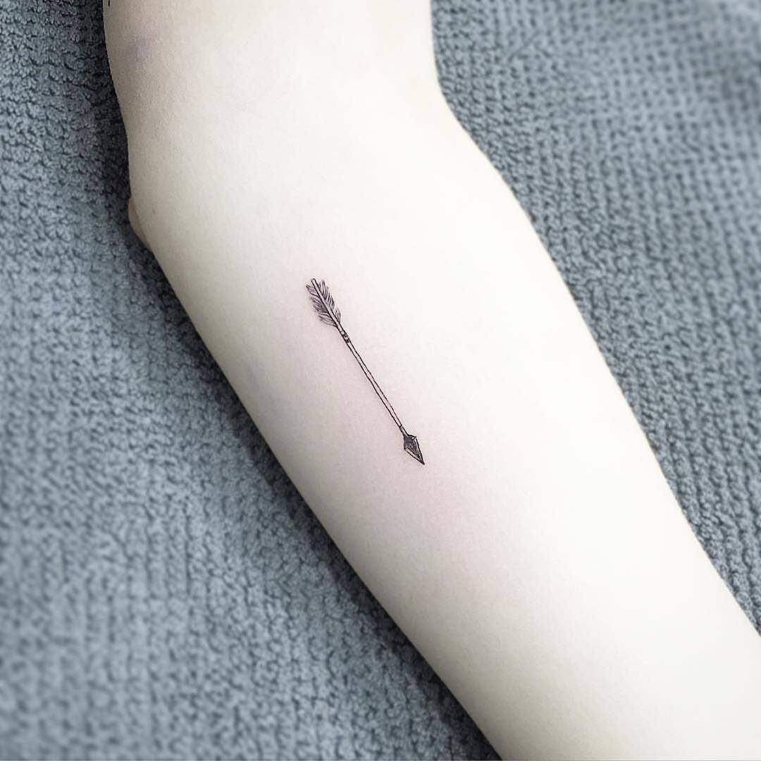
An arrow pointing in one direction, stripped to its outline. The design reads clean on the forearm, wrist, or along the ribs, and the single-direction line gives it a sense of forward motion without added symbols.
Inner forearm or side of the wrist are the usual placements because the arrow sits flat and stays visible when your arm hangs at your side.
The fine line keeps it small, but the shaft needs to be straight, so avoid spots where the skin curves sharply.
Some people add a date or initials along the shaft. That works when the arrow is long enough to hold the text and leave the line breathing room.
7. Minimal Moon Phase Design
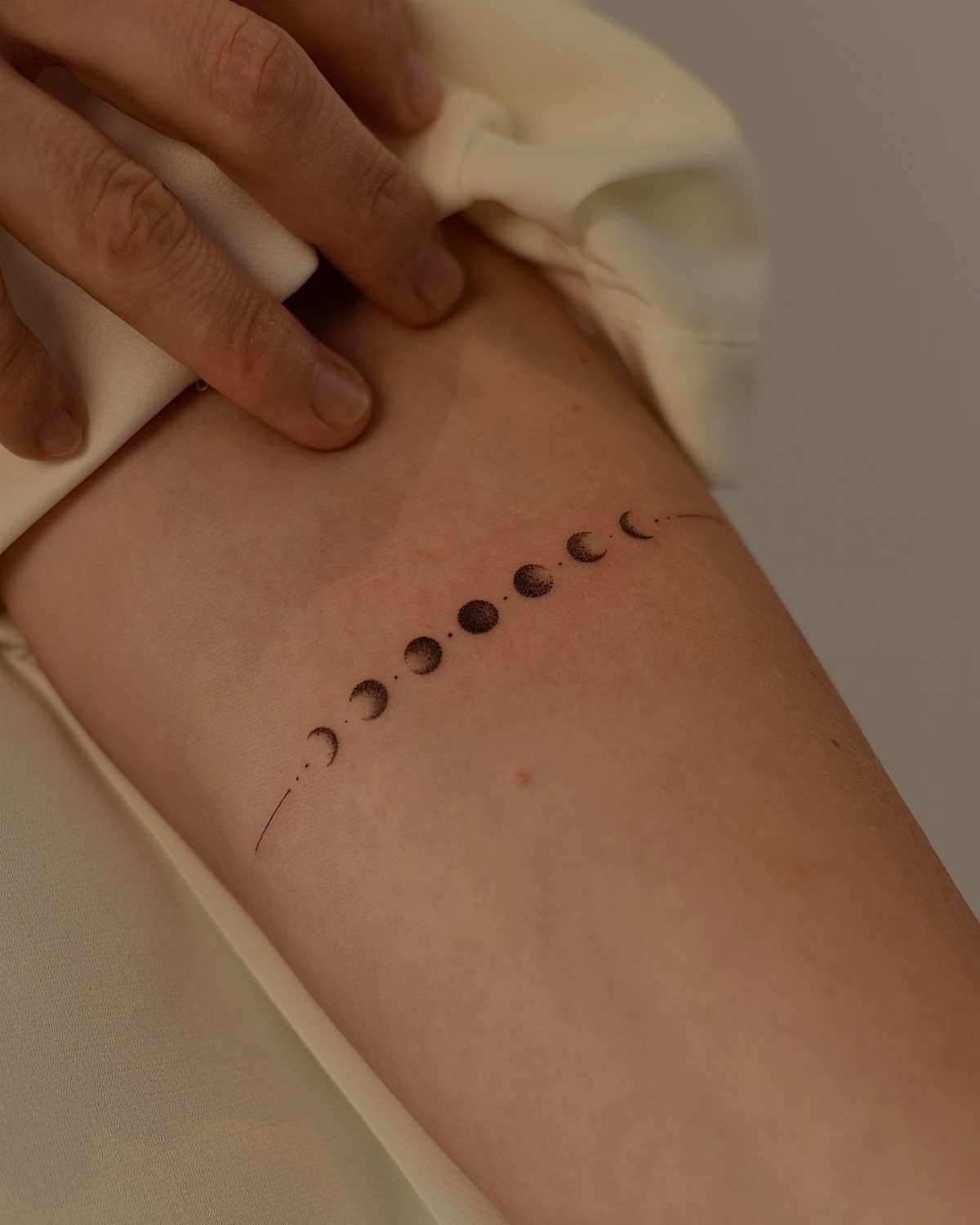
Circles charting the moon from new to full and back again, arranged in a horizontal line. The symmetry reads clearly on the forearm, where the row sits flat and lets each phase stay distinct.
Inner forearm is standard because you see it yourself without turning your arm. The design sits small enough to fit the wrist, but the circles compress too much there and lose their detail.
Fine line keeps the phases delicate, though the filled new moon can blur if the artist overpacks the ink.
8. Small Infinity Symbol
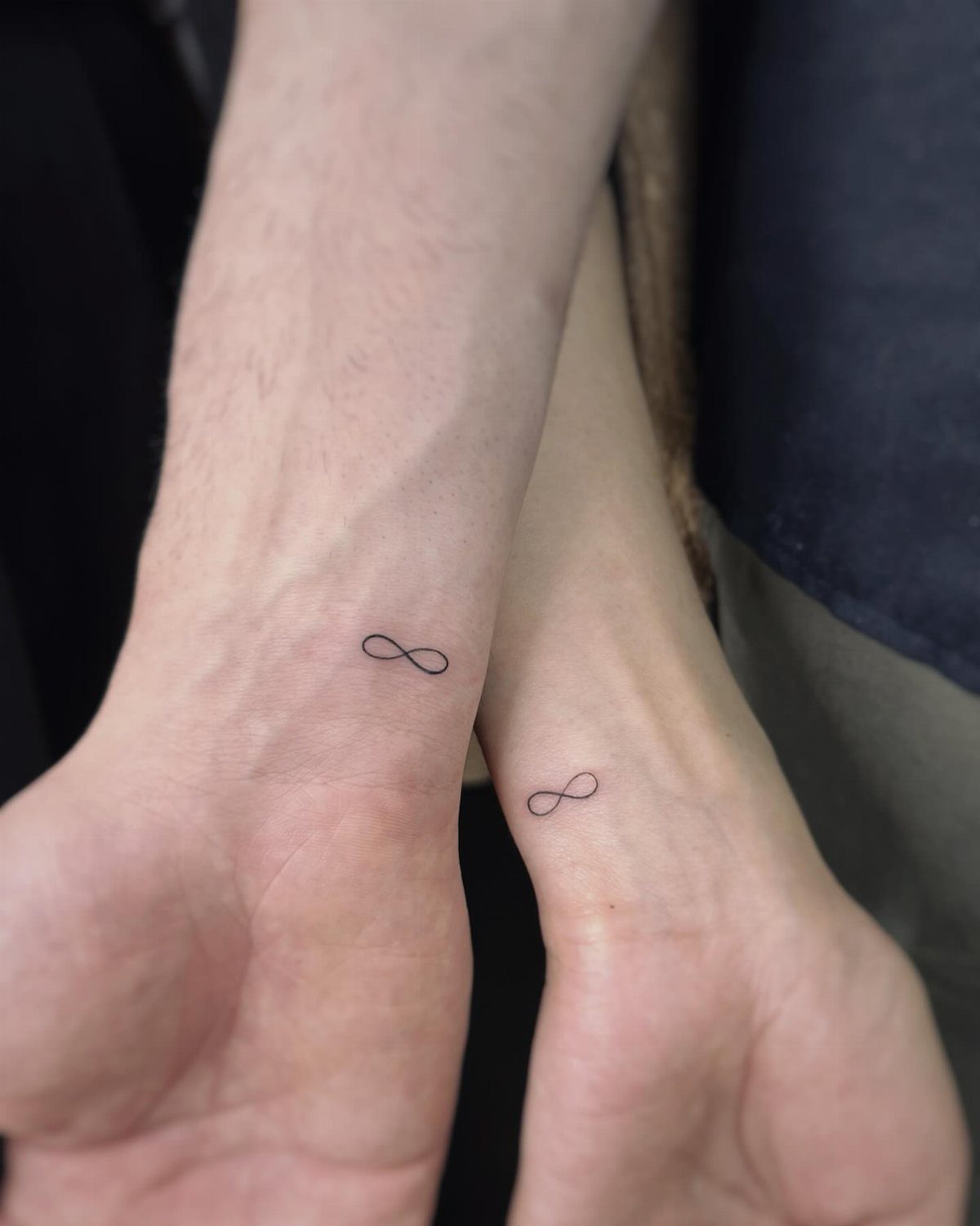
A continuous loop in the shape of a sideways figure eight. The line crosses itself once at the center, and the fine stroke keeps the symbol minimal.
Inner wrist is the most common placement because the symbol stays visible and fits the narrow space. Matching infinity symbols work as a shared mark between partners or siblings without adding initials or dates.
The symbol is small enough that most artists finish it quickly.
9. Geometric Circle
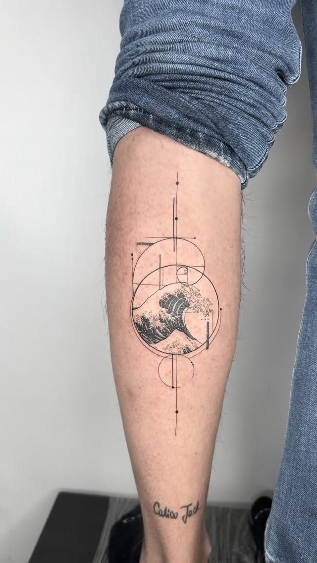
The circular border contains the motion and locks in clean geometry.
Lower leg or forearm both hold the circle without distortion. The wave can be detailed with foam spray and texture, or kept to a single curved line based on the contrast you want inside the frame.
Text near the design, like the name visible here, personalizes it but needs enough space between the 2 elements so neither crowds the other.
10. Bear Outline
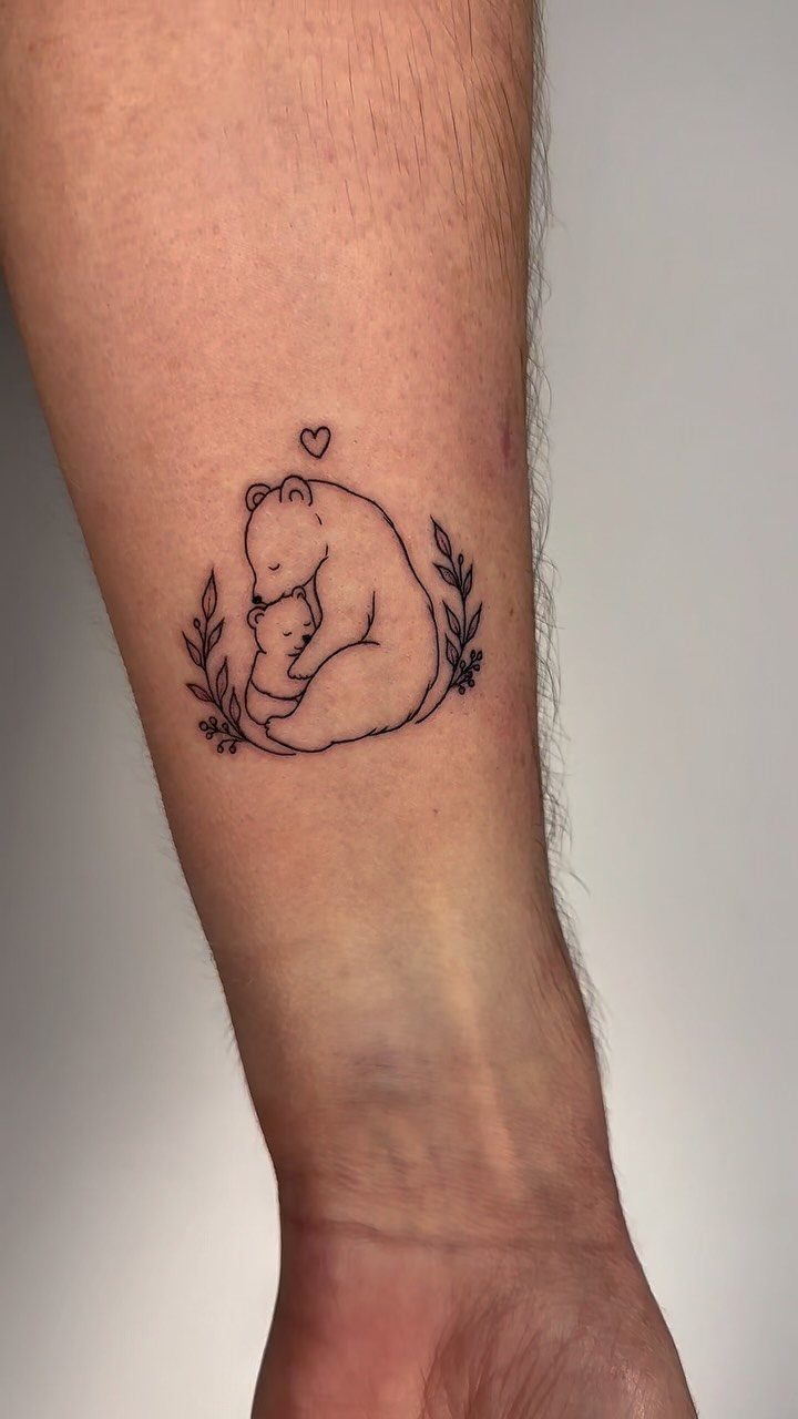
A larger bear holding a smaller one, the outlines following the curve of the bodies without interior shading. Leaves or branches around the pair soften the edges and fill the negative space.
Forearm gives enough room for both figures to read clearly. The parent-and-cub image works as a marker for fatherhood or family, and the fine line keeps it from reading too heavy.
Adding a small heart or other symbol above the bears personalizes it, but the pair stands on its own without extras.
11. Anchor Tattoo
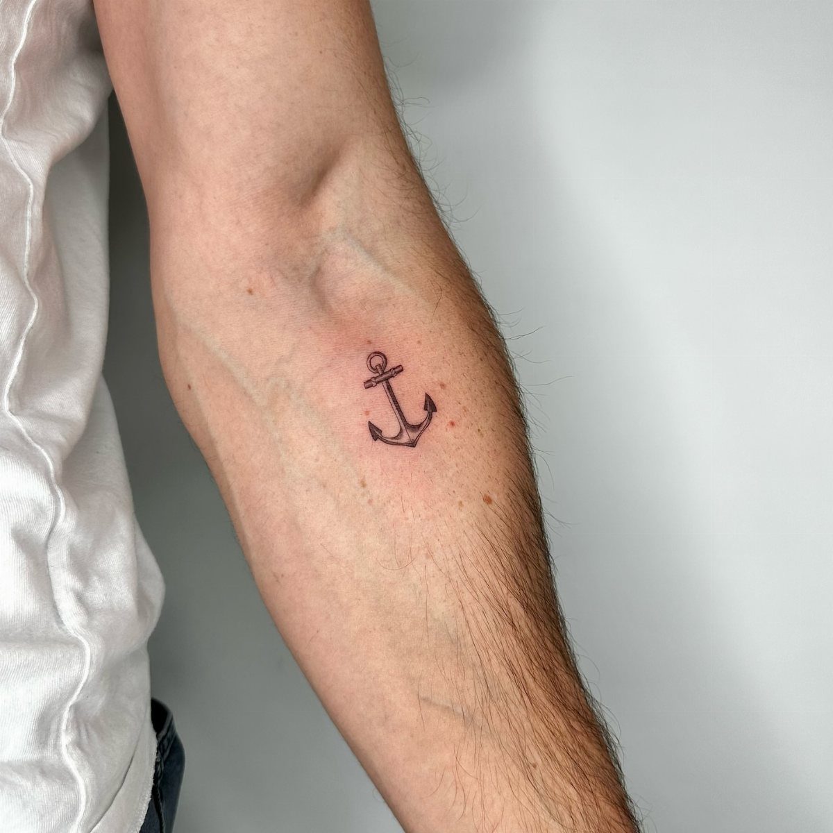
A traditional anchor shape, shank and flukes outlined in black with no interior fill. The vertical design fits narrow spots like the inner forearm or side of the wrist.
Inner forearm keeps it visible and gives the anchor enough height to maintain its proportions. The symbol reads as stability or grounding, and the fine line keeps it understated.
Skip the rope or banner unless you want to add a date or name. The anchor alone is enough.
12. Small Bird in Flight
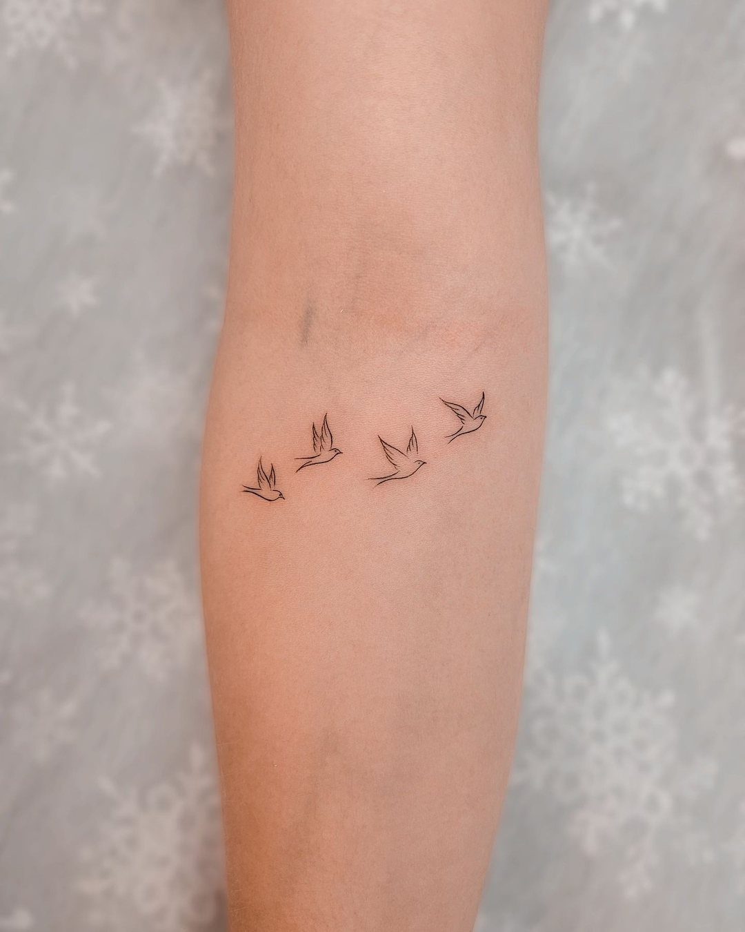
Birds spaced across the forearm, each one mid-flight with wings spread. The silhouettes read as movement without filling the space, and the fine line keeps each bird distinct.
Forearm is the usual spot because the birds can follow the curve of the arm and stay balanced. The design works as a symbol of freedom or change, and adding more birds fills the area while keeping it clean.
Placement of each bird matters. Space them unevenly so the composition feels natural rather than gridded.
13. Small Cat Portrait
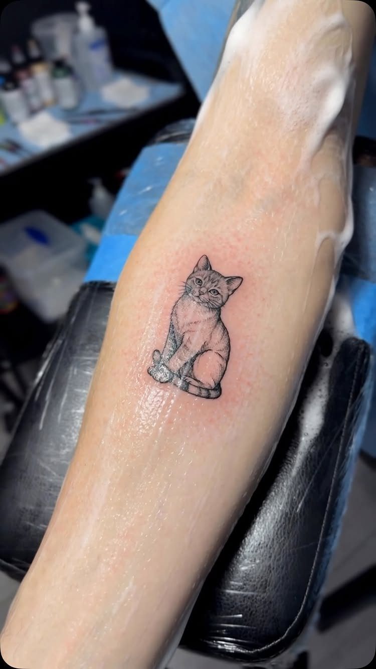
A cat sitting, outlined in single-needle strokes that follow the curve of the body and the shape of the ears.
The fine line keeps it minimal, and the size stays small enough to fit the forearm or wrist without filling the space.
Forearm works because the flat surface holds the detail. The cat reads as a portrait of a specific animal rather than a generic silhouette, so bring a clear reference photo to the session.
The simplicity keeps the session short, usually under an hour.
14. Abstract Line Symbol
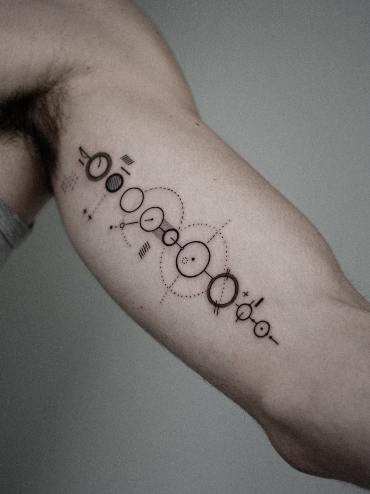
Circles, dots, and connecting lines arranged in a pattern that means something to you or simply holds its own as geometry. The composition sits on the upper arm or forearm, and the abstract form keeps it open to interpretation.
Upper arm lets you balance the elements without crowding them. The design reads as intentional without referencing anything recognizable, which works when you want a tattoo that stays personal.
Spacing between the shapes matters. Too tight and it blurs into a cluster; too loose and the piece loses its unity.
15. Family Initials
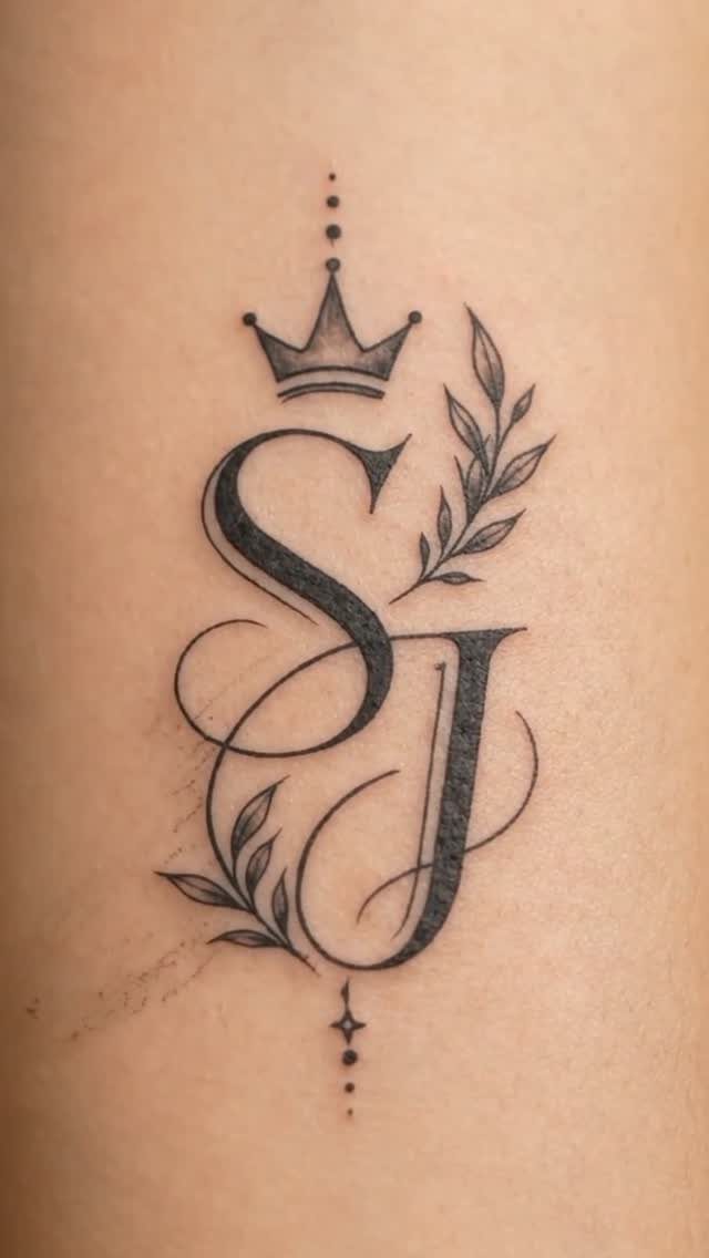
Letters for parents, siblings, or children, linked or stacked so they read as one unit. Adding a crown or small botanical accents frames the initials without overpowering them.
Inner forearm or upper chest keeps the letters visible and leaves room for the surrounding elements. The script style affects legibility, so choose something with clear separation between letters.
Order matters if you’re stacking initials vertically. Birth order or hierarchy work as ways to arrange them.
16. Minimalist Deer Silhouette
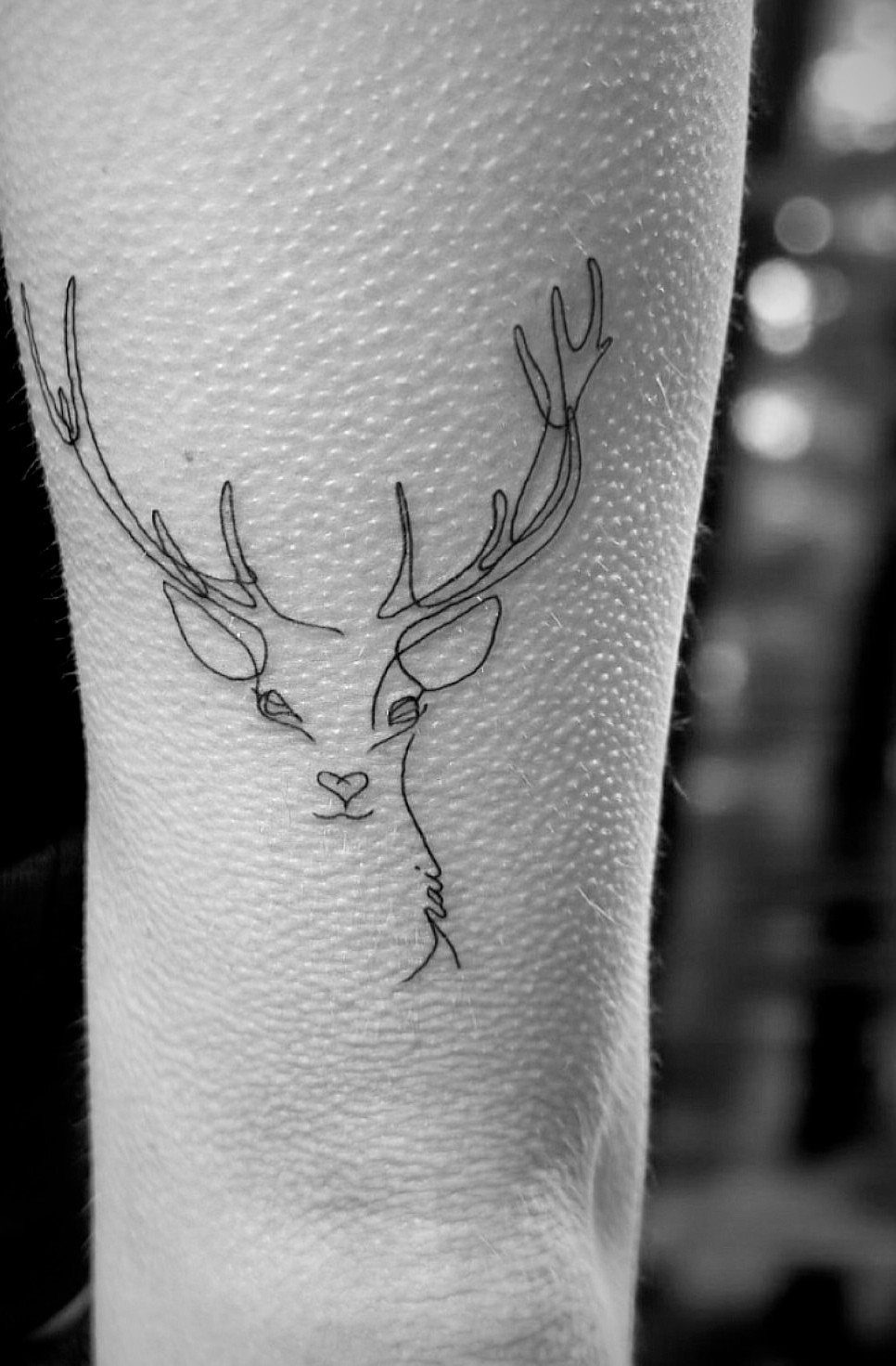
The outline of a deer’s head and antlers, drawn with thin lines that define the shape without shading or fill. The antlers branch outward, so the design needs vertical space to keep the proportions intact.
Forearm handles the height, and the clean silhouette reads from a distance. The deer works as a symbol of patience or connection to nature, but the image stands on its own without requiring that reading.
Antler detail can vary. More branches fill the space; fewer keep it cleaner.
17. Minimalist Owl
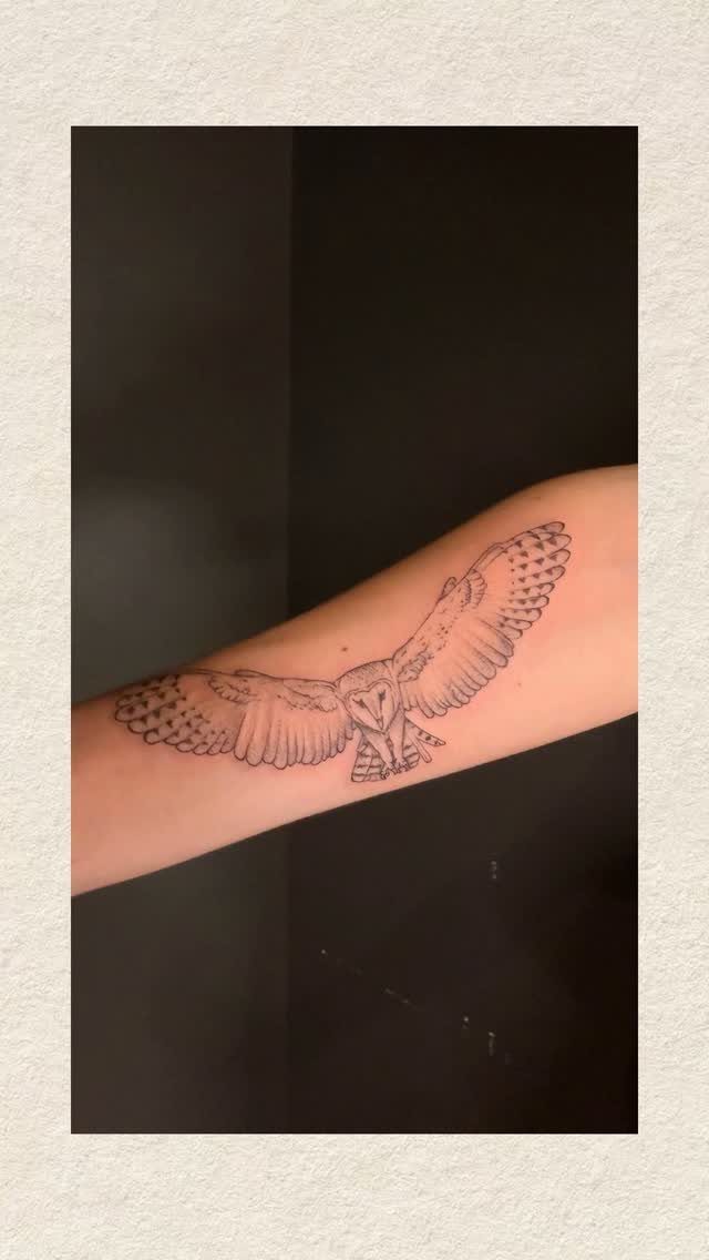
An owl mid-flight, wings spread and feathers outlined in fine strokes. The body stays compact, but the wingspan gives the design width, so placement needs horizontal room.
Forearm or outer bicep accommodates the wings without warping the shape. The owl in flight reads as movement rather than stillness, which separates it from a perched version.
Feather detail is up to you. More lines add texture; fewer keep the bird graphic.
18. Circular Wave Design
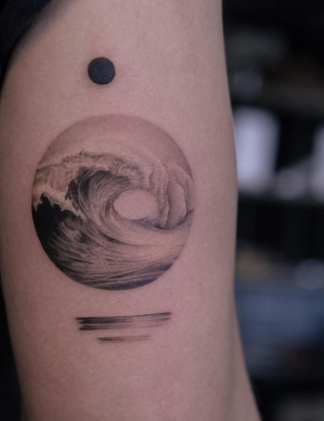
A wave breaking inside a circular border, the crest drawn in fine lines that curve with the motion of the water. A single dot above and thin lines below anchor the composition and give it balance.
Upper arm or calf holds the circle without distortion.
The dot and lines are optional. The wave alone works if you prefer minimal elements.
19. Geometric Koi Fish Forearm Tattoo
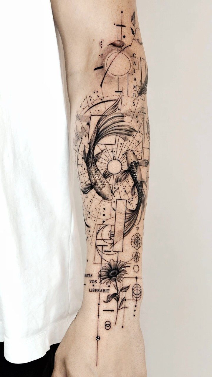
Two koi fish swimming in a circle, their bodies drawn in fine line detail with scales and fins visible, surrounded by geometric borders, circles, and technical line work. A flower and script text fill the remaining space.
Forearm gives the composition room to breathe. The circular motion of the koi creates symmetry, and the geometric elements frame the fish without crowding them.
The Latin phrase adds meaning if that matters to you, but the koi pair works on its own. The technical lines read as drafting marks, which gives the piece a blueprint feel.
Space between the fish and the border keeps each element legible.
20. Geometric Whale Forearm Tattoo
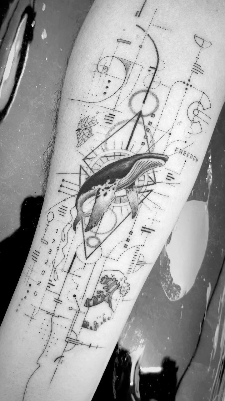
A whale swimming horizontally across the forearm, its body outlined in fine strokes with subtle shading on the fins and tail.
Geometric circles, diamonds, and technical lines sit above and below the whale, and a script word anchors the bottom of the composition.
The whale stays large enough to show detail while the geometric elements frame it without competing. Forearm placement keeps the design visible and lets the whale follow the natural length of the space.
The text adds a personal layer if you want it, but the whale and geometry hold the composition without it.
21. Surreal Portrait with Bird and Script
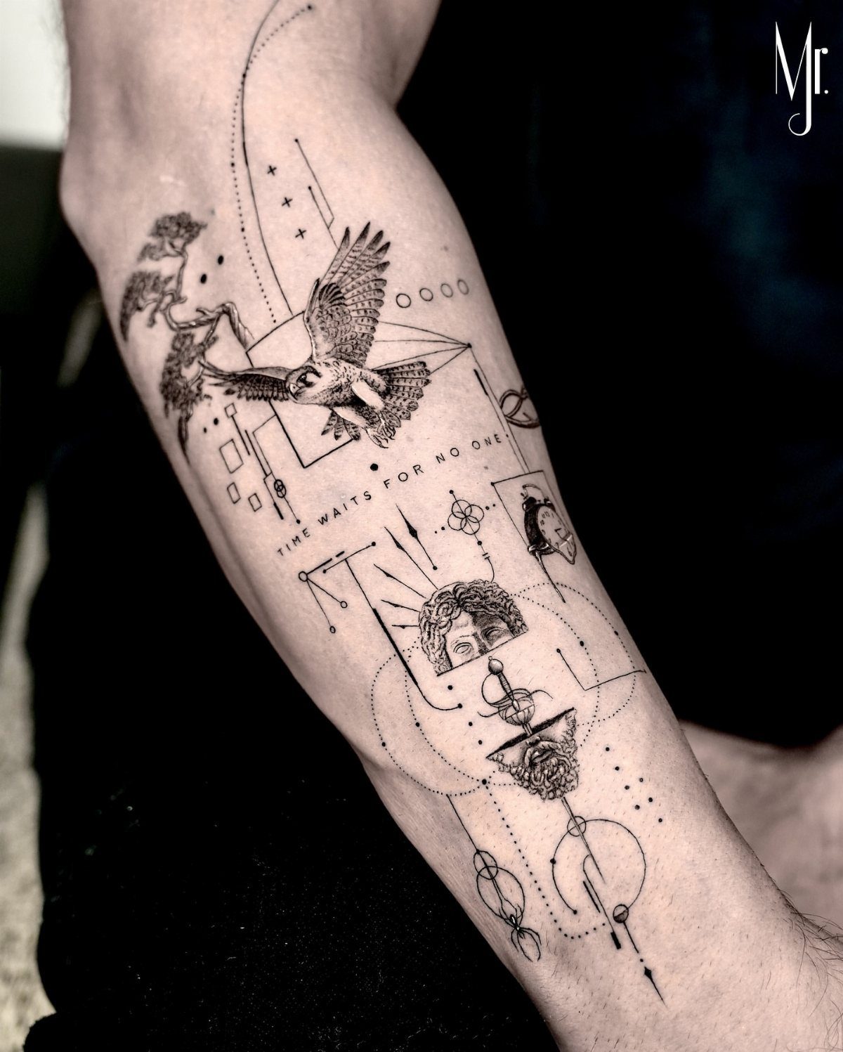
A bird of prey, a human face, geometric frames, and a script quote layered into one composition. The bird and face stay separate but visually tied, relying on line weight alone instead of shading to hold the composition.
This design needs vertical space, so forearm or outer bicep fits the stacked layout. The surreal pairing reads as symbolic without spelling out a single meaning, and the quote grounds the image in a specific idea.
The complexity means a longer session. Each element needs its own breathing room, so the composition works best when nothing touches.
22. Crescent Moon and Radiating Star
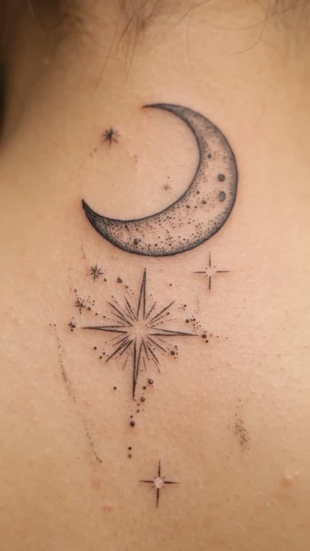
A crescent moon with subtle interior shading paired with an eight-pointed star and small dots scattered around both. The shading gives the moon dimension, and the star stays outlined in fine strokes.
This design sits small, so wrist, forearm, or behind the ear all work. The moon and star combination reads as celestial without additional symbols, and the dots add balance without filling the space.
The shading on the moon separates it from purely line-based designs. Healing takes care because the gradient needs even ink distribution to stay smooth.
23. Detailed Sailing Ship Forearm Tattoo
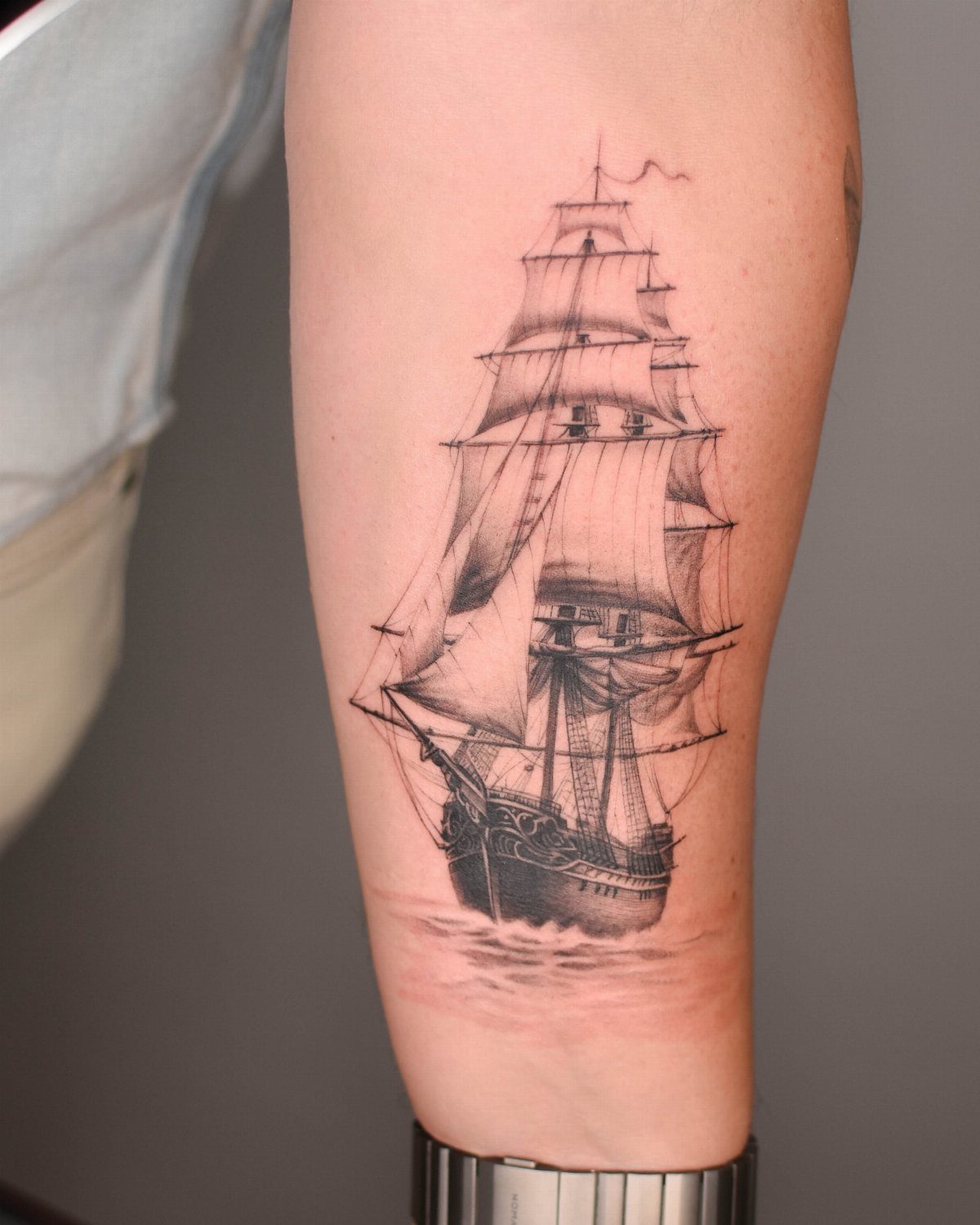
A sailing ship with full rigging, masts, and sails rendered in fine black and grey line work. The detail includes individual ropes and planks, so the design needs room to keep the ship readable.
The fine line keeps it from reading too bold, and the grey shading adds depth without heavy fills.
The session runs longer because of the detail. Sessions run longer if the rigging carries a lot of detail or the masts span more than a few inches.
24. Geometric Tree and Line Design
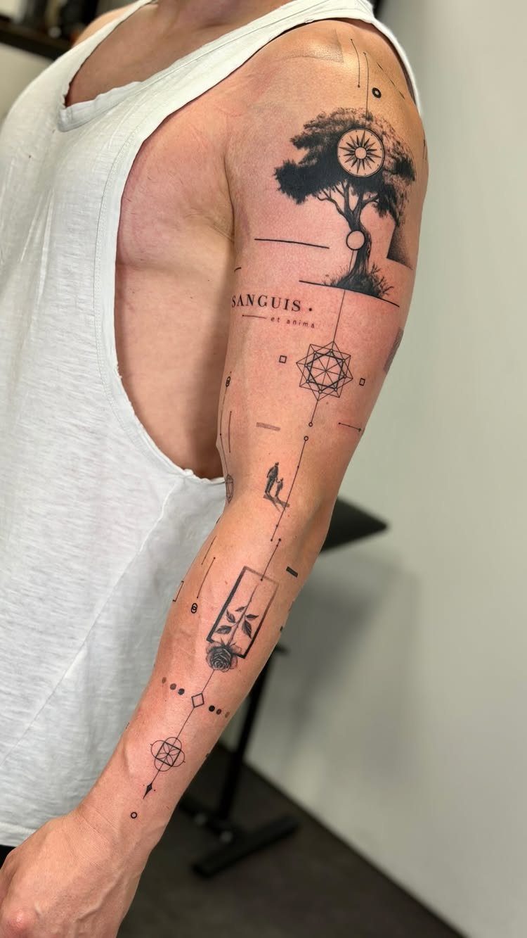
A tree outlined in fine strokes sits inside geometric circles, with technical lines radiating outward and celestial symbols filling the negative space. Script text in Latin curves along the bottom edge of the composition.
The tree reads as the anchor, and the geometric elements frame it the way technical drawings do. The celestial symbols add layers without crowding the tree itself.
The text personalizes it, but the tree and geometry stand alone if you skip the script.
25. Eagle and Celestial Fine Line Sleeve
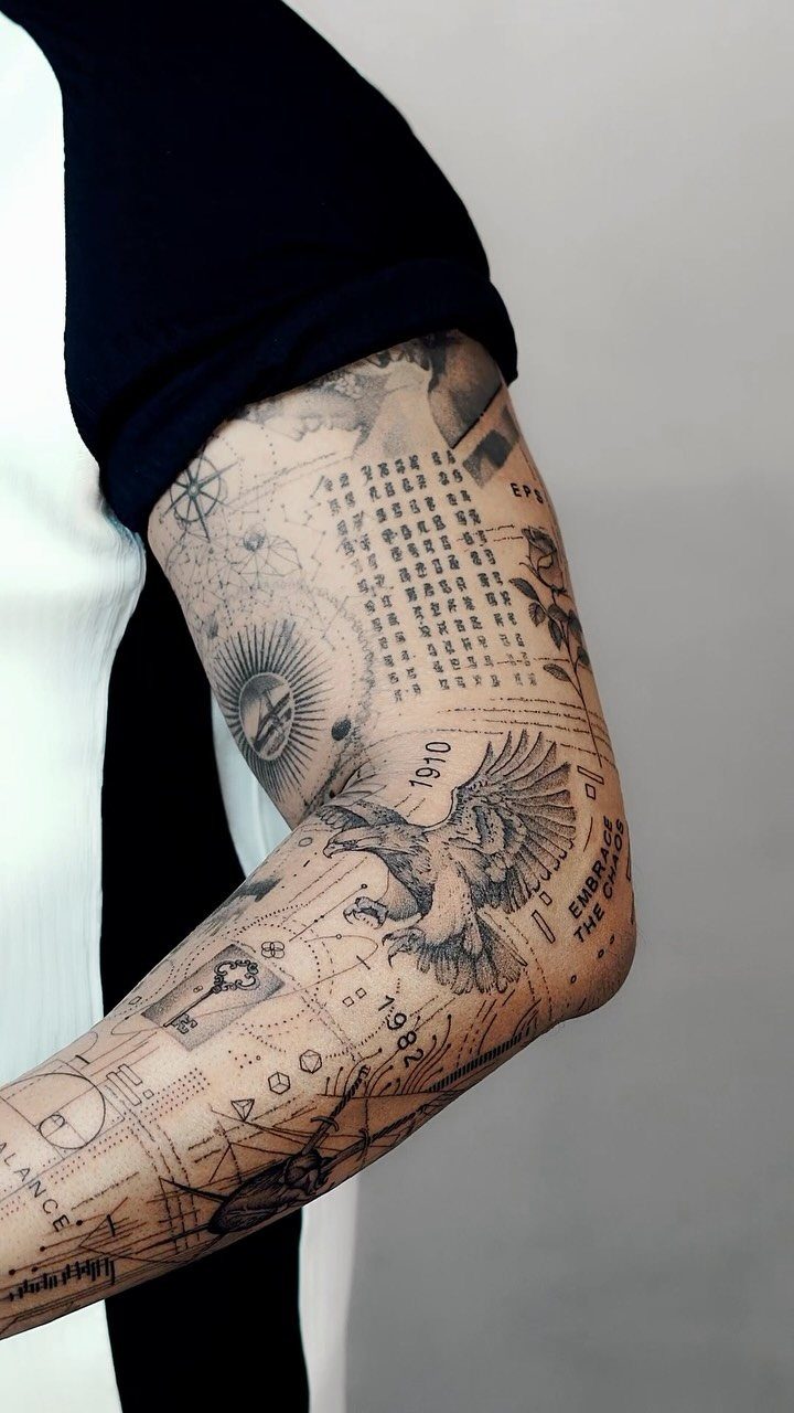
An eagle in flight sits at the center, surrounded by moon phases, geometric lines, and script text that includes years and phrases personal to the wearer.
The composition fills the outer forearm or bicep as a sleeve, with each element spaced to keep the eagle as the focal point.
The celestial symbols and text layer meaning without competing for space. The fine line keeps the detail readable even when the design covers a large area.
Filling a sleeve takes more hours in the chair than a single piece. The eagle needs careful line work, and the surrounding elements require spacing adjustments as the piece wraps around the arm.
26. Arrow and Mountain Landscape
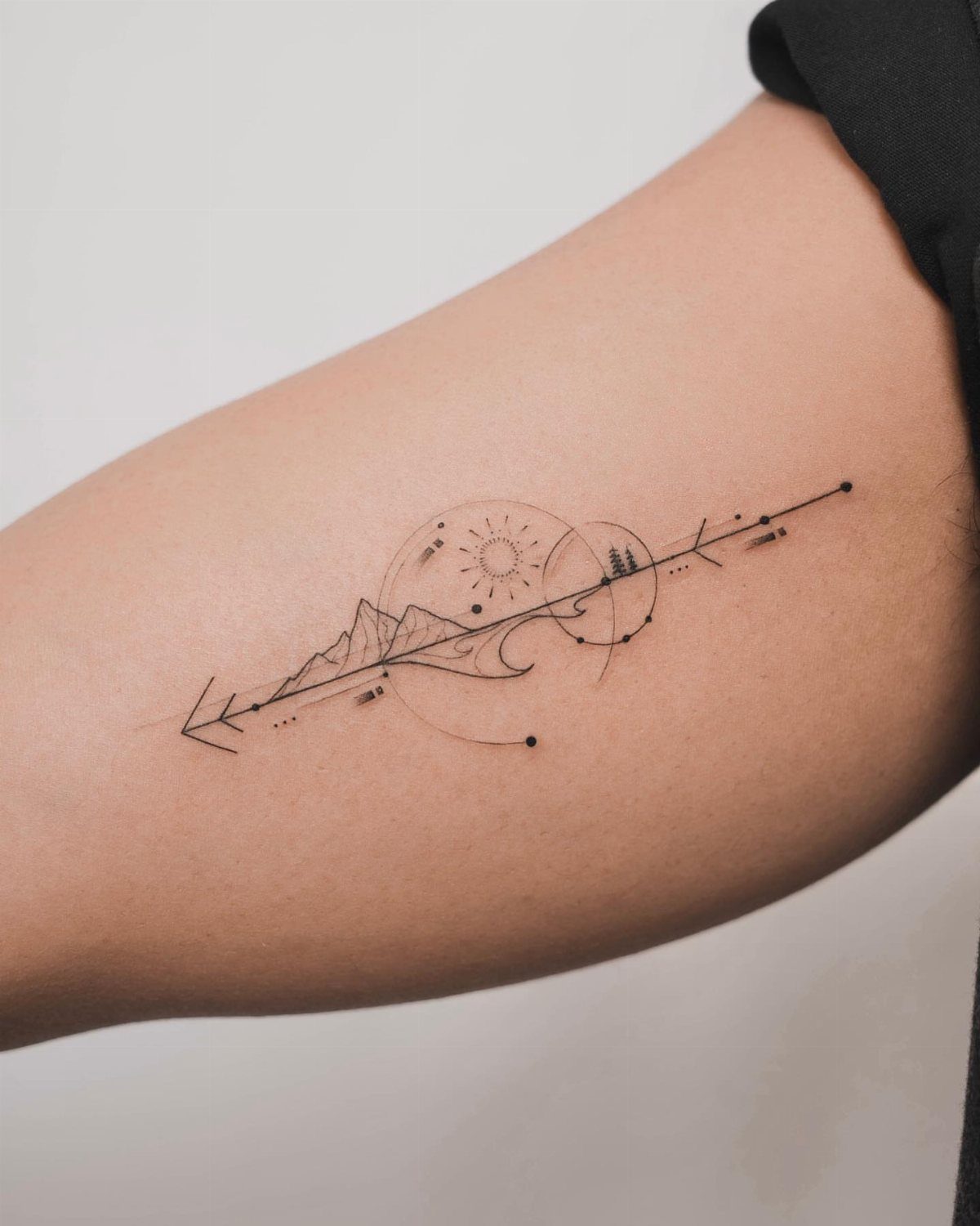
Mountains stacked in layers with a sun above and an arrow piercing through the landscape horizontally. The arrow connects the elements and adds motion to an otherwise still scene.
Forearm holds the horizontal layout without distortion. The arrow works as a directional symbol or simply as a way to tie the mountains and sun into one composition instead of separate pieces.
Keep the arrow sized so it crosses the mountains without dominating them. Too thick and it pulls focus; too thin and it gets lost in the detail.
Best Placements for Fine Line Tattoos
Upper arm and chest keep ink hidden under most shirts, which matters if your workplace runs conservative or you want control over when the design shows.
Healing varies by location. Forearm and upper arm both heal cleanly if you keep them covered during the first 2 weeks.
Size affects how placement reads. Curved spots like the ribs or side of the torso distort straight lines, so save geometric work for flatter areas.
Choosing the Right Artist
An artist posting healed work, photos taken 6 months or more after the session, shows you what the tattoo actually looks like once the skin settles.
Fresh ink looks sharp on everyone; healed work separates the artists who can make it last.
Zoom in on the lines when you check a portfolio.
The lines should end clean, and anything meant to run parallel needs to hold steady all the way through. Fine line technique demands precision, and those details tell you whether the artist has it.
Match the portfolio to your design and placement. An artist with strong forearm portraits may not have experience with small hand tattoos, and the two require different approaches to line weight and spacing.
Going longer increases fatigue for both you and the artist, and tired hands produce shakier lines. Fatigue also affects how well your skin holds the ink.
Fine Line Tattoo Longevity
The shift happens gradually, and it affects extremely small or densely detailed designs more than larger, simpler compositions.
How long the tattoo holds depends on the artist’s technique, your skin type, placement, sun exposure, friction, and how well you care for it during healing. Black holds longer than color and keeps a design clear even as it softens.
Placement affects longevity.
Constant friction from clothes or movement breaks down the ink faster in those spots. Forearm and upper arm both hold ink longer and see less daily wear.
The tattoo will still be there, but the crispness softens over time.
Frequently Asked Questions
Can men get fine line tattoos?
Yes, fine line tattoos work well for men and read as understated rather than delicate when sized above 4 inches and built around geometric shapes, animals, or technical elements.
The single-needle technique shows detail without the boldness of traditional work, and placement on flat surfaces like the forearm or upper arm keeps the lines clean. Black ink holds better than color and maintains contrast as the tattoo ages.
Is fine line tattoo cheaper?
Price depends on the artist’s experience, session time, design complexity, and studio location rather than the line weight itself.
Fine line work requires precision, so choosing an artist by their portfolio matters more than finding the lowest quote. Studios set minimums and price custom work differently, so cost varies shop to shop.