The calf sits between ankle and knee, giving you enough vertical space that a tiger’s head, a samurai’s armor or a full sword blade reads clearly without wrapping.
Roaring animals benefit from the muscle’s flex when you walk, biomechanical designs use the curve to show depth, and text placed front and center stays legible at any size up to 3 lines.
Pick tribal or geometric if you want bold shapes that age without touch-ups, a portrait or skull if shading matters more than color, or a motivational phrase if the message is short enough to read in one glance.
1. Tiger Tattoo
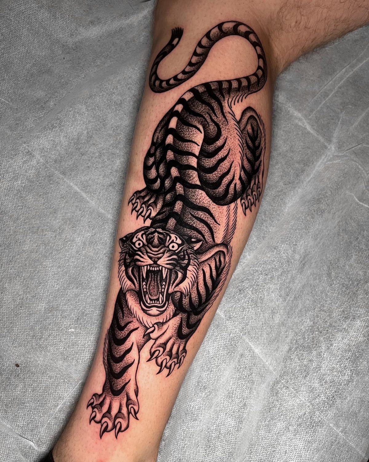
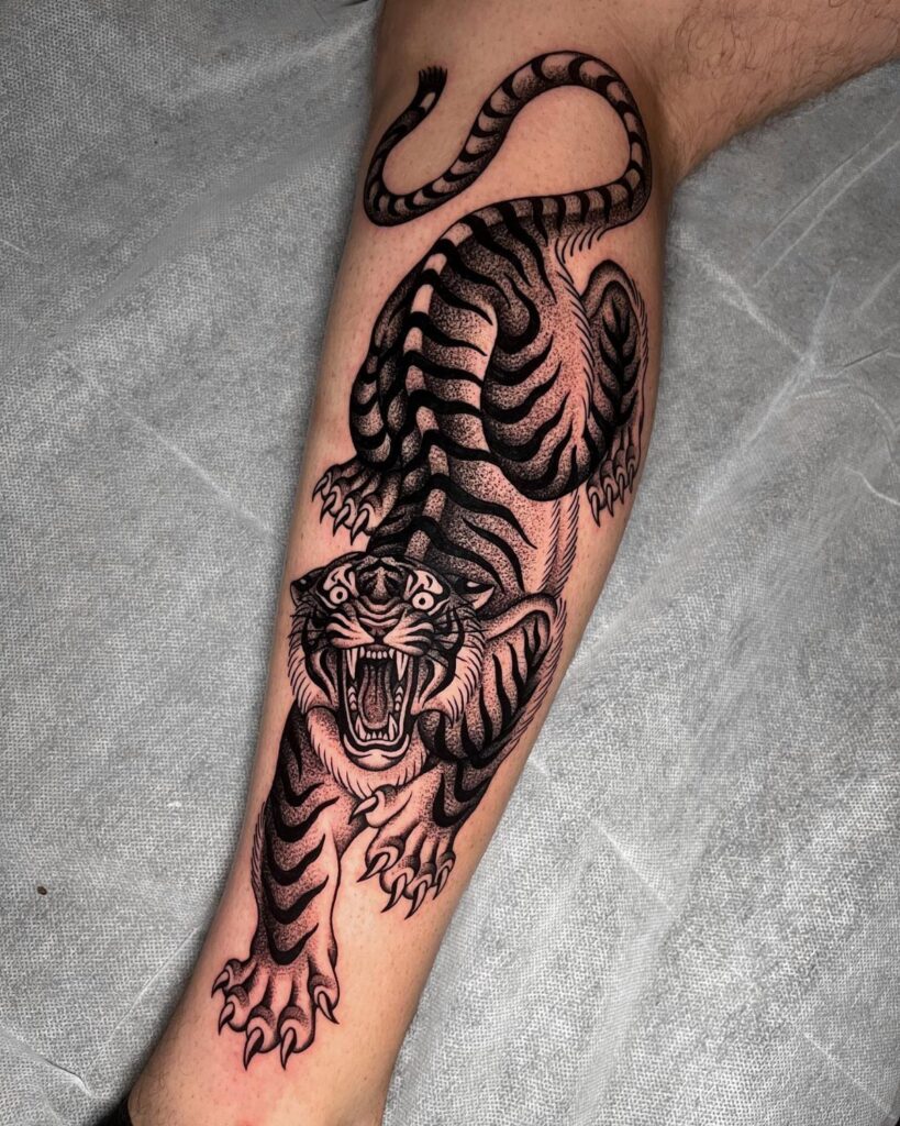
A tiger caught mid-roar reads as raw aggression, and the calf gives you vertical space to let the head fill most of the muscle and keep the composition tight.
Black and grey keeps the focus on shading and texture rather than color, and the stripes offer natural lines that follow the curve of the leg.
The calf flexes when you walk, so motion shows through the design. A roaring tiger benefits from that movement more than a resting pose would.
2. Lion Tattoo
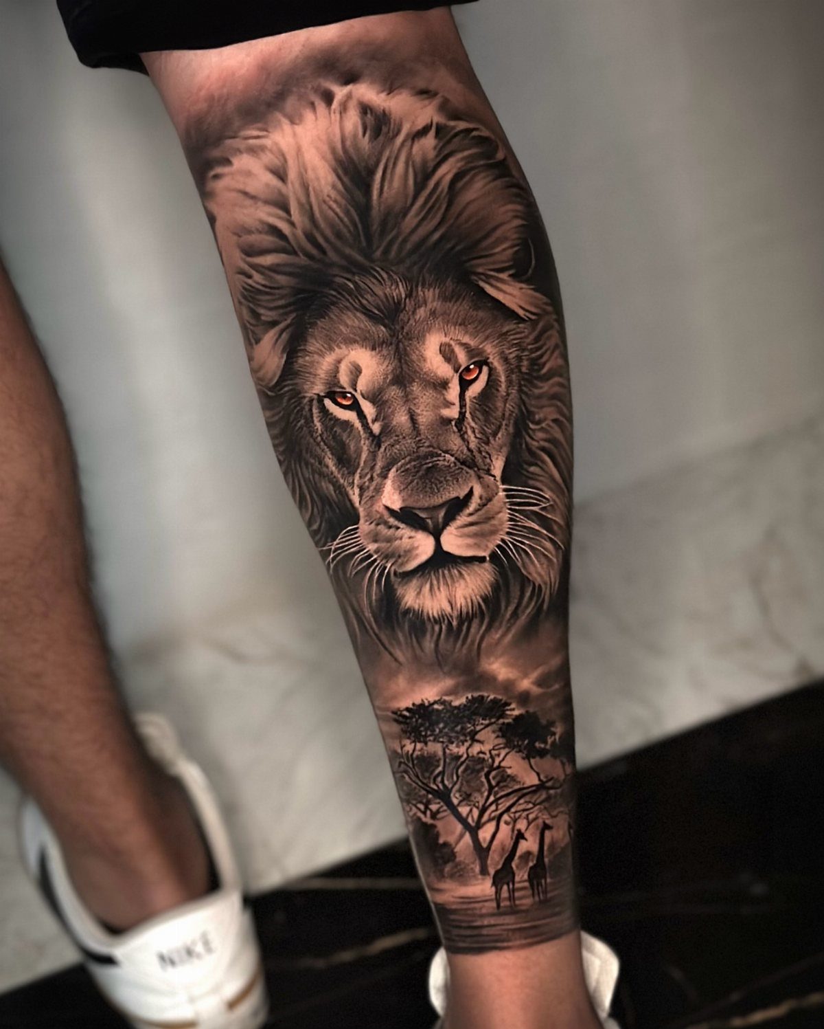
A lion’s face anchored at the top of the calf, with landscape falling below it, splits the design into 2 readable zones: the portrait and the context. That separation keeps both clear when the leg bends.
Red eyes pull attention without requiring full color work elsewhere.
The rest stays monochrome, which ages better than a palette that needs to stay saturated. Savanna grass, acacia trees or distant mountains ground the portrait in a specific place rather than leaving it floating.
3. Wolf Tattoo
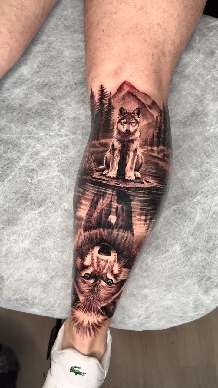
Mountains and forest give the wolf a habitat, which reads as a fuller idea than the animal alone.
Young wolves carry different symbolism than adults: pack bond over dominance, learning over leading. If that suits the story you want, the composition already supports it.
4. Dragon Tattoo
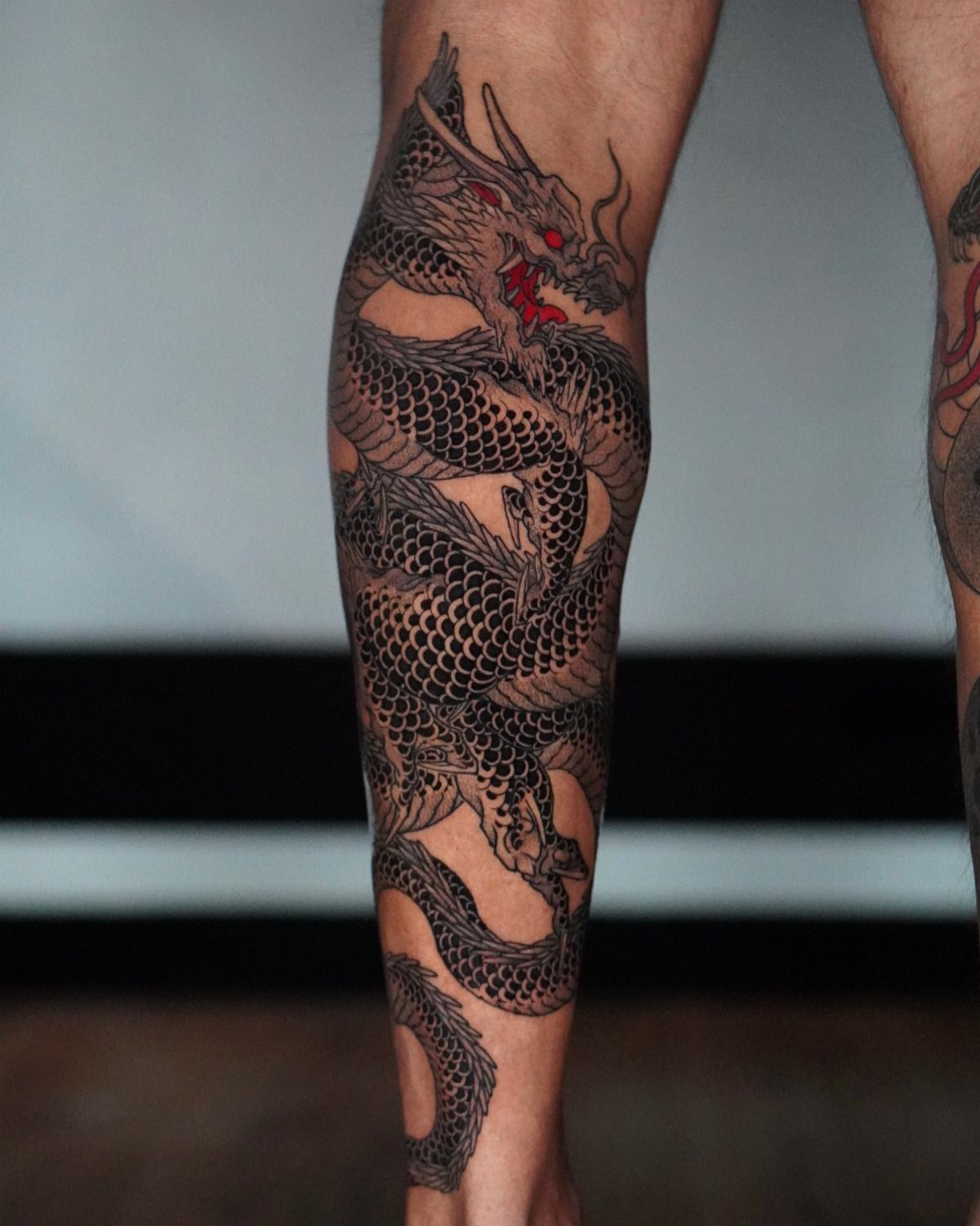
A dragon that wraps the calf uses the full circumference, so you see different sections of the body from different angles.
That wrap works better on the calf than the forearm because the curve is rounder and there is more vertical distance to let the serpentine shape stretch.
Red eyes against grayscale ink give you one accent without committing to a fully colored piece. The calf hides easily, which matters if the dragon design reads as too bold for some settings.
5. Samurai Tattoo
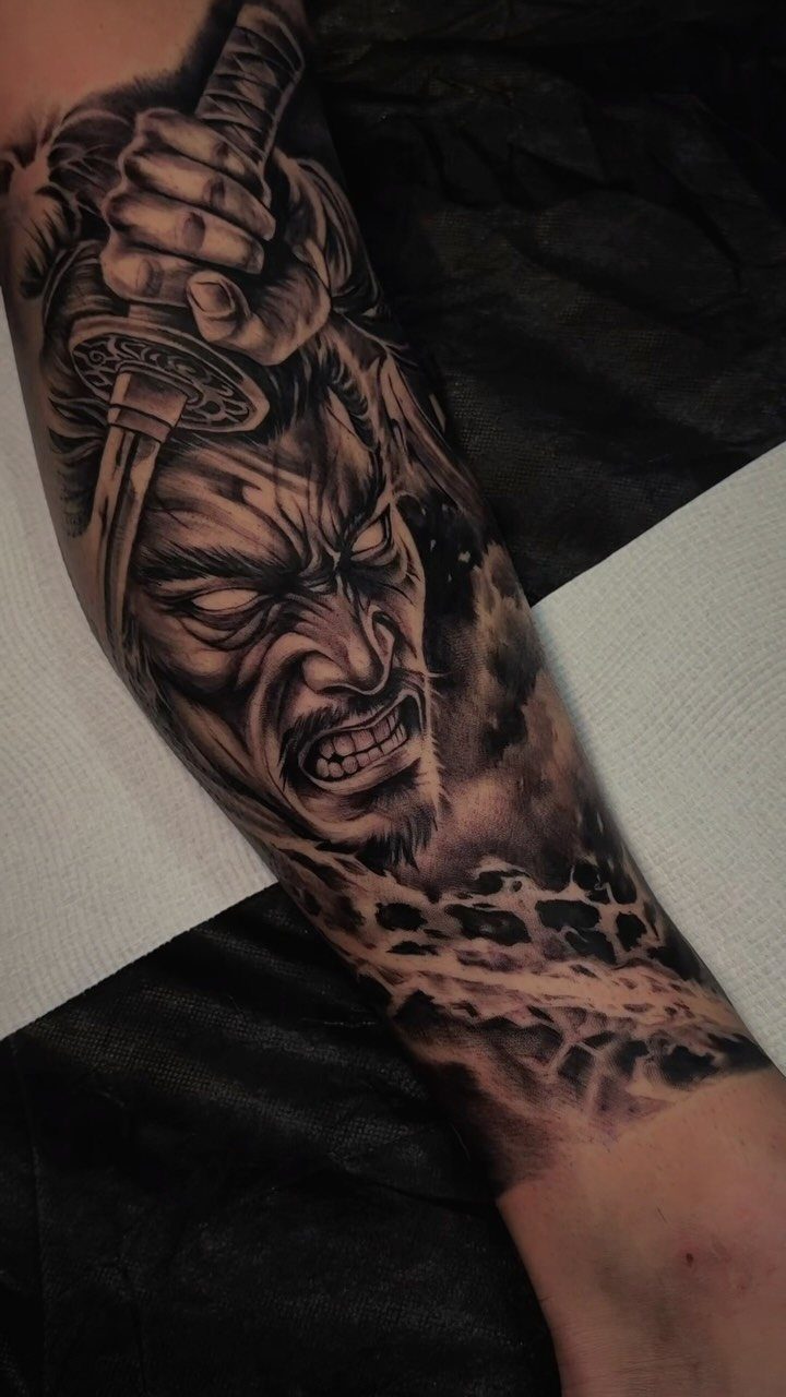
A samurai face paired with a hand gripping a katana gives you 2 focal points, and the calf has enough height to separate them vertically without either feeling cramped.
Smoke and clouds fill negative space and tie the elements together, but they also soften hard edges if the face and weapon feel too stark on their own.
Black and grey suits the historical weight of the subject better than bright color would, and fine line detail in the armor or facial expression holds up well on the flatter front of the calf.
6. Roman Warrior Tattoo
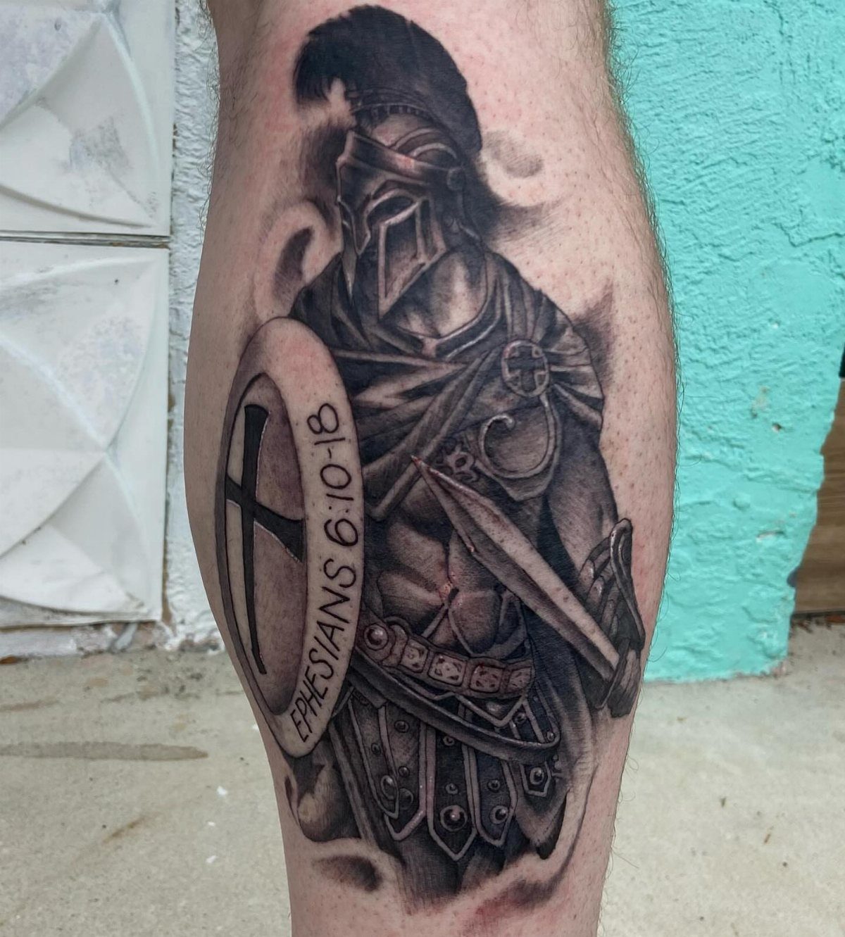
A Roman warrior combines helmet, shield and weapon into one figure, and the vertical format of the calf lets you stack those elements rather than compressing them.
The plumed helmet sits high, the shield in the middle, and the sword or spear extends down, so each piece gets its own readable space.
Text on the shield, like a Bible verse or a motto, adds personal meaning without requiring a separate panel. The calf is wide enough that a shield face stays legible even with multiple lines of small script.
7. Biomechanical Tattoo
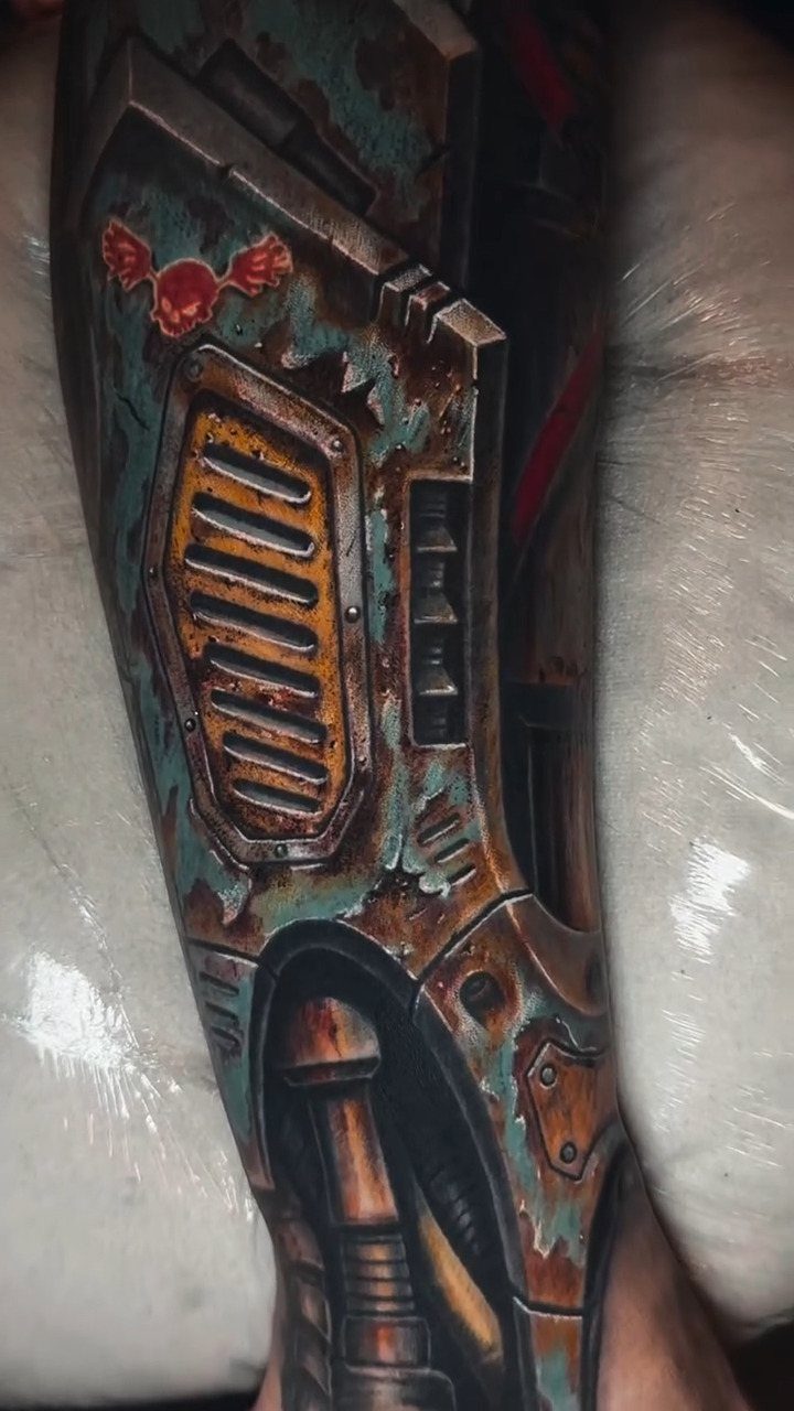
Rust, exposed gears and torn metal give the illusion that machinery sits under the skin. The calf has enough width to show depth: vents, pistons and bolts layered back so the piece reads as three-dimensional, not flat.
Shading under the torn edges sells the effect. Without shadow where the "skin" peels away, the design loses the depth that makes biomechanical work.
8. Sword Tattoo
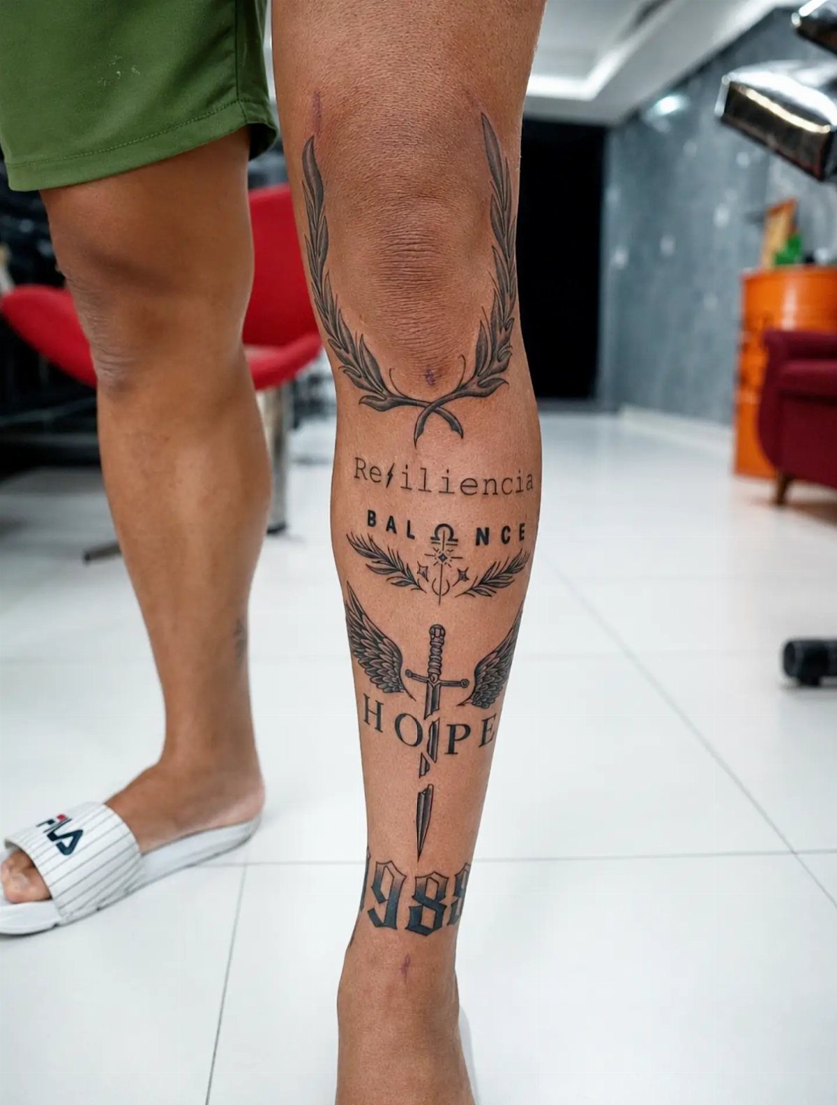
A sword running vertically down the calf uses the natural length of the muscle, and the blade stays readable from any angle.
Wings or a wreath at the handle add symmetry without covering too much space, and text around the design lets you layer meaning without a separate panel.
The calf hides easily, so a design this direct does not force every conversation toward what it says.
9. Axe Tattoo
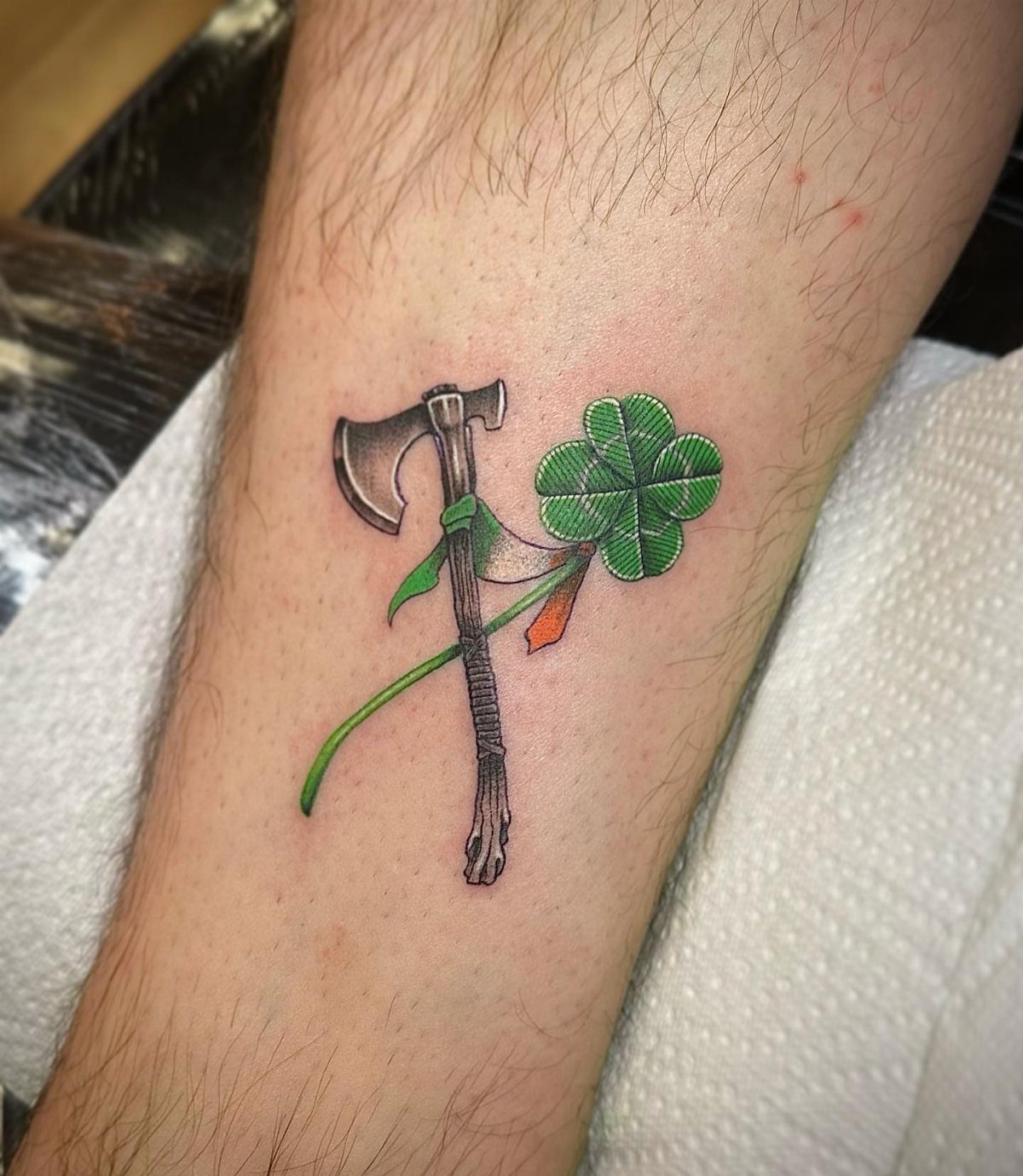
An axe fits the vertical shape of the calf better than a horizontal layout would, and adding a ribbon or clover ties the tool to a specific heritage or story.
The calf gives enough space that the blade detail holds up without looking busy.
Green and orange accent the metal’s edge and handle while the rest stays grayscale.
10. Oni Mask Tattoo
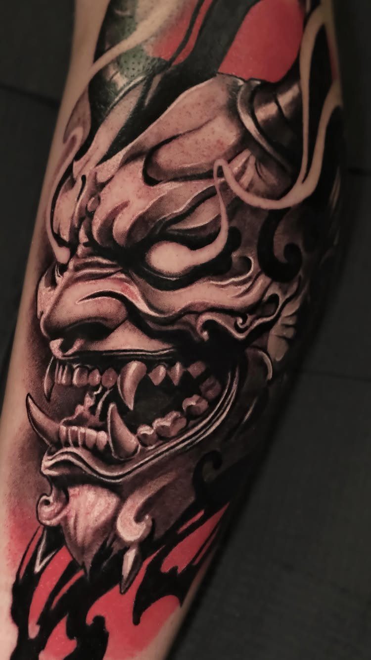
Red eyes and horns against black and grey give you one accent color without needing a full palette, and the oni’s expression reads clearly at any distance.
The calf is wide enough that the mask sits front and center without wrapping, so the face does not distort when the leg bends.
Smoke or waves below the mask fill space and add movement without competing with the face itself.
11. Viking Mask Tattoo
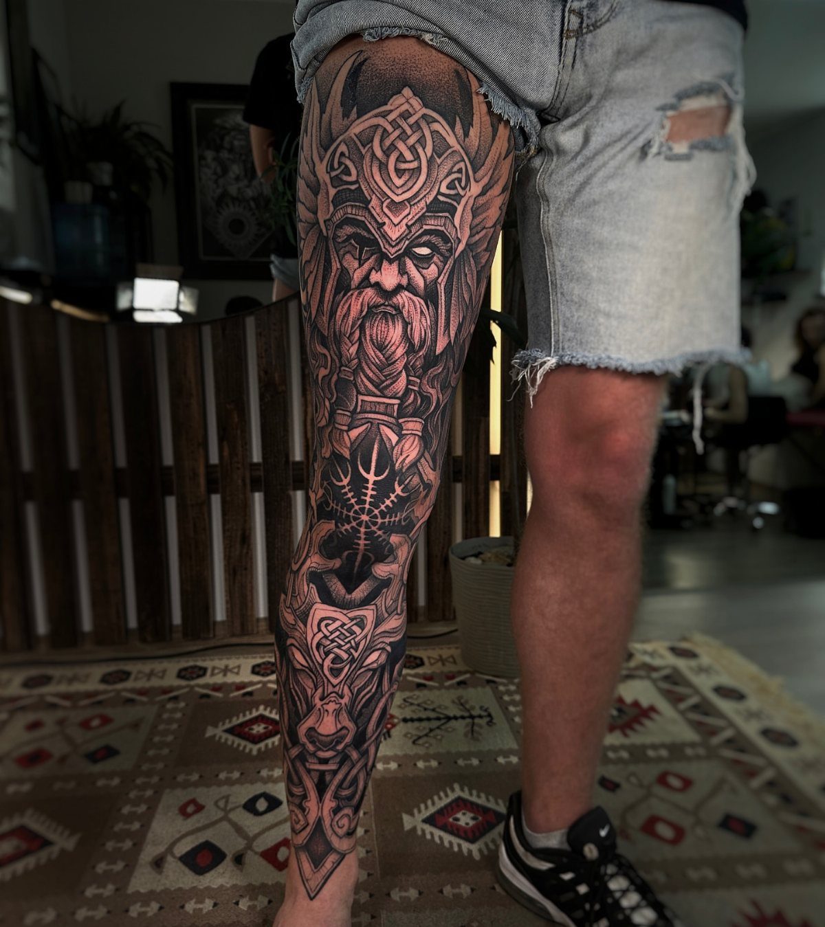
A Viking warrior with a horned helmet and beard fills the calf vertically, and the helmet’s symmetry holds its shape even when the leg flexes.
Black and grey keeps the focus on texture in the fur, chainmail or carved detail rather than on color.
The calf is rounder than the forearm, so faces and helmets sit flat against the muscle and read clearly from the front.
12. Tribal Tattoo
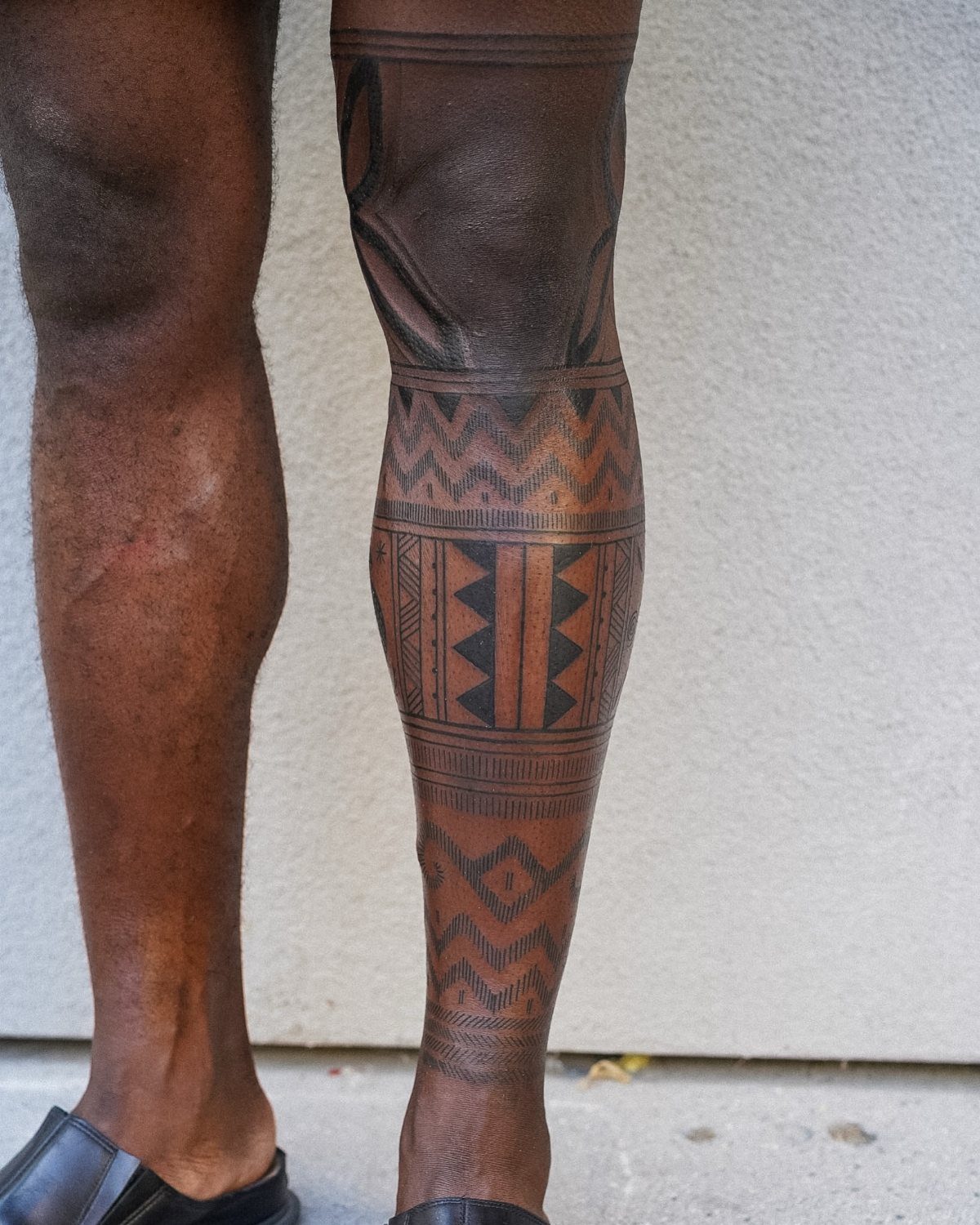
Bold black shapes with sharp angles follow the curve of the calf and emphasize the muscle underneath. Tribal work scales up better than down, so the calf’s surface area lets you go wide without the pattern feeling cramped.
The design wraps or stays centered depending on how much coverage you want, and black ink holds its edge longer than fine line work does as the tattoo ages.
13. Floral Tattoo
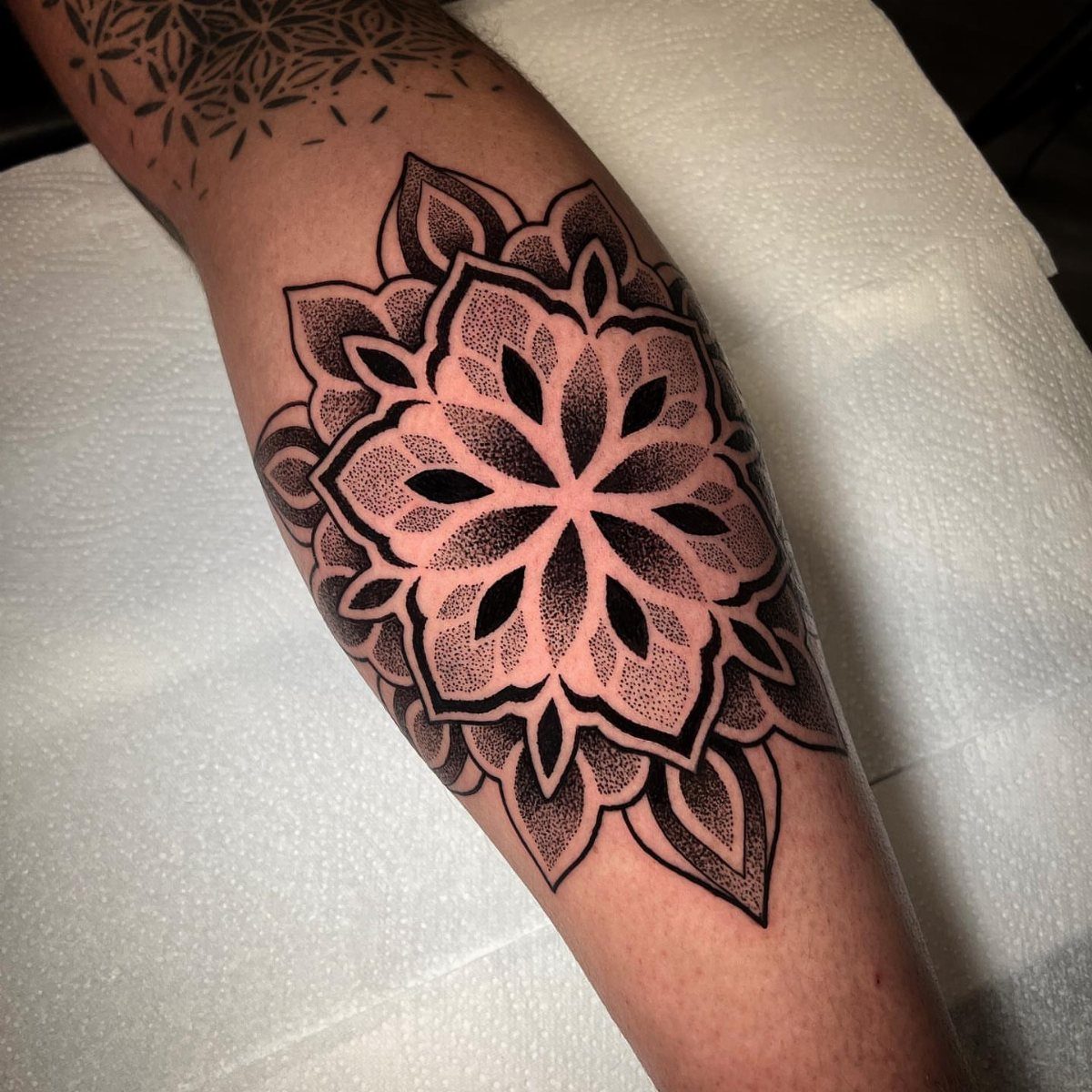
A mandala built from petals and leaves reads as ornamental rather than literal, and the circular symmetry stays balanced whether the leg is flexed or resting.
Dotwork shading gives the piece texture without needing color, and the soft gradient from dense stippling at the center to lighter work at the edges creates depth.
Floral designs scale down better than animal portraits do, so the calf can hold a smaller piece that still reads clearly. Black ink alone keeps maintenance simple and the design ages without needing touch-ups to restore faded color.
14. Geometric Tattoo
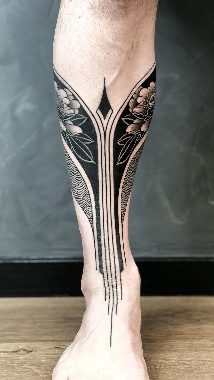
Shapes layered over organic line work combine structure with movement, and the contrast keeps both elements readable.
The calf’s flat front surface suits geometric patterns because straight lines and angles hold their shape better on a plane than on a curve.
Blackwork with negative space stays crisp as it heals, and the open areas inside the geometry prevent the design from looking too dense when the leg flexes.
15. Realistic Portrait Tattoo
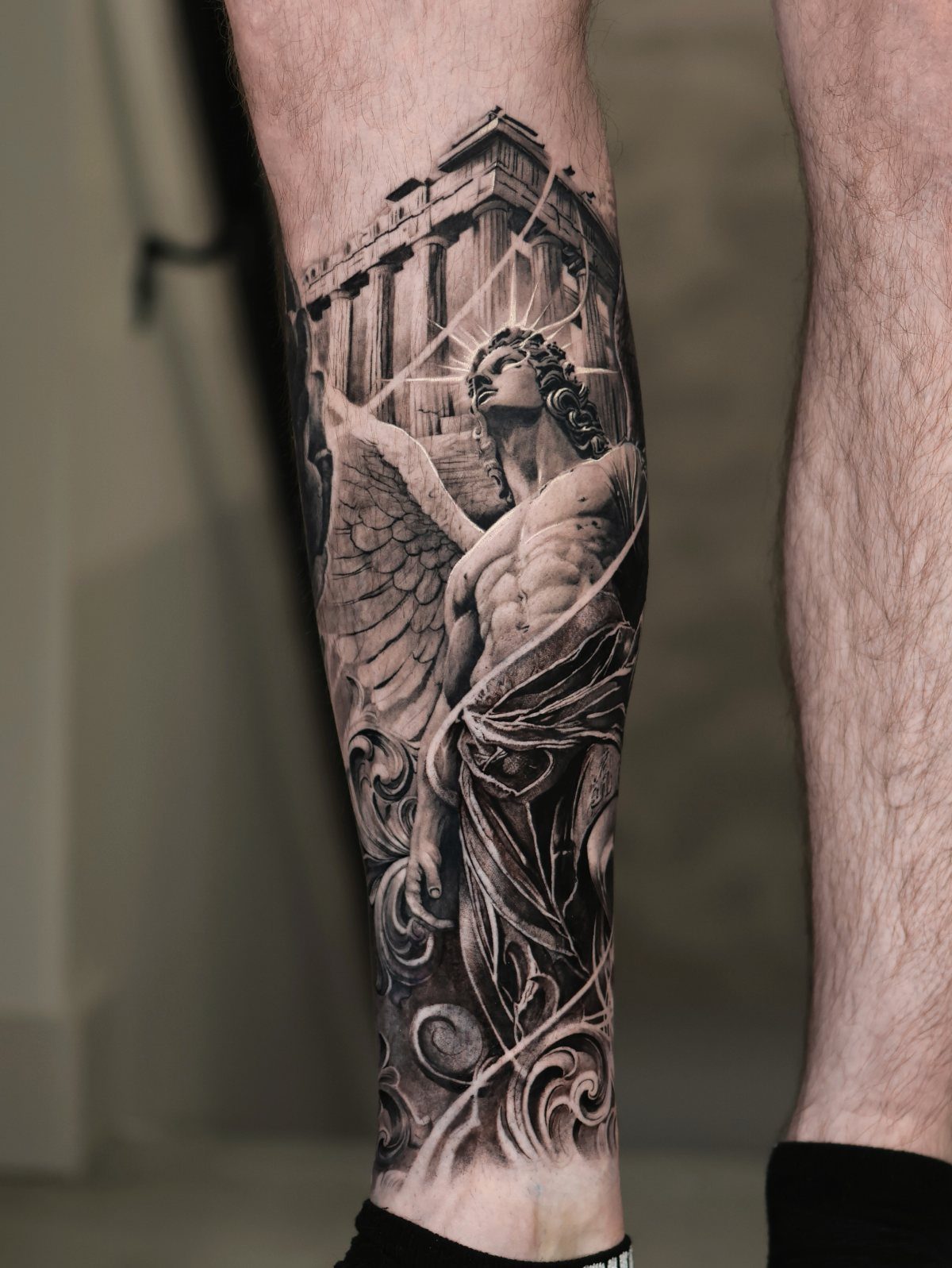
A statue paired with architecture gives you 2 layers of detail, and the calf’s height lets you separate them vertically so neither competes for space.
Wings at the top and columns at the base frame the composition and fill the full muscle.
Realistic work depends on shading, and the calf has fewer contours than the ribs or shoulder, so gradients stay smooth and faces hold their proportions.
16. Skull Tattoo
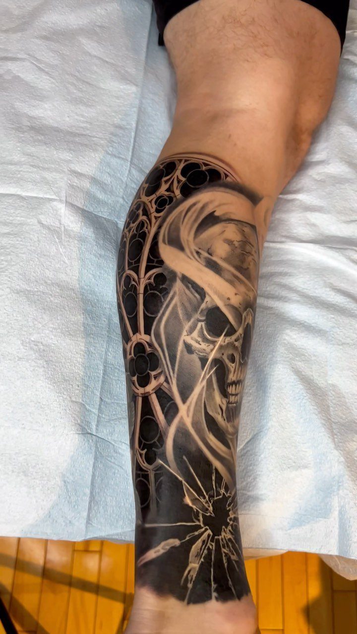
Gothic arches and columns behind the skull add structure without crowding the face, and the vertical lines of the architecture follow the natural length of the calf.
Black and grey suits the subject better than color would, and the contrast between the smooth skull and the textured stone keeps both elements distinct.
Skull tattoos read as direct, so the calf’s ability to stay covered matters if you want the option to hide it.
17. Family Name Tattoo
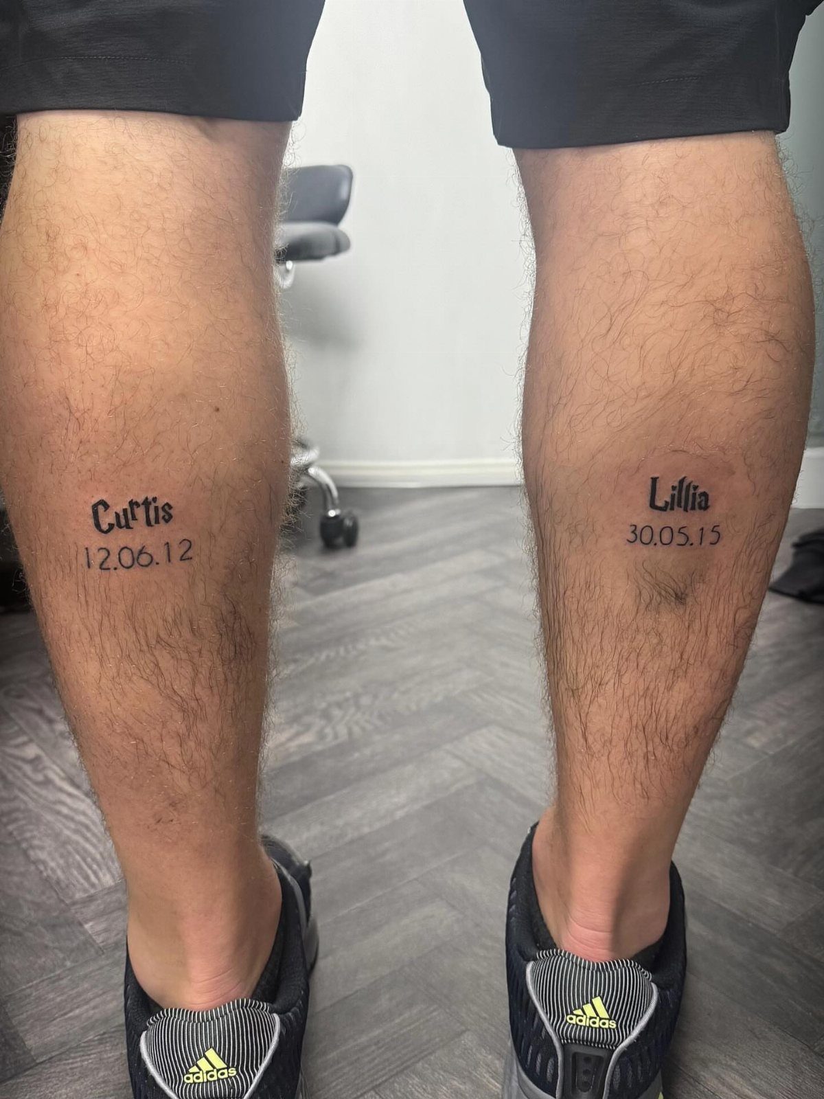
Names and dates sit centered on each calf and read clearly without decoration, so the focus stays on what the text says rather than on design elements around it.
The calf’s width gives you room for a full name and a date without reducing the font size to the point where legibility suffers.
Stick with straightforward letterforms in solid black for a piece that stays legible decades from now.
18. Motivational Text Tattoo
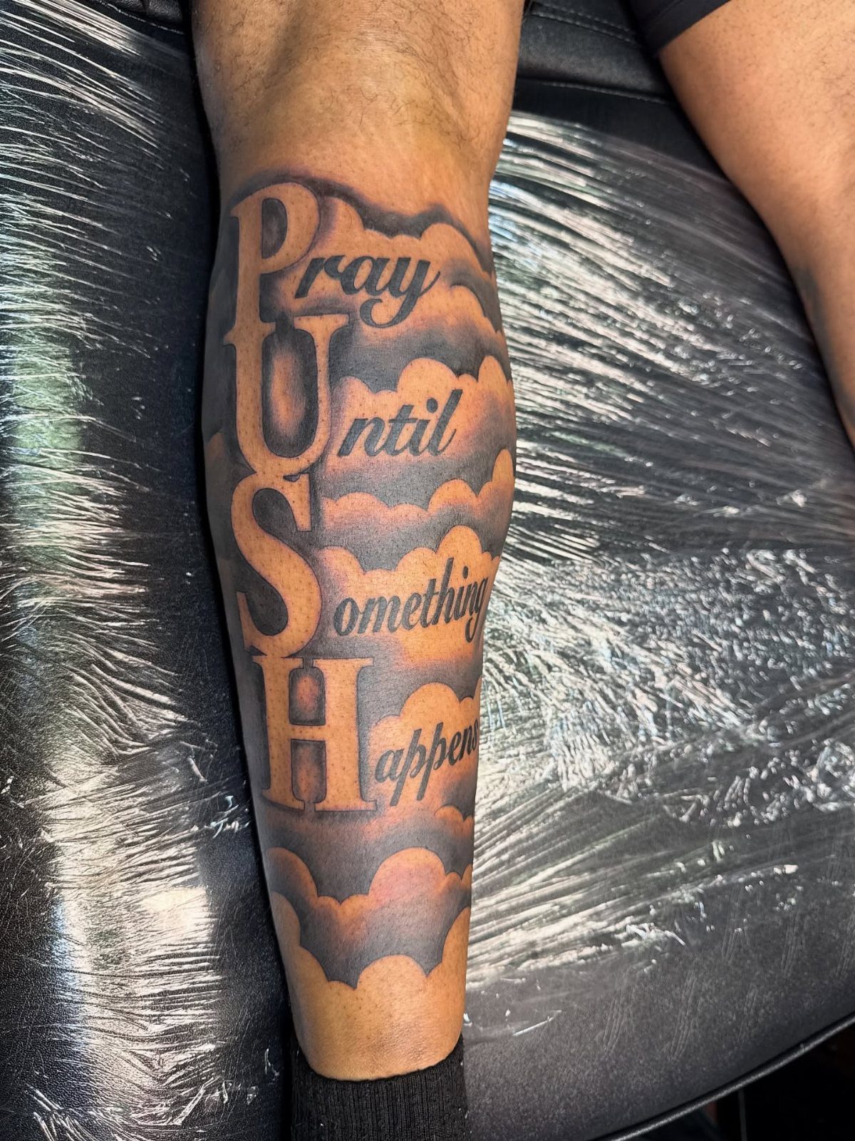
Large text over clouds gives you bold lettering that reads from a distance, and the background adds depth without competing with the words.
The calf’s vertical space lets you stack the acronym and the full phrase so both fit without crowding.
Text tattoos work best when the message is short enough to read in one glance, and the calf holds up to 3 lines comfortably before the layout starts to feel cramped.
19. Dagger Tattoo
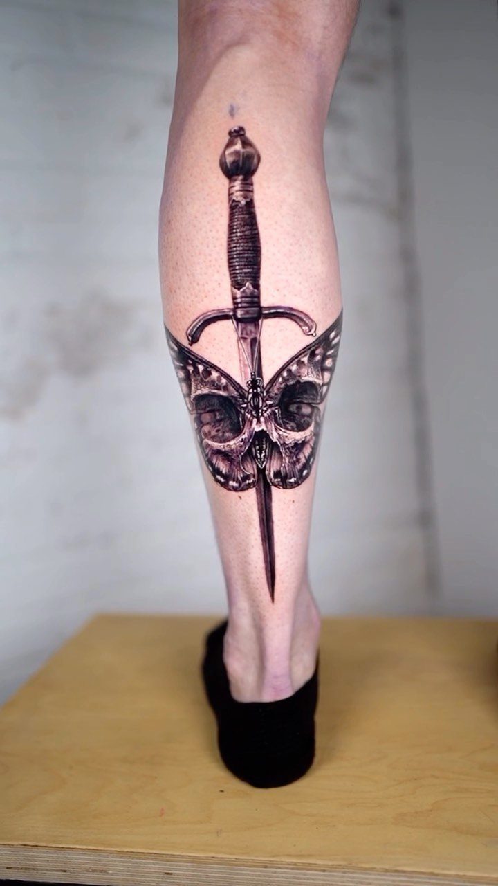
Adding butterfly wings softens the skull without losing the weapon’s edge, so the piece balances aggression with transformation.
Black and grey keeps the focus on contrast between the sharp blade and the organic shapes around it. The calf’s width gives enough space that the skull, wings and dagger each stay distinct when the leg bends.
Frequently Asked Questions
What should I get tattooed on my calf?
Pick a design that fits the vertical shape and uses the muscle’s natural curve: animals like tigers or wolves, warriors with stacked armor and weapons, or geometric patterns that follow the leg’s contour all work well.
Avoid designs that need to wrap fully unless the design suits that treatment, since the front surface is flat and holds detail better for most ideas.
How expensive is a calf tattoo?
Cost depends on size, detail and how many hours the piece takes. A small simple design runs less than a large realistic portrait with heavy shading, and the calf’s surface area means most designs fall somewhere in the middle.
Expect to pay for the artist’s time rather than a flat rate, since intricate work like biomechanical gears or fine line text takes longer than bold tribal shapes.