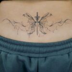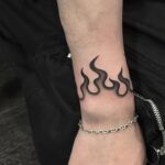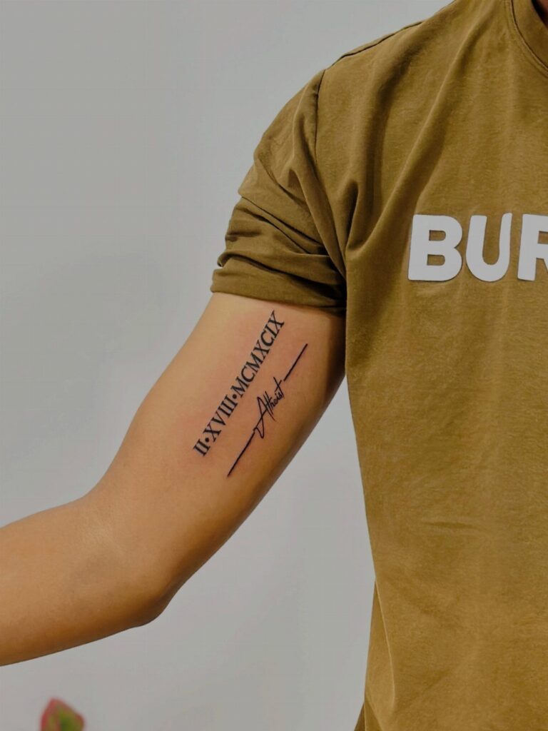
The bicep fits everything from tribal patterns and geometric shapes to quotes, crosses, and small minimalist pieces, with placement options that stay visible or tuck into the inner curve.
Realism and clock tattoos take multiple sessions to layer the shading that creates depth, while tribal patterns and small symbols finish faster with bold black lines that age cleanly.
Lions and wings wrap the curve well, watercolor needs touch-ups faster than traditional linework, and biomechanical designs use the muscle shape to sell the effect.
1. Tribal Patterns
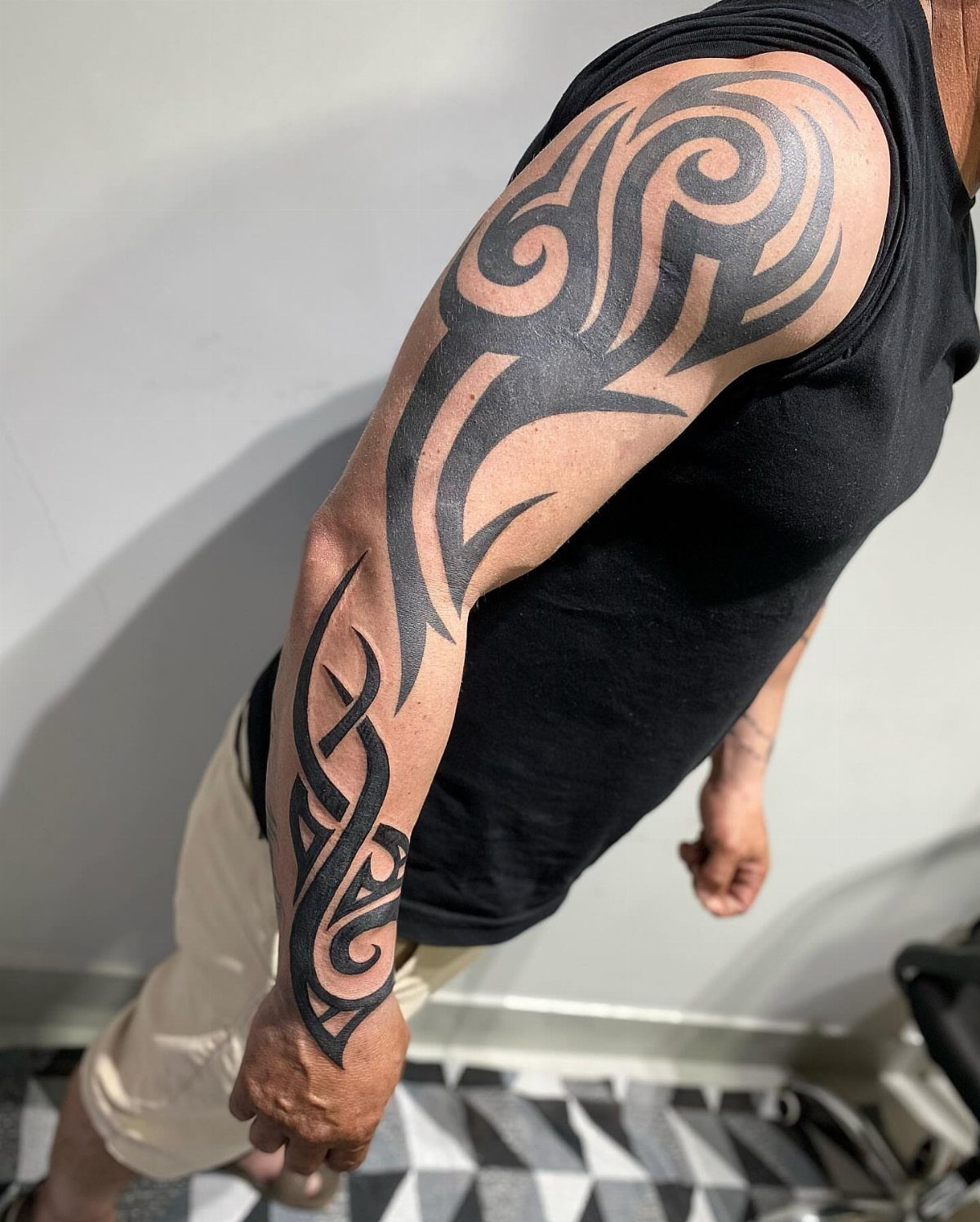
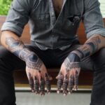
Tribal patterns lock in bold black lines, the kind of coverage that reads from across a room. The designs wrap around the muscle, following the curve of the bicep with shapes that flow from shoulder to forearm.
These patterns work best when sized large.
Thin tribal looks tentative; a design that fills the space carries the weight the style needs. The blackwork ages cleanly, holding its contrast without needing touch-ups as often as fine detail would.
2. Lions
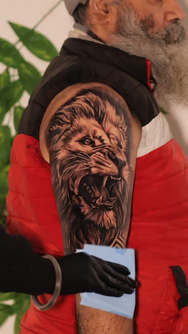
A roaring lion turns the bicep into a statement about dominance. The open mouth, bared teeth and forward gaze all reinforce the same message: courage under pressure.
Black and grey shading gives the mane its depth.
The lighter tones separate each strand, and the darker fills push the face forward. Realism here depends on contrast, so plan for a piece that takes multiple sessions to build up the range.
The bicep’s curve suits a lion’s head facing out. When you flex, the face distorts less than it would on the forearm.
3. Realism
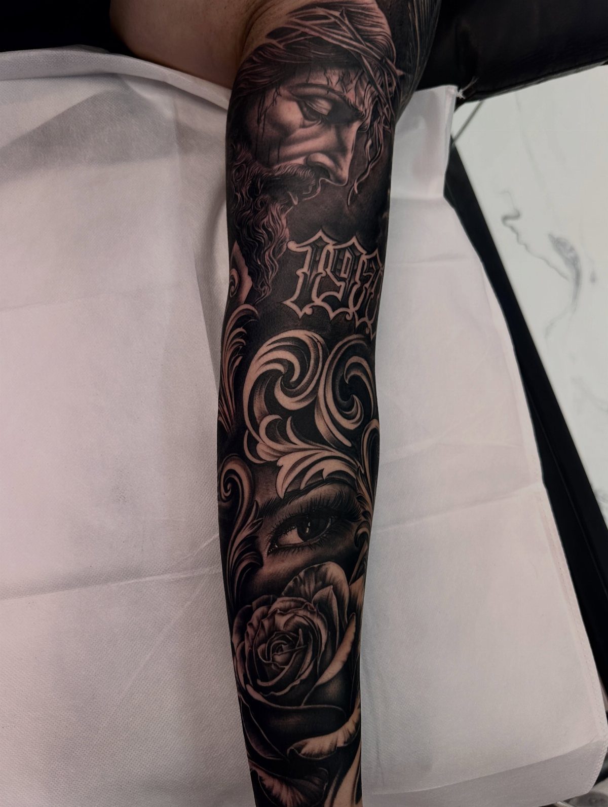
Realism tattoos pull from photographs, translating fine detail into skin. Portraits, flowers, eyes and religious figures all fit the style, and the bicep gives enough flat surface for a face or object at close to actual size.
Black and grey realism relies on smooth gradients.
Your artist needs time to layer the shading, so expect longer sessions than a bold design would take. The subtlety that makes realism striking also makes it harder to maintain: over time, the softest tones fade first.
Choose reference images with strong lighting. A photo with strong shadows and bright highlights will give your artist more to work with than even, diffused light.
4. Letter Tattoos
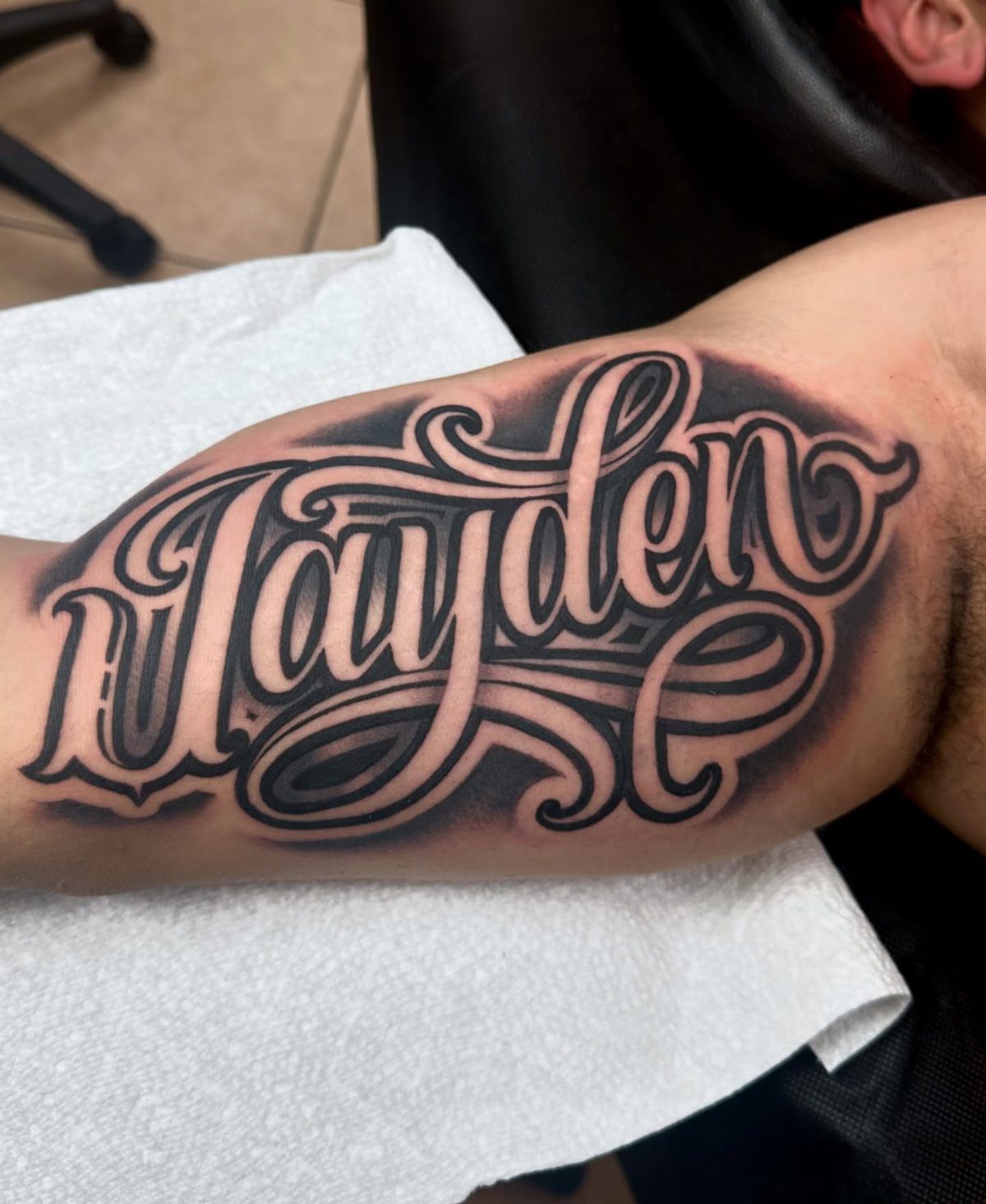
Letter tattoos turn a name, date or word into the design itself. Script works well on the bicep because the muscle gives a smooth, slightly curved surface that doesn’t crease as much as the wrist.
Cursive reads as formal or sentimental depending on the weight of the letters.
Thicker strokes hold up better over time; delicate calligraphy can blur as the ink spreads slightly under the skin. Size the letters large enough that each one stays distinct after a decade.
Pair script with small accent details like flourishes or shading only if the lettering alone feels too sparse.
5. Geometric Designs
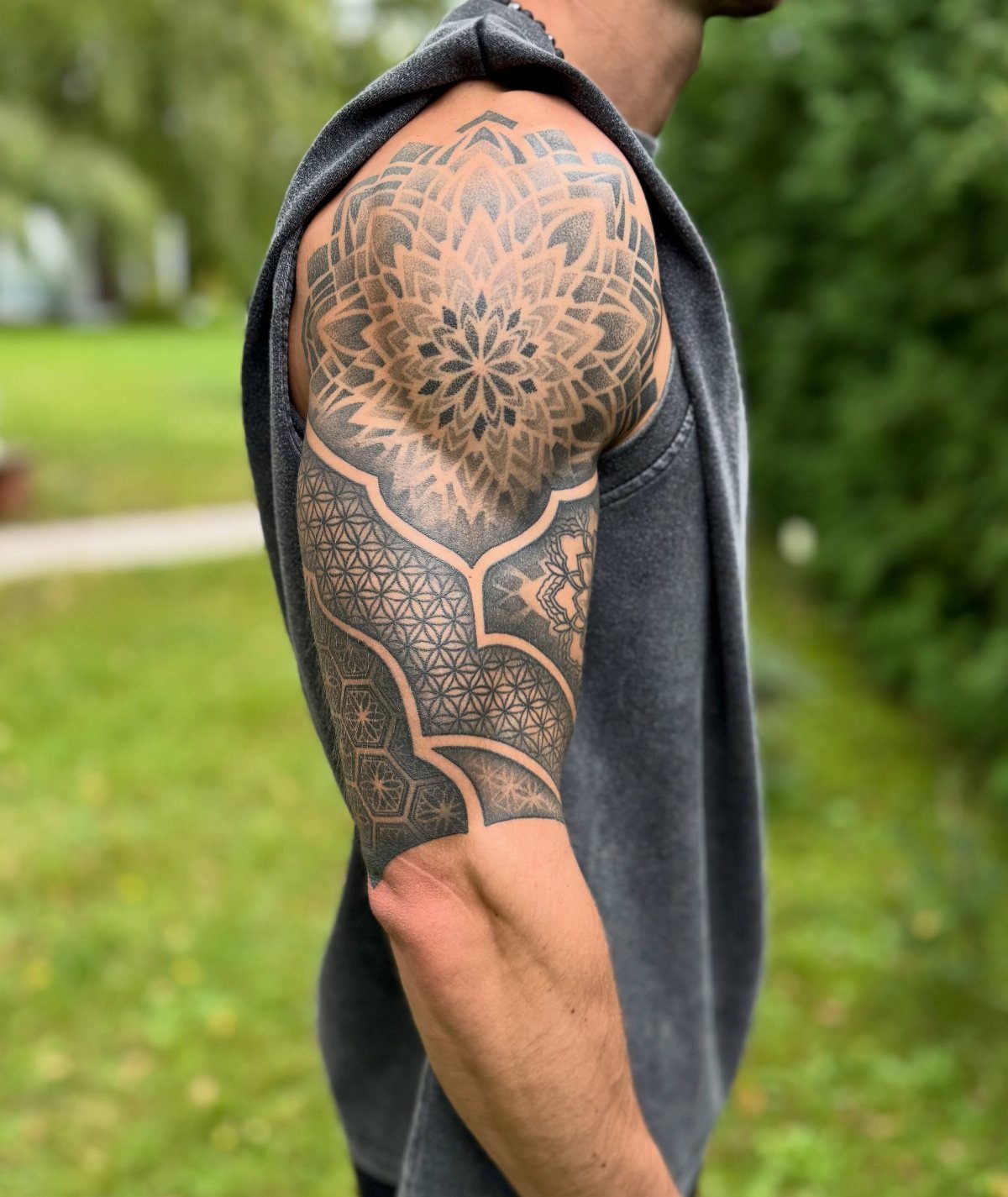
Geometric mandala designs balance symmetry with intricate line work. The circular shape fits the bicep naturally, centering on the muscle and radiating outward with repeating patterns.
These tattoos depend on precision.
A mandala with uneven spacing or inconsistent line weight loses the order that makes it work. Your artist should specialize in geometric work; slight wobbles in a dotwork mandala are immediately visible.
The bicep’s shape keeps the design from warping when you move. Shoulders and elbows distort circles, but the bicep holds the symmetry intact.
6. Inspirational Quotes
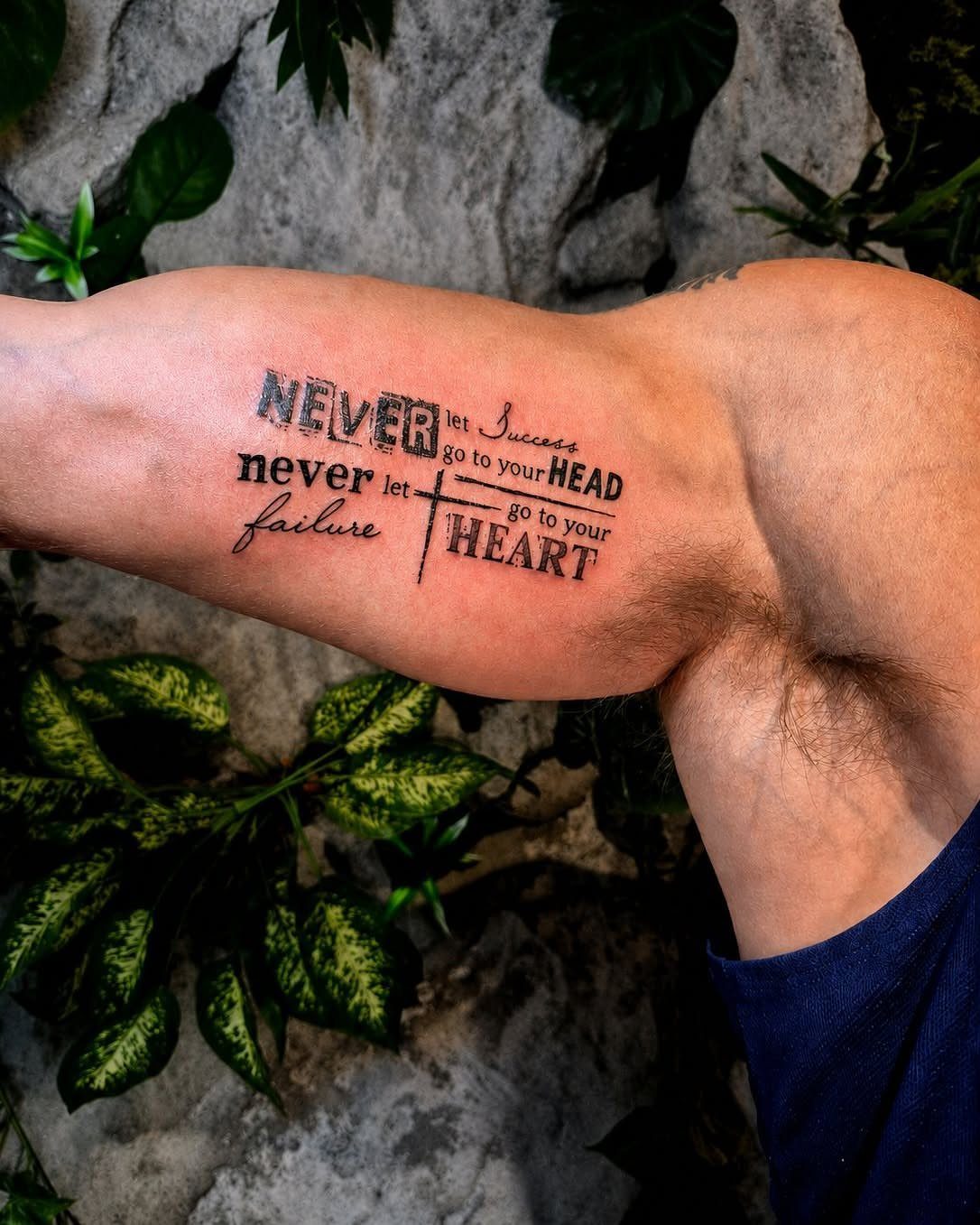
Inspirational quotes wrap personal beliefs around the muscle, turning the bicep into a daily reminder.
The length of the phrase determines how the text breaks: short quotes fit on one line, longer ones stack or curve to follow the arm’s shape.
Sans-serif or block lettering reads faster than ornate script.
If the message matters more than the decoration, keep the font simple. Black ink stays legible longest; adding color or gradient can make the text harder to read as it fades.
Wrapping a quote around the inner curve lets you keep it to yourself unless you lift your arm. Outer bicep makes it visible in short sleeves.
7. Watercolor Tattoos
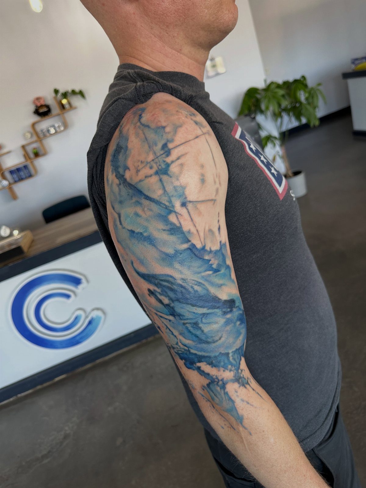
Watercolor tattoos mimic the look of watercolor paintings, with soft edges and color that bleeds beyond the lines. The style skips the black outline that holds most tattoos together, relying instead on color gradients and splashes to define the shape.
Blue and purple tones show up cleanest on lighter skin. The bicep gives enough room for the color to spread without crowding the design into too small a space.
Watercolor fades faster than traditional tattoos.
The lack of outlines means there’s less structure to hold the design together as the pigment softens over time. Touch-ups keep the colors bright.
8. Biomechanical Tattoos
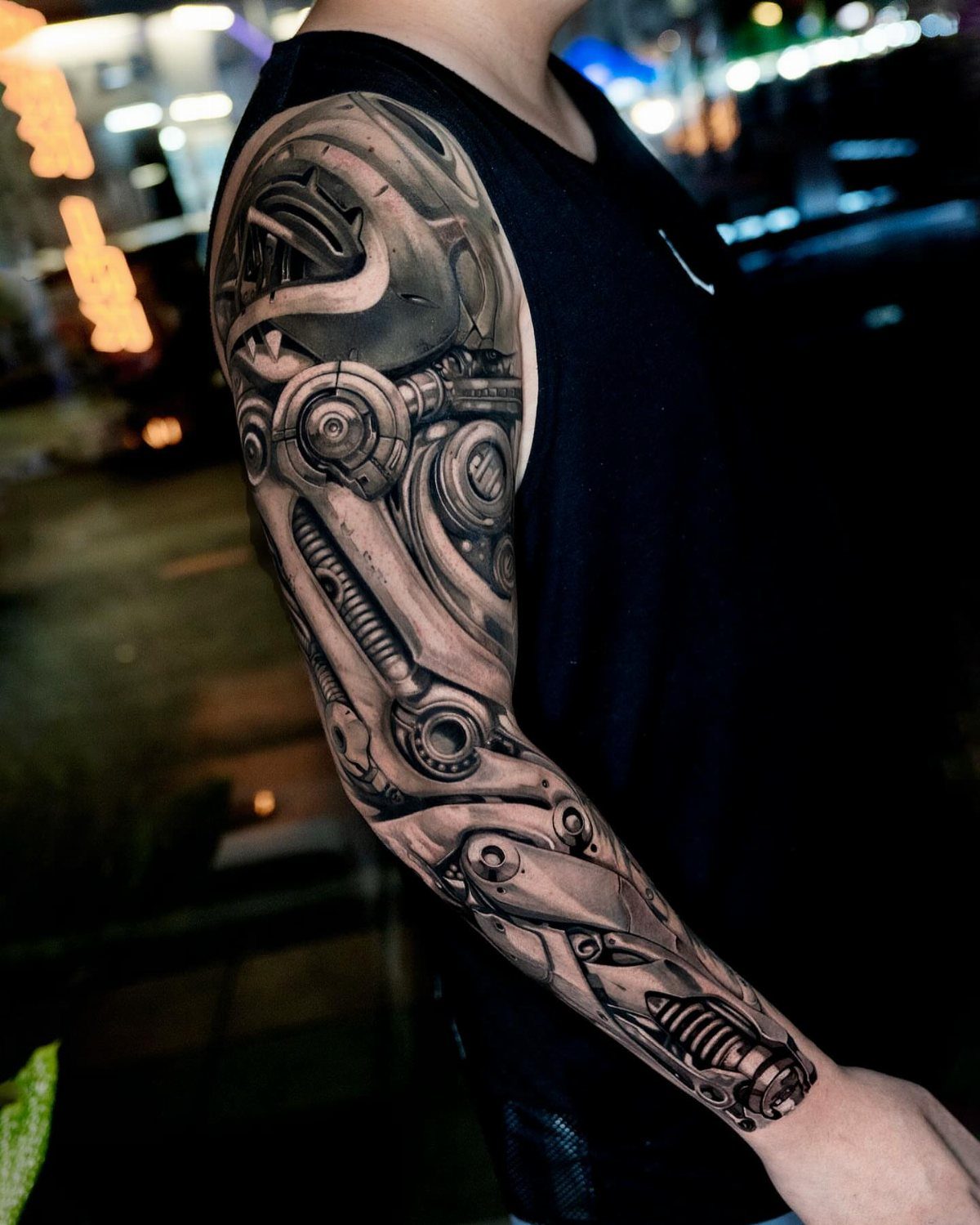
Biomechanical tattoos blend skin with machine parts, creating the illusion that gears, pistons and metal plates sit under the surface. The design uses shading to make robotic elements appear three-dimensional, as though they’re built into the muscle itself.
Black and grey work suits this style.
The metallic look depends on highlights and shadows, and color can flatten the effect. The bicep’s contour helps the mechanical pieces appear embedded, with darker shading in the recesses and lighter tones on raised surfaces.
This style takes time. Layering the detail to make the machine parts look real means multiple sessions.
9. Wings Tattoos
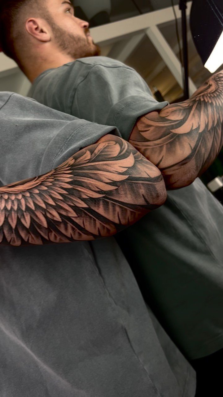
Wings turn the bicep into a symbol of freedom or remembrance. Feathered wings reference angels or birds, while bat or dragon wings shift the meaning toward something darker or more mythic.
The wings can sit symmetrically on both arms or wrap around one bicep, with the tips curving toward the shoulder or elbow.
The bicep holds the detail without distortion. Wings on the forearm or shoulder blade shift with every movement, but here they stay in place.
10. Cross Tattoos
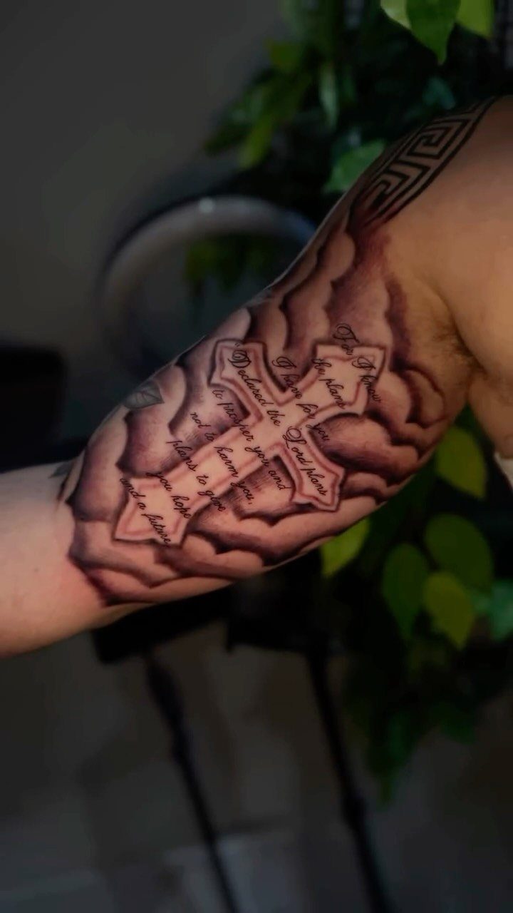
A bicep cross usually marks a moment of belief or a promise the wearer made to themselves. The design can stand alone or sit inside clouds, rays or geometric shapes that fill the space around it.
Script paired with the cross adds a verse or name without crowding the image. The bicep’s width lets the cross sit upright and centered, with any surrounding detail wrapping the curve.
Simple crosses age cleanly. Adding heavy shading or fine detail around the cross increases the time and the chance that softer elements fade before the main lines do.
11. Bible Verse Tattoos
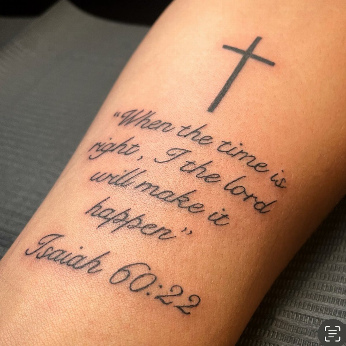
Bible verse tattoos bring scripture into a personal form, pairing the text with symbols like crosses, doves or praying hands. The verse itself can wrap around the bicep or stack in lines that follow the muscle’s curve.
Short verses fit on one arm without crowding.
Longer passages need smaller text, which fades faster and becomes harder to read over time. Black ink stays legible longest.
The bicep keeps the verse visible in short sleeves. Pair the text with one central image rather than multiple small details, so the focus stays on the words.
12. Small Bicep Tattoos
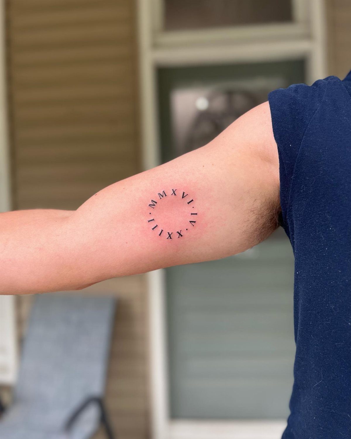
Small bicep tattoos compress symbols, initials or dates into compact designs that fit on the inner or outer curve. Roman numerals, arrows, coordinates and single-word script all suit the size.
Placement on the inner bicep keeps the tattoo more private. The bicep’s flat surface keeps small details from warping, unlike the wrist or finger where skin creases.
Line weight matters at this scale.
13. Clock Tattoos
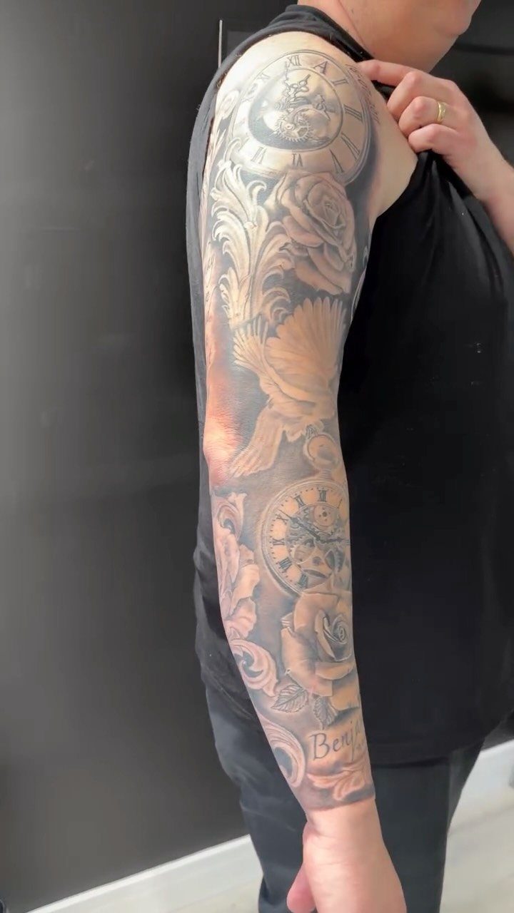
Clock tattoos mark time as the central image: a pocket watch, a Roman numeral face or hands frozen at a specific hour. Most clock tattoos freeze a specific hour and minute that mark a moment the wearer will never forget.
Pair the clock with roses, script or portrait work to fill the bicep. A clock alone can look isolated; surrounding detail gives it context and balances the composition.
Shading in grey tones separates the flat face from the raised bezel and brings out the hardware.
The highlights on the rim and the shadows inside the face separate the clock from the background, making it look three-dimensional rather than flat.
Bicep Tattoo Placement
Horizontal compositions work well on the inner bicep, running beneath the upper arm without wrapping too far around.
Longer pieces can extend toward the elbow, though the available space depends on your arm size and how much wrapping the design needs.
A portrait or script that requires rotation to view properly will frustrate you every time you check it. For personal tributes, a single centered image with minimal surrounding detail often lands better than multiple competing elements.
Choosing a Tattoo Artist
Review an artist’s portfolio for repeated examples of the style you need. Portrait work lives or dies on shading control and likeness, script needs consistent letter height and spacing, and geometric patterns demand straight lines and symmetry.
Check for multiple tattoos at your intended size, preferably on clients with similar skin tone to yours, and ask to see healed results when you can.
Ask how they would adapt your reference for the bicep instead of copying it line for line. The right answer covers proportion, where the piece should sit, and which elements to simplify, not a promise to fit every detail.
Show up with your target dimensions, rough budget, and a mention of any other tattoos you plan that might tie in later.
Check their sterilization protocol, get aftercare in writing, and confirm how deposits and touch-ups are handled before you commit.
Caring for Your Tattoo
Stick to the aftercare sheet your artist hands you, since instructions vary by bandage type.
After you peel the dressing, clean it with unscented soap, pat dry with a clean towel, and apply the moisturizer your artist recommended. Wear loose, clean sleeves and avoid rubbing, picking or scratching.
Skip swimming, baths and hot tubs until the skin has fully healed. A settled surface doesn’t mean the deeper layers have finished repairing, so give it the full time your artist recommends.
If you see fever, red streaks spreading outward, pain that gets worse instead of better, or pus, get it checked. After healing, apply SPF 30 or higher every time the tattoo sees daylight, and reapply every 2 hours if you’re outside.
Frequently Asked Questions
What are some popular bicep tattoos for guys?
Tribal patterns, lions, realism portraits, geometric mandalas and crosses show up most often on men’s biceps.
Bold designs with strong contrast read well from a distance and hold their shape as the muscle flexes. Bold shading holds up longer than fine lines, which blur faster and need touch-ups sooner.
Do front bicep tattoos hurt?
The outer bicep sits over muscle with less nerve density, so pain stays moderate compared to ribs or spine.
Place the stencil while standing with your arms relaxed, not flexed, so the design looks balanced in everyday positions. A tall, narrow design follows the muscle’s curve and stays readable when your arm bends.
How much do bicep tattoos cost?
Cost depends on size, detail level and how many sessions the piece needs to complete. A small symbol or script takes less time than a realistic portrait that requires multiple layers of shading.
What tattoo should I get on my inner bicep?
Meaningful script, portraits and symbols suit the inner bicep because the placement stays private until you lift your arm. Keep the main subject readable without twisting your arm into an awkward pose.