Hand tattoos fade faster than designs on most other spots because the skin there sheds and moves constantly.
You can go minimal with a single heart or rose, or commit to vines and script that wrap across fingers and climb the wrist.
1. Rose with Leaves
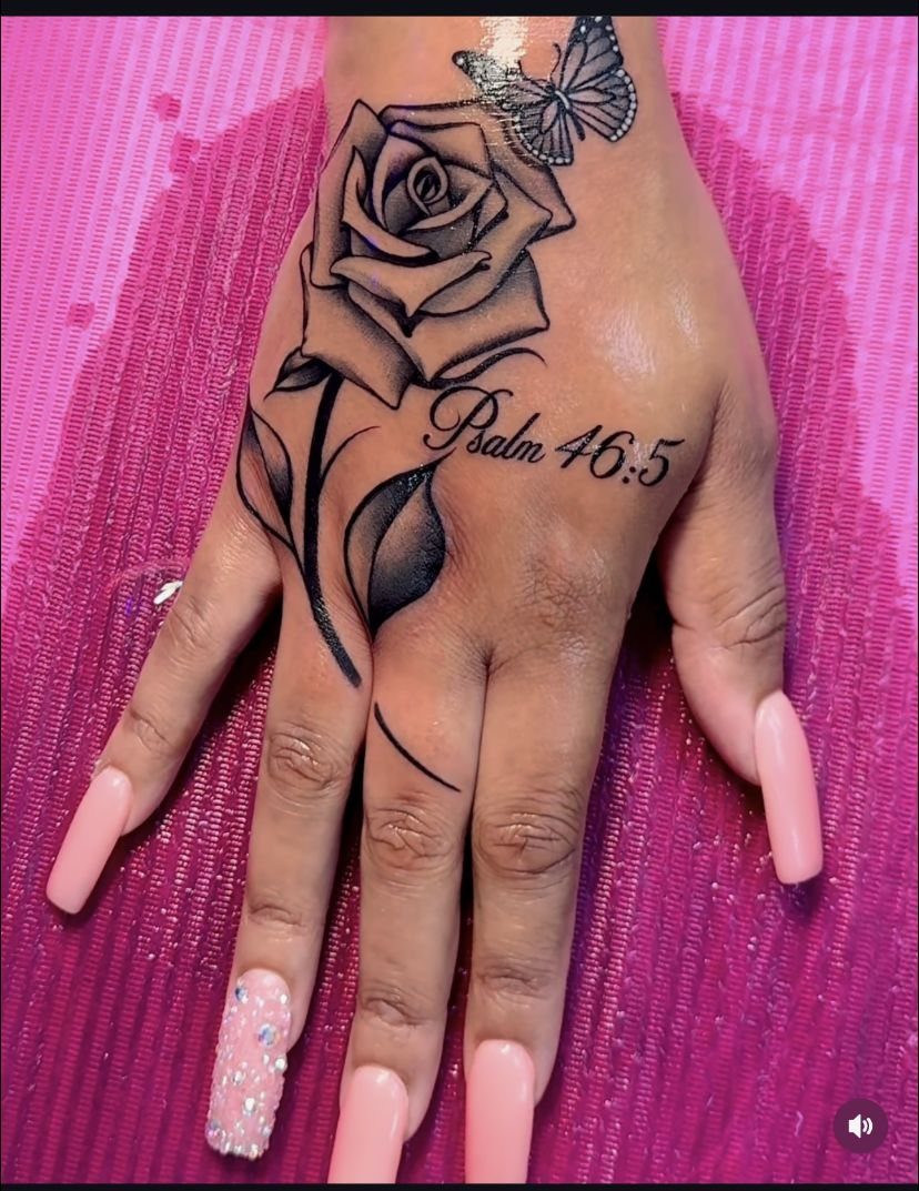
A realistic rose sits at the center, stem and leaves trailing toward the wrist or fingers. The shading gives it dimension, and the petals feel soft even in black ink.
This design reads well across the top of the hand because the rose itself anchors the composition.
Fine-line leaves fill the negative space without crowding it. A rose with a bit of botanical detail holds that middle ground better than a single flower head alone when you’re after something delicate but not minimal.
The style ages cleanly. Roses have been tattooed for decades, and a well-executed one still looks intentional years later.
2. Crescent Moon and Stars
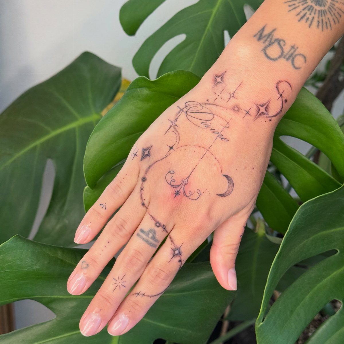
A crescent moon paired with scattered stars gives you a celestial theme that fits the natural contours of the hand.
The moon usually sits near the thumb or along the side, with stars filling the space between knuckles or trailing toward the wrist.
I like this one for people who want something symbolic without heavy linework. The shapes are simple enough to stay legible as the skin ages, and you can add as many or as few stars as the layout needs.
Script works alongside it for layered meaning. Keep the text small and placed where it won’t compete with the main design.
3. Floral Vines
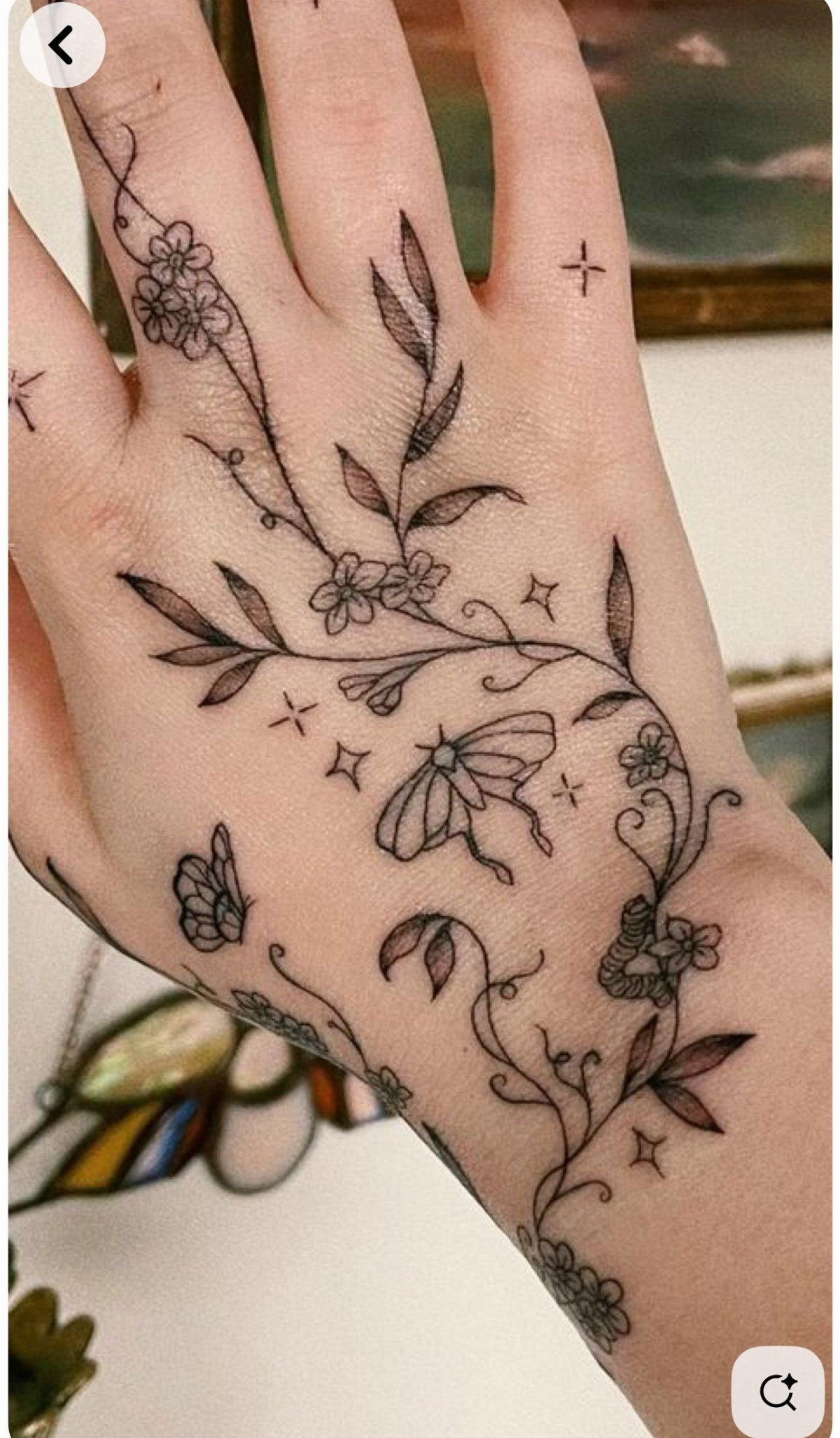
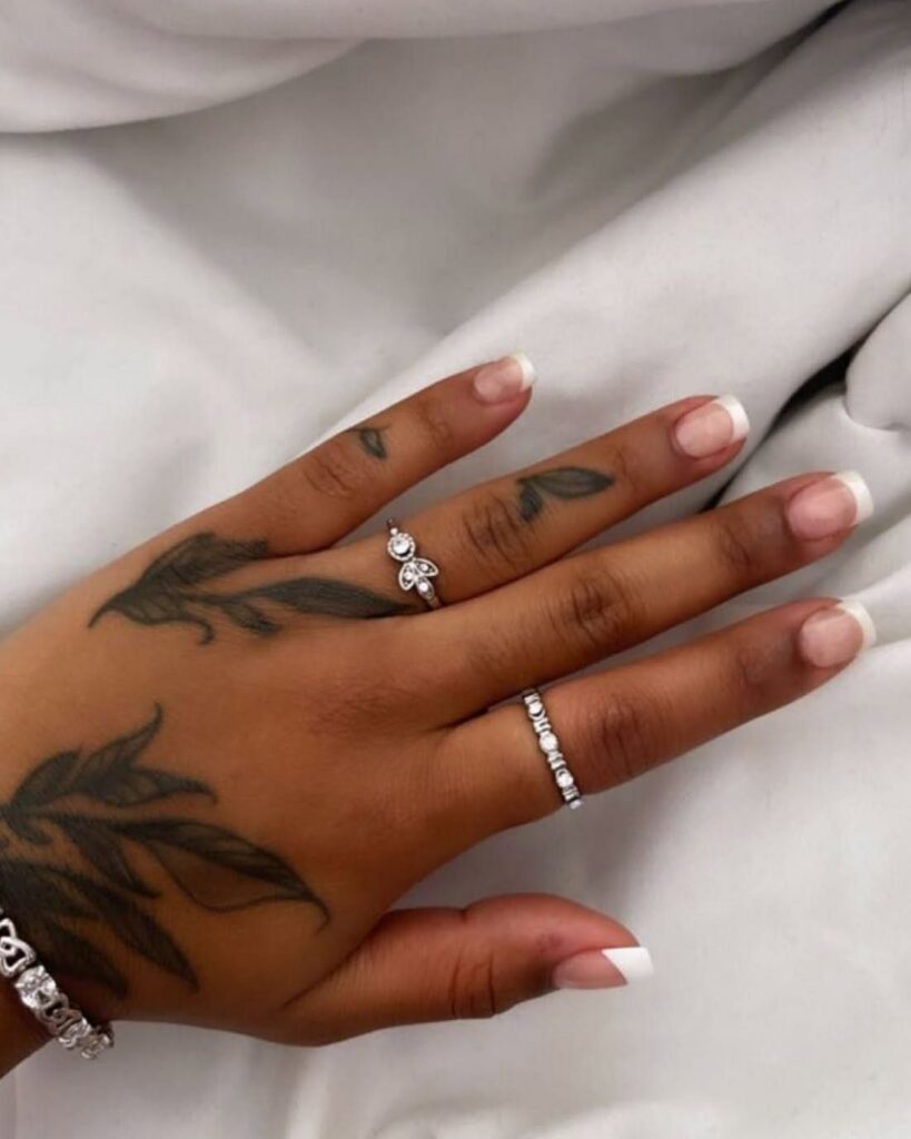
Fine-line vines circle the fingers and climb toward the wrist, with small flowers and butterflies spaced along the stems. The linework stays delicate, so the design feels organic rather than dense.
This approach uses the hand’s natural shape.
Vines follow the curve of the knuckles, and butterflies sit where there’s room to show the wings in full. Botanical line work gives you coverage without solid black.
Plan for touch-ups. Fine lines on the hand lose clarity sooner, especially between the fingers where skin moves constantly.
4. Small Heart Tattoo
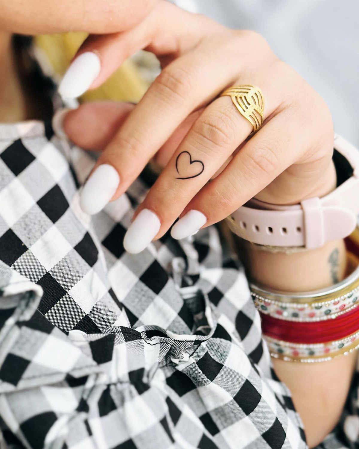
A tiny heart on the ring finger is about as minimal as hand tattoos get. The shape is simple, the placement is visible, and it doesn’t demand much real estate.
Finger tattoos fade faster than most spots because the skin sheds and stretches more.
A small heart will need a touch-up every few years to keep the edges clean. Some artists won’t tattoo fingers at all because of how often they blur, so ask before you book.
For something that lasts longer, move the heart to the top of the hand instead.
5. Script Tattoo
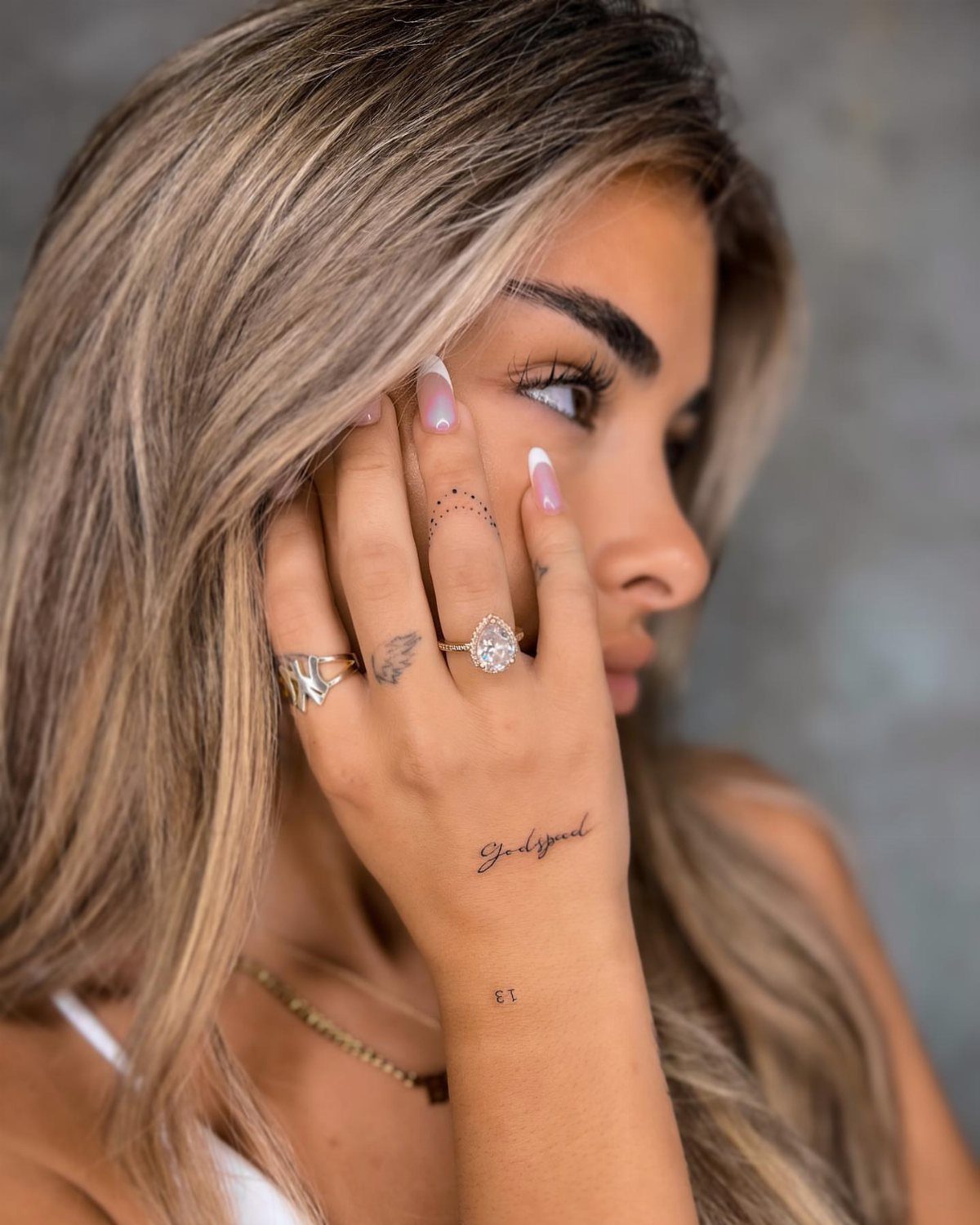
Script along the side of the hand or across the knuckles gives you room for a word or short phrase that means something personal.
The lettering style matters: clean, bold fonts hold up better than thin cursive, which tends to blur.
Keep it short.
One or two words fit the space without wrapping awkwardly, and they’re easier to read at a glance. Script on the hand fades faster than other placements, so plan for touch-ups every couple of years to keep the letters sharp.
If you’re adding script to an existing design, place it where it won’t compete with the main image.
6. Butterfly Finger Tattoos
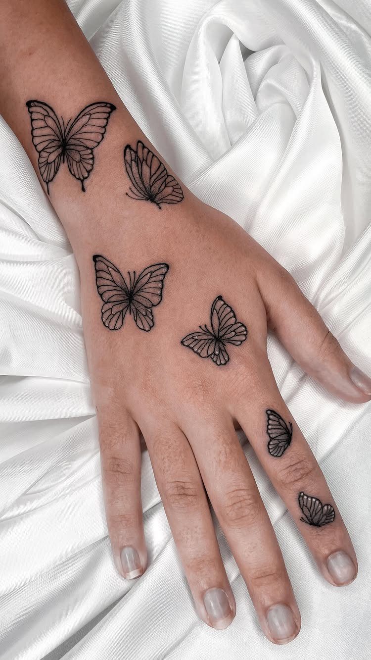
Butterflies scattered across the hand and wrist give you a repeated motif that feels cohesive without being identical. The wings are detailed enough to show the pattern, and each one can vary slightly in size or angle.
This design works best when the butterflies face the same direction and follow the natural line of the finger. If you space them evenly, the repetition looks intentional rather than random.
A butterfly design like this will need regular touch-ups to keep the wings defined and the outlines crisp.
7. Bow and Ribbons
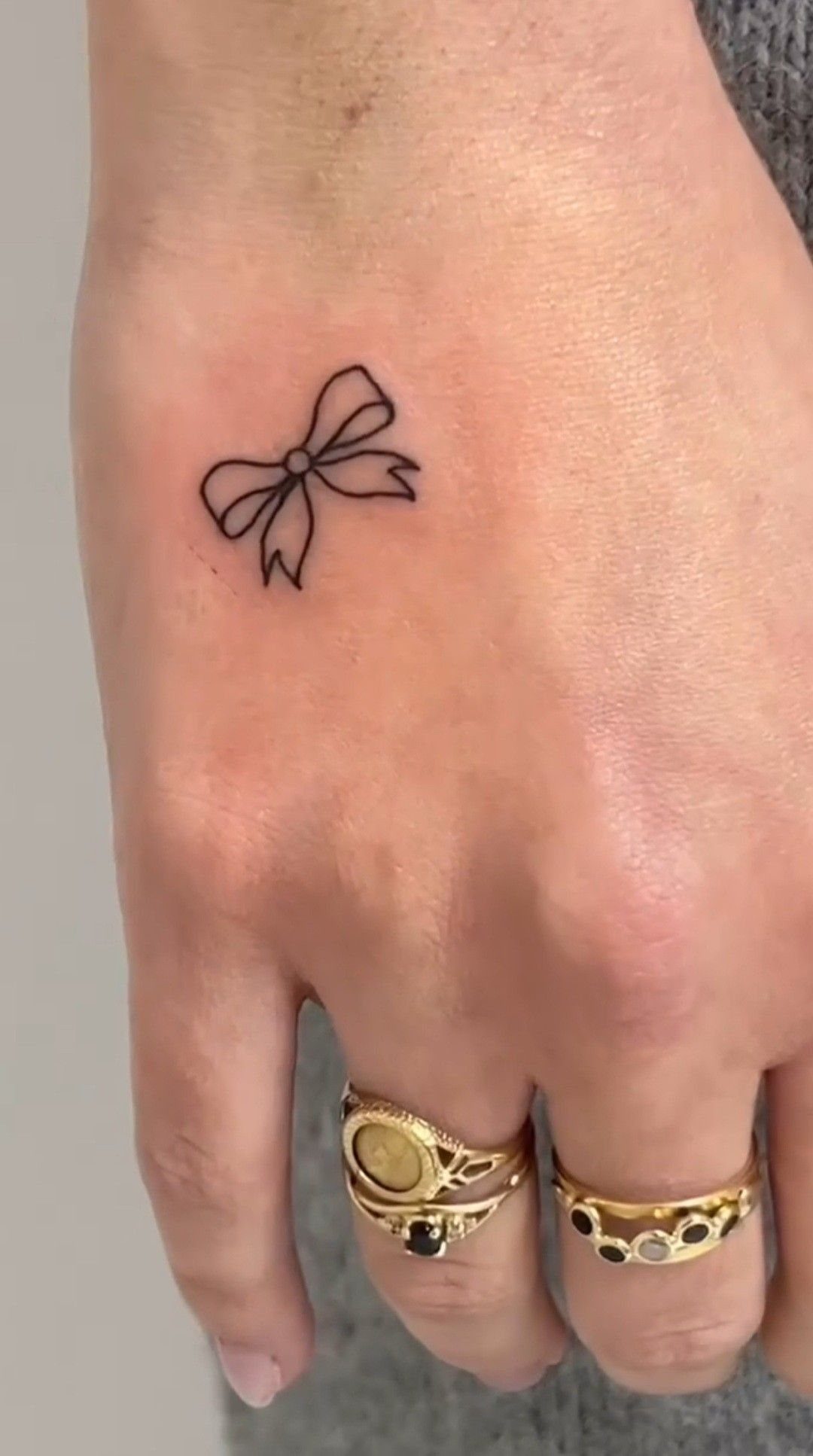
Most bows sit high on the hand, either centered above the knuckles or tucked just below the wrist. The linework is delicate, and the loops feel symmetrical without looking stiff.
This design leans fully into the feminine side of hand tattoos.
It’s soft, minimal, and quick to tattoo. The placement lets you pair it with rings or layer it alongside other fine-line designs without crowding the space.
Keep the lines clean and the size proportional. A bow that’s too small loses its shape as the skin moves, and one that’s too large reads awkwardly on the hand.