Inner bicep tattoos fit a narrow vertical strip that shows when you lift your arm and hides when you drop it, with pain falling somewhere between the outer arm and the ribs.
Sessions run anywhere from a couple hours for script or simple graphics to a full day for detailed realism with shading, and cost follows the same line.
The choice splits between designs that carry their own weight, like a cross, dragon or compass, and something tied to your own story, whether that’s a verse, a date or a line that stuck with you.
The skin here stretches when you bend your arm, so fine linework and script need enough weight to stay readable.
1. Cross Tattoo
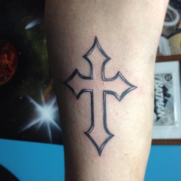
A cross on the inner bicep reads as faith without needing explanation. The plain black outline keeps it clean and lets the symbol speak for itself.
This spot stays visible in a t-shirt but tucks under long sleeves when needed.
The inner bicep curves slightly, so a vertical cross naturally follows the shape of the arm. Pain here is tolerable for most first-timers.
A simple outline costs less than a detailed piece. Keep it clean and avoid tight sleeves that rub while it heals.
2. Bible Verse Tattoo
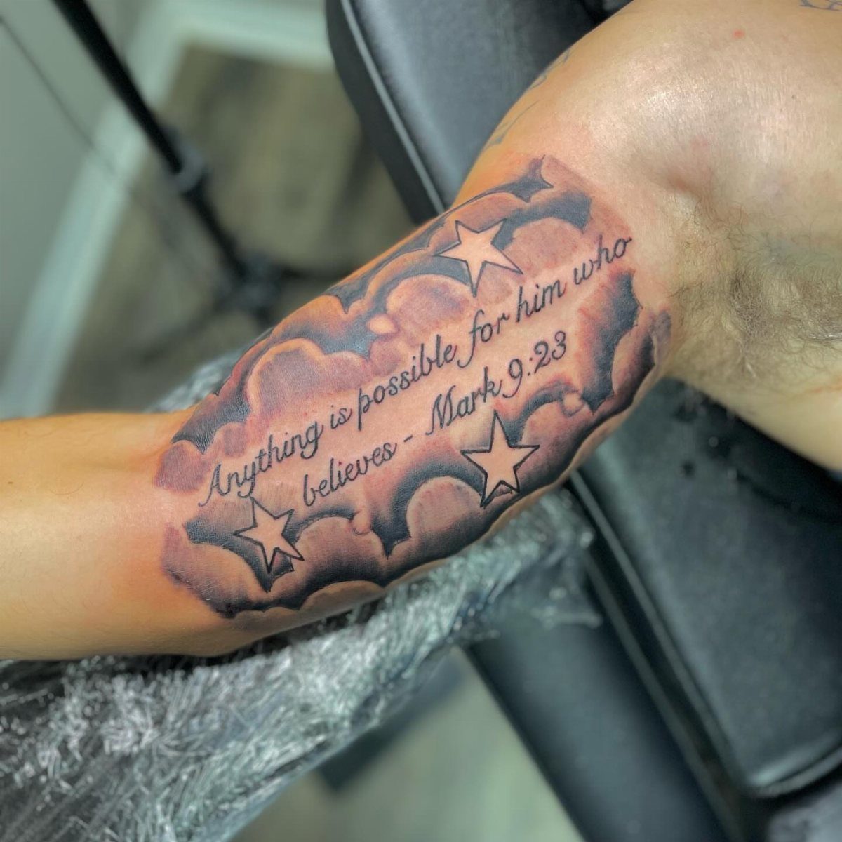
Scripture on the inner bicep turns a personal verse into something you carry with you.
Pick a verse short enough to stay legible at this size.
Long passages cramp together and blur over time. Script fonts need skilled linework or the letters run together, so look for someone whose lettering reads clean.
More detail in the background raises the price. The inner bicep swells a bit during healing, so expect some tenderness when you bend your arm for the first week.
3. Roman Numeral Tattoo
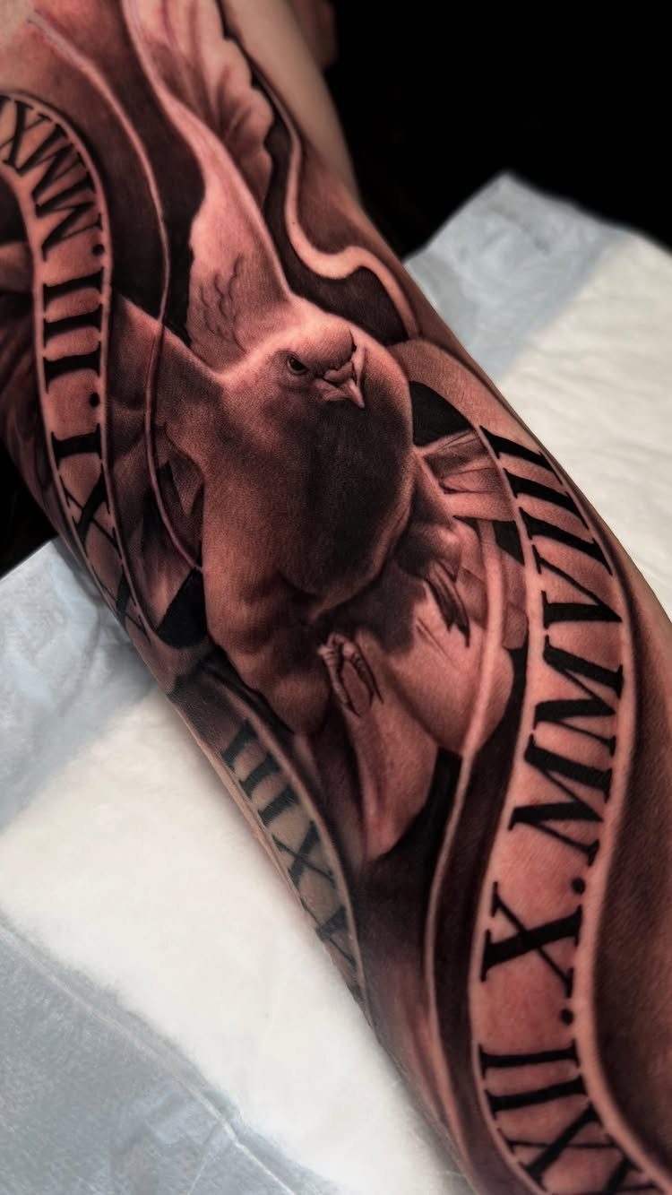
Roman numerals mark a date without spelling it out. Pairing them with a dove and ribbon ties the date to a specific meaning: a birth, a loss, someone you remember.
Numerals stay readable longer than script if the lines are thick enough.
Thin strokes fade faster and need touch-ups. The inner bicep fits a vertical stack or a banner wrap, whichever suits the date length.
Healing is straightforward, just keep the area moisturized and out of direct sun for the first month.
4. Barbed Wire Tattoo
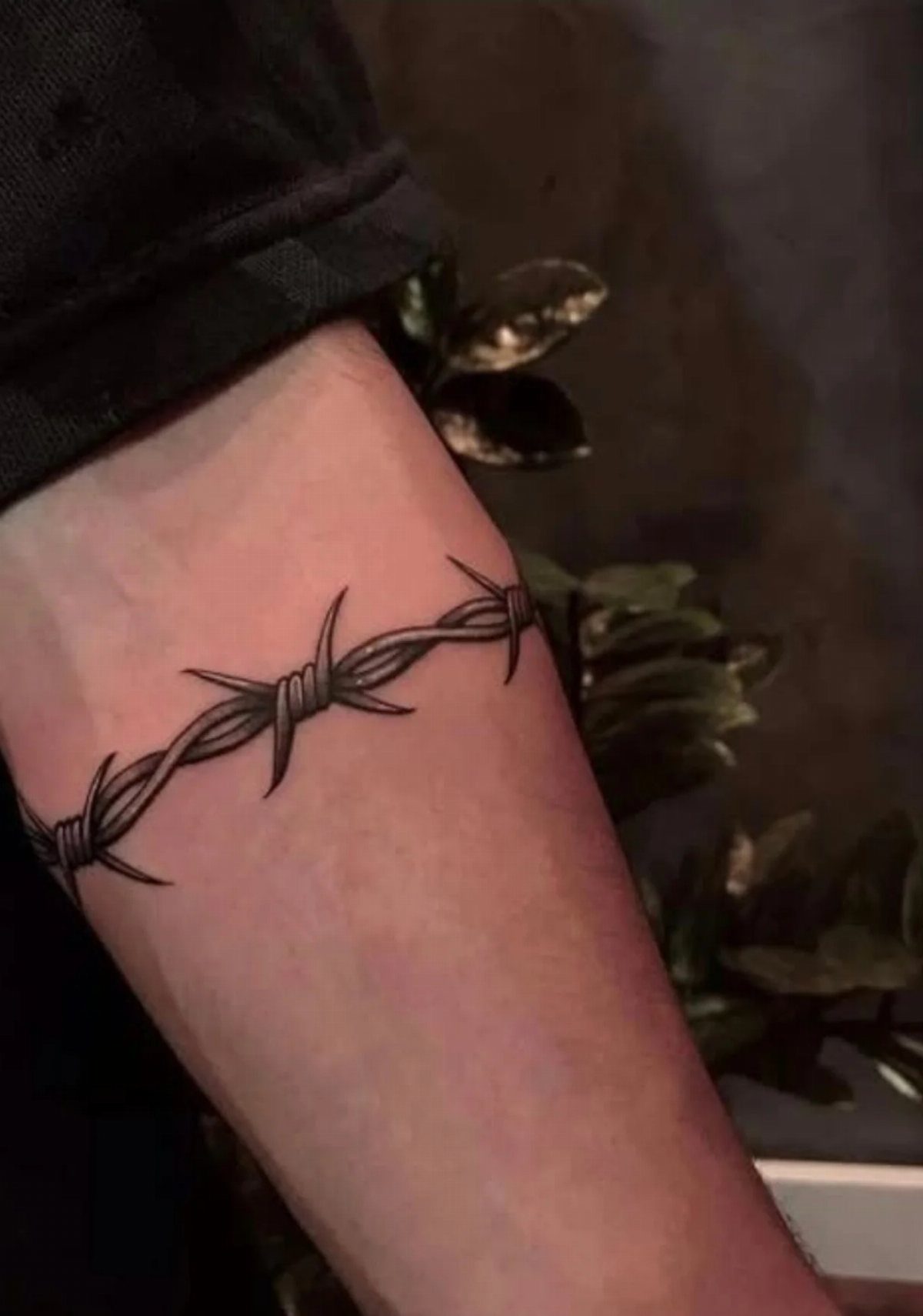
Barbed wire around the inner bicep carries a hard-won edge. The wrap design plays into the armband tradition but with sharper intent, and the black ink keeps it stark.
This one sits well if you’ve already got ink or want something with bite. The inner bicep hurts a bit more than the outer arm, but the session stays short since the design repeats.
Once it settles the line stays bold for years if you avoid sun damage.
5. Dragon Tattoo
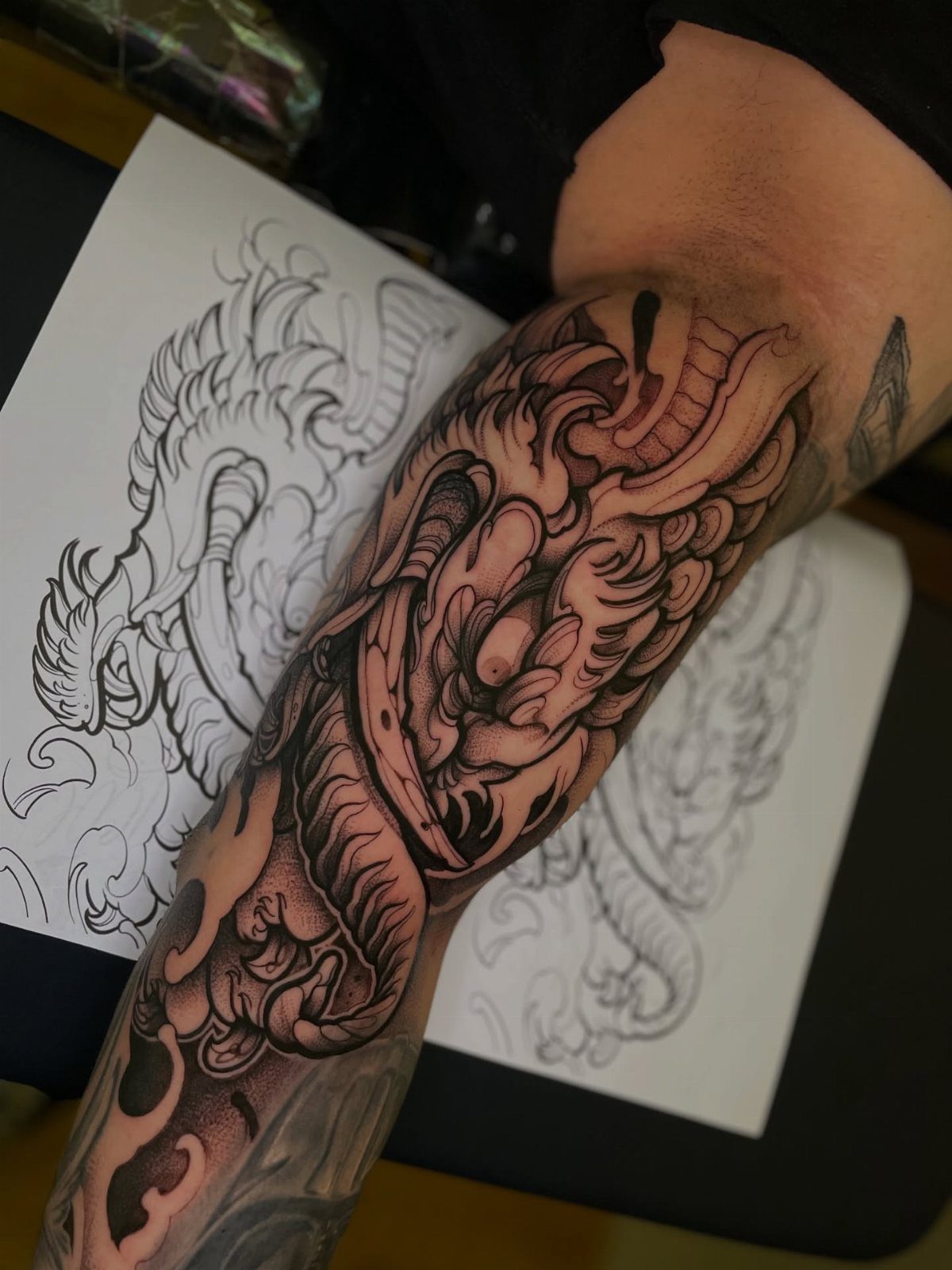
A dragon on the inner bicep brings Eastern symbolism into a spot most people miss until you move. Black and grey shading lets the scales and curves read without color, and the design fits the vertical stretch of the arm.
Dragons take time.
The detail in scales, claws and face takes time, longer if you add background. The inner bicep tolerates shading better than linework, so the session stays bearable even as it runs.
Size and detail drive the price up.
6. Tribal Pattern Armband Tattoo
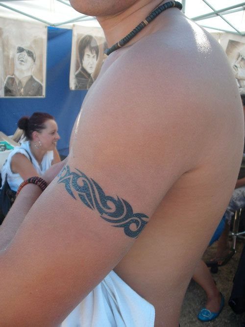
Tribal bands wrap the bicep in symmetry and bold black shapes. The pattern holds its own without background and stays sharp over time since there’s no shading to fade.
This style suits men who want something graphic and fast.
The inner bicep curves enough to make the band sit naturally, and the solid black heals cleanly if you follow basic aftercare. Pain is manageable for most.
Sessions take a couple hours and the piece heals in the usual window.
7. Crown of Thorns Tattoo
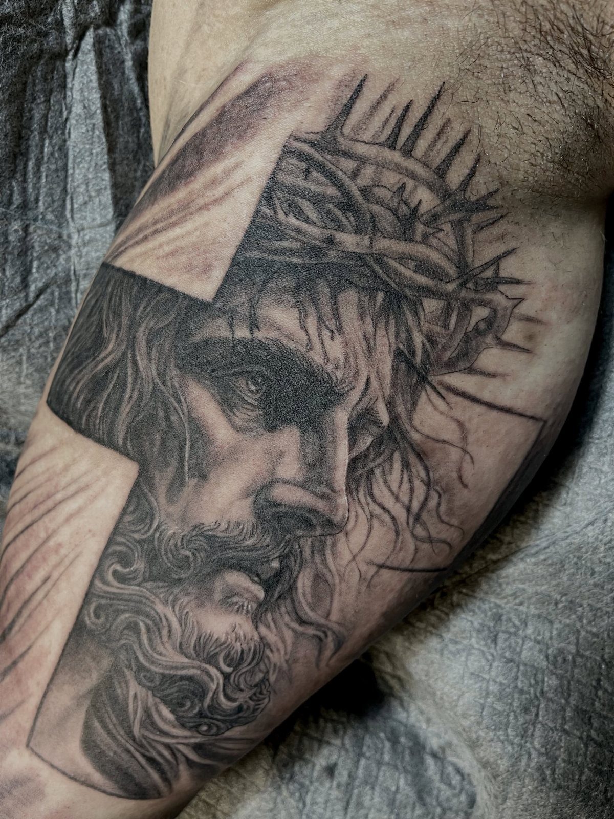
Jesus wearing a crown of thorns carries weight that most inner bicep pieces don’t. The cross background anchors the face and the black and grey realism keeps every detail readable.
This piece takes skill.
Faces need an artist who handles portraits well, or the expression goes flat. Sessions run longer than graphic work since shading this detailed can’t be rushed.
The inner bicep gives enough space for the full composition without cramping the face. Pain sits in the middle range.
8. Eagle Tattoo
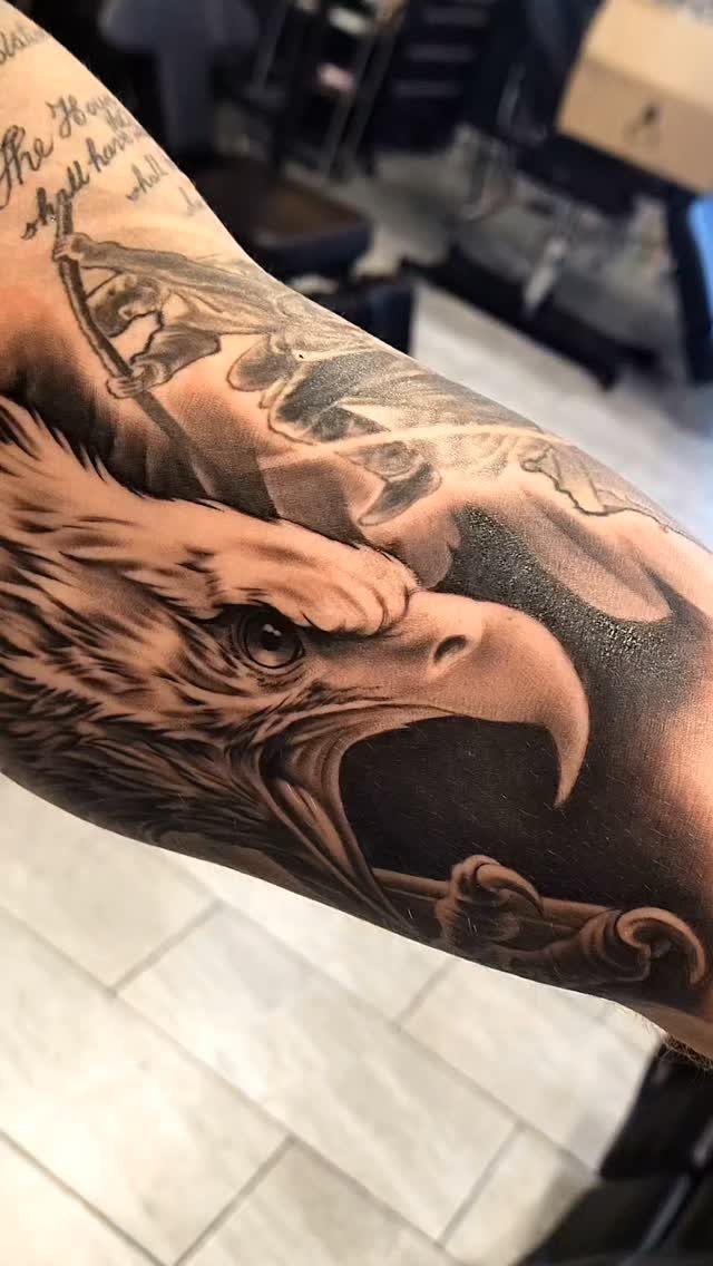
An eagle head reads as strength without leaning on a full back piece. The black and grey shading brings out the feathers and beak, and the vertical fit suits the inner bicep.
Realism takes time.
Feather detail and eye work need an artist who handles texture cleanly, and the session runs a few hours depending on size. The inner bicep tolerates shading well.
Script at the top ties the eagle to a name or date when the connection matters to you. Once healed, the contrast holds for years if you keep sun off it.
9. Snake Tattoo
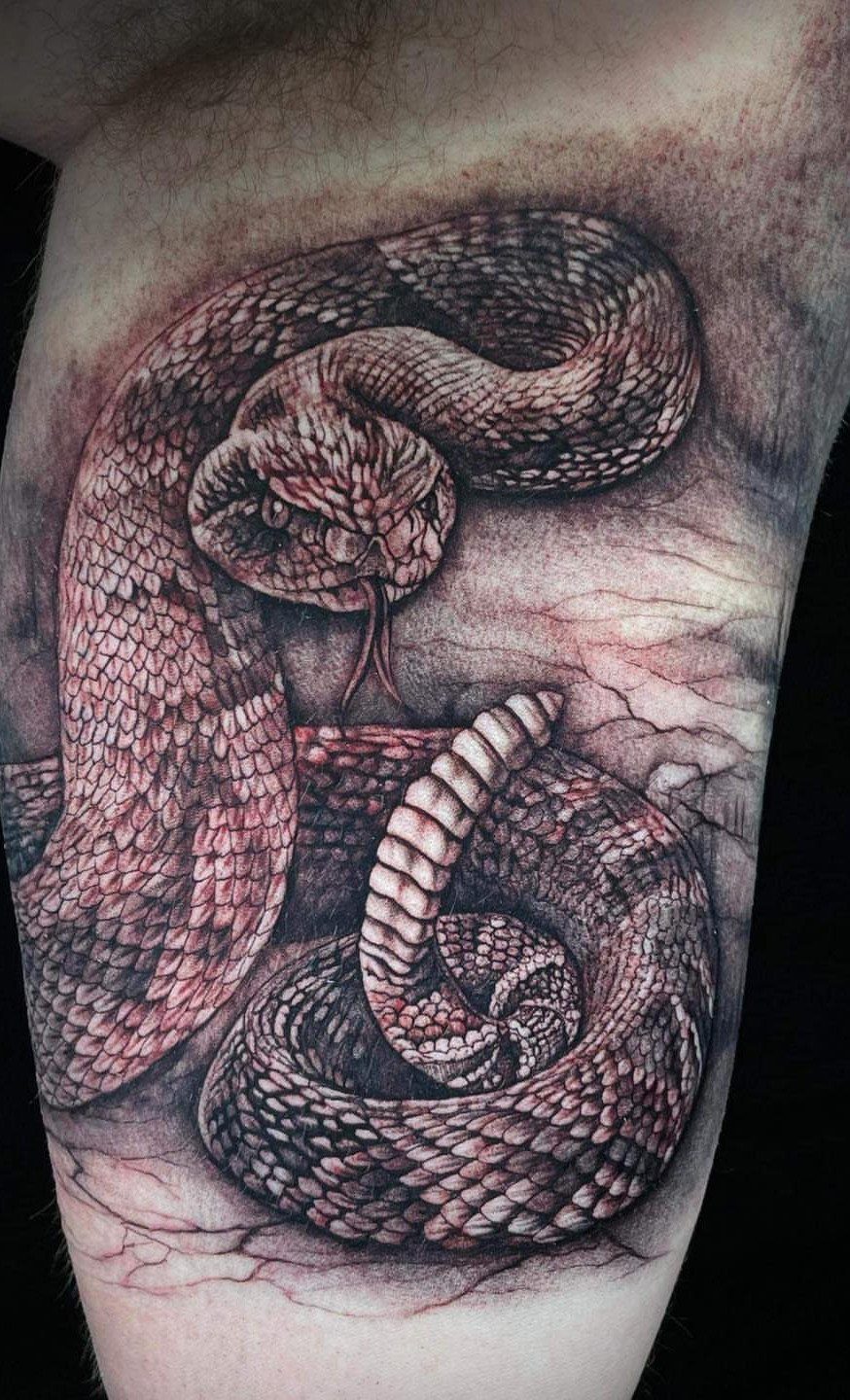
A coiled snake wraps the bicep naturally and the scales give texture without needing color. Black and grey lets the detail sit clean, and the curve of the body follows the arm’s shape.
Snakes read different ways depending on who’s looking, but the image itself stays sharp.
Scale work takes patience, so expect a longer session than a simple outline. The inner bicep hurts less than bony spots.
Moisturize while it heals and the black stays solid. The design ages well since there’s no fine line to blur.
10. Angel Tattoo
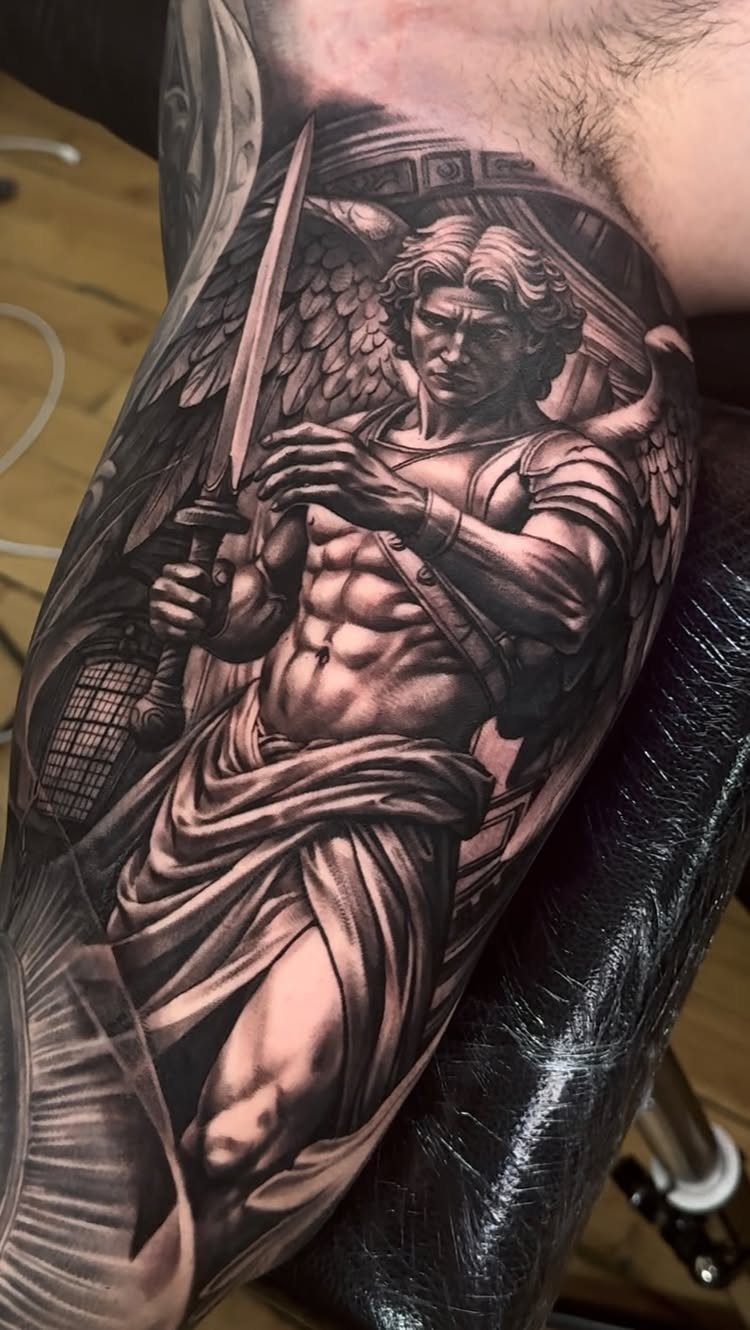
A muscular angel holding a sword brings guardian energy without pulling from overtly religious imagery. The wings frame the figure and the sword gives it direction, all in black and grey that reads clearly on the inner bicep.
This one needs space.
Cramming a full angel into too small an area loses the anatomy, so size matters here. Shading the wings and muscles takes a full session or more depending on how much background you add.
11. Quote Tattoo
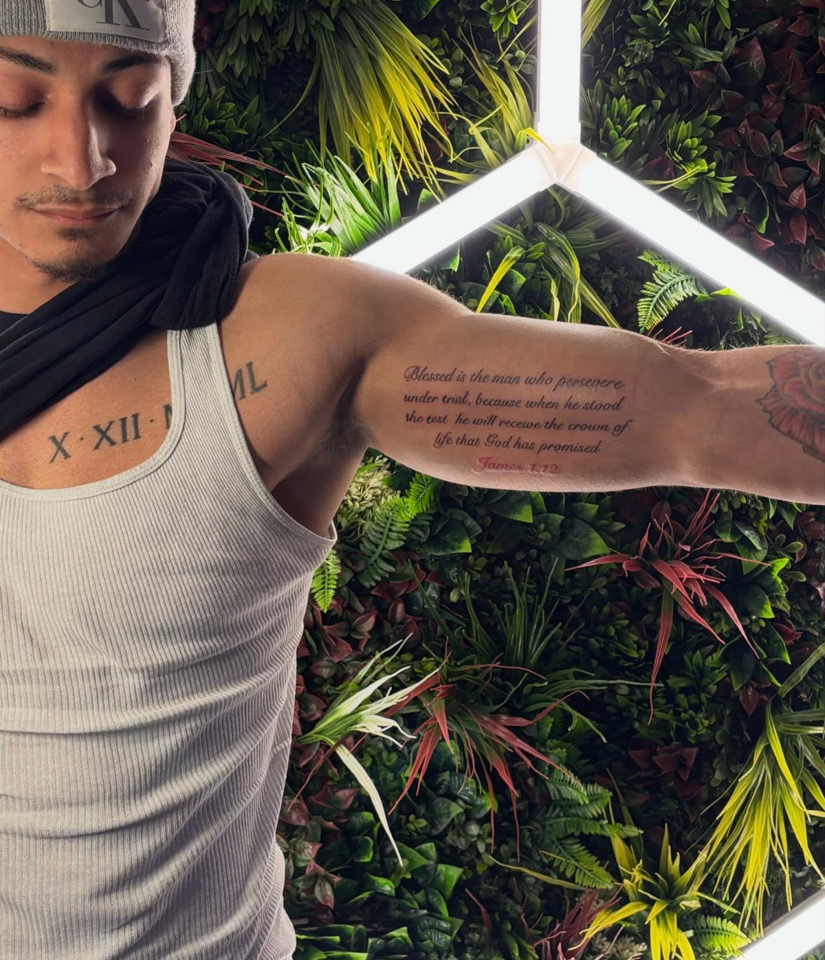
A quote in script gives you a line that matters, no graphic required. The inner bicep fits a few words comfortably, and the vertical space works for stacked lines if the phrase runs longer.
Pick a font that stays legible after healing.
Thin script blurs faster and tight spacing turns into a smudge after a decade. An artist who does clean lettering is worth finding, or the text reads poorly.
Sessions stay short and the cost stays low compared to detailed images. Keep it simple and the piece ages better.
12. Wolf Tattoo
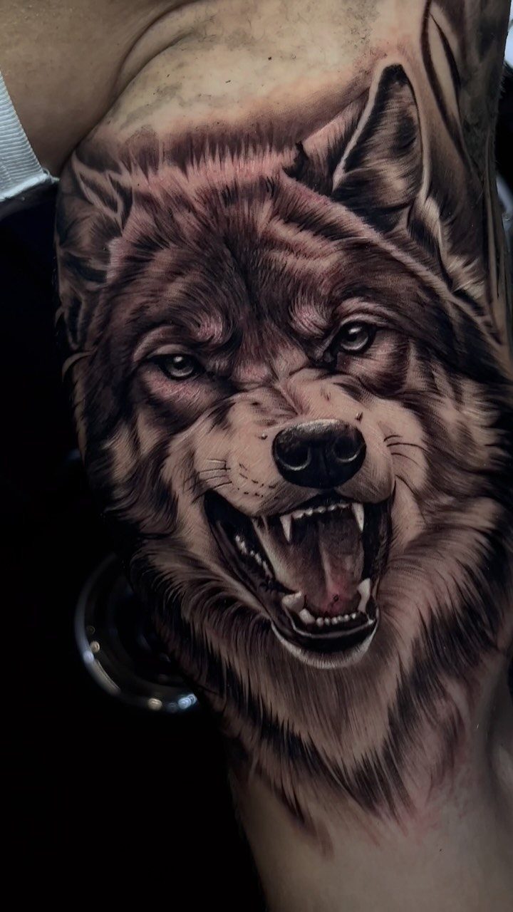
A snarling wolf brings aggression and pack loyalty into one image. The realism in the fur and teeth takes black and grey shading that holds detail, and the inner bicep gives enough room for the full head without cropping.
Facial detail on animals needs an artist who handles expression well. Fur texture takes time to shade properly, so sessions run longer than flat graphic work.
Once healed, the contrast between the dark fur and highlights stays sharp if you follow standard aftercare.
13. Koi Fish Tattoo
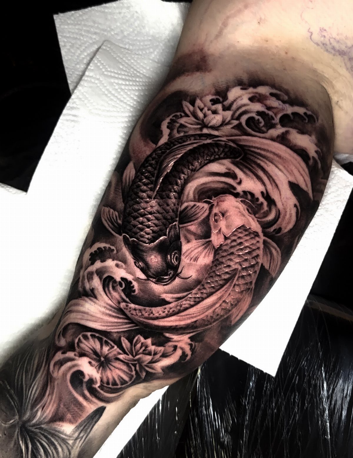
Two koi swimming together hold the meaning: perseverance through opposition. The swirling water gives movement and the black and grey shading keeps the scales readable without color.
Koi take time to shade.
The water background adds a session hour if you want the flow detailed, and the inner bicep gives enough room for both fish without cramping the composition. Pain sits in the tolerable range.
Floral details at the edges tie the design together if you want more coverage later.
14. Mechanical Parts Tattoo
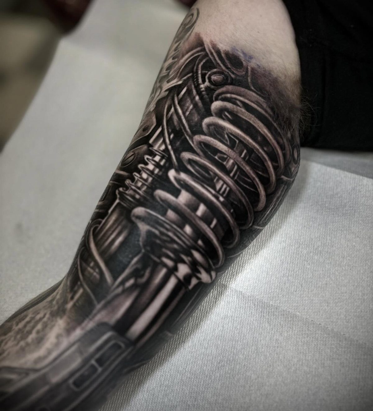
Mechanical springs and gears turn your arm into exposed machinery. The vertical stretch of the inner bicep suits stacked mechanical elements without cramping the design.
This design suits someone who wants something different from the usual symbols. Shading metal textures takes skill, so find an artist who handles highlights and shadows cleanly or the parts look flat.
Sessions run a few hours depending on how much detail you pack in. Once healed, the contrast between light and dark metal holds well.
15. Nautical Compass Tattoo
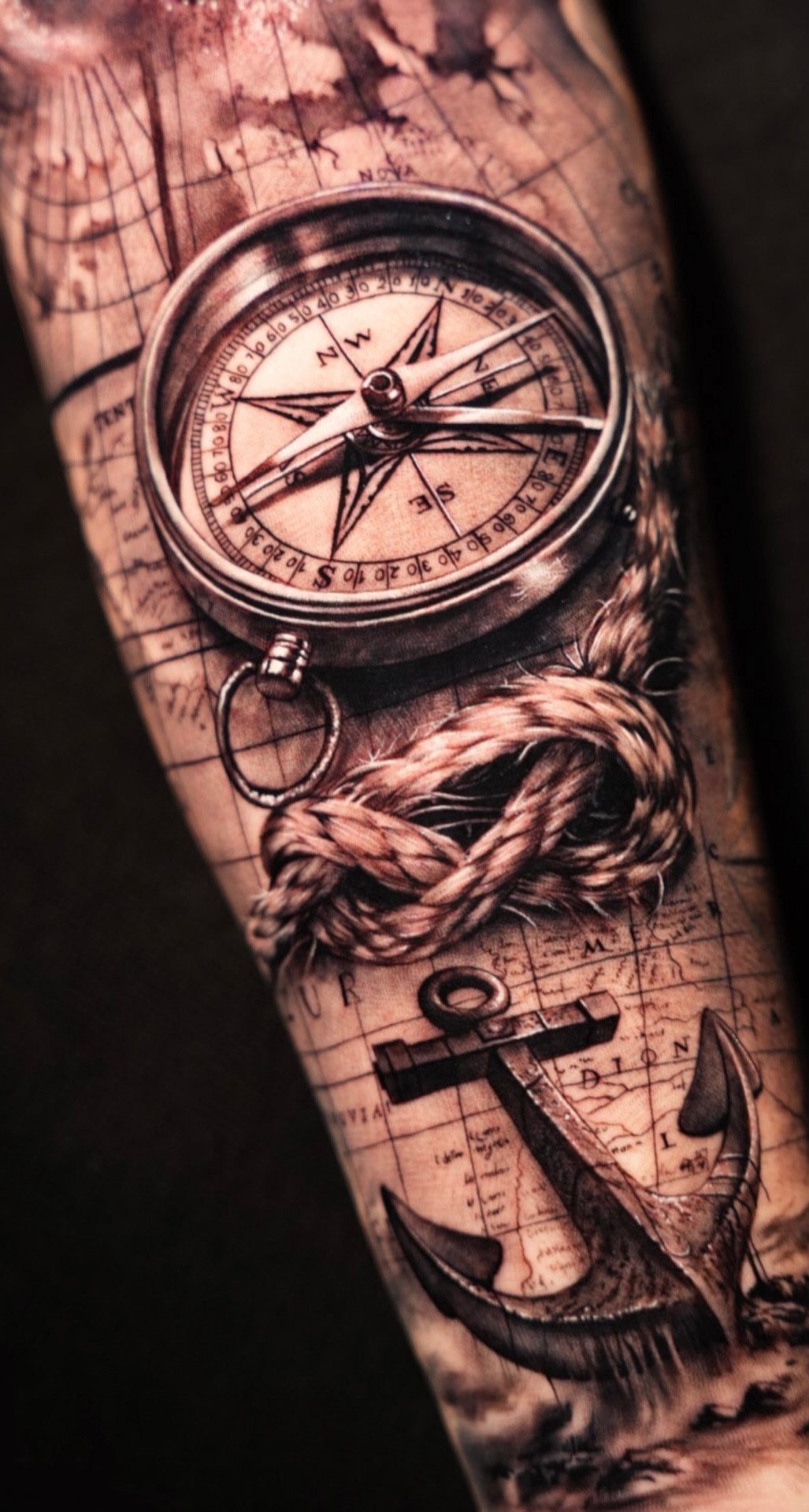
A compass paired with rope and anchor gives you navigation symbols grounded in old maritime tradition. Black and grey holds detail better than color on the inner bicep, where the skin moves and stretches.
This piece needs room for all 3 elements or they read as crowded. The session runs longer than a single symbol since the map detail takes patient shading.
Cost rises with background complexity. The design ages well if you keep sun exposure low during healing and after.
16. Playing Cards and Dice Tattoo
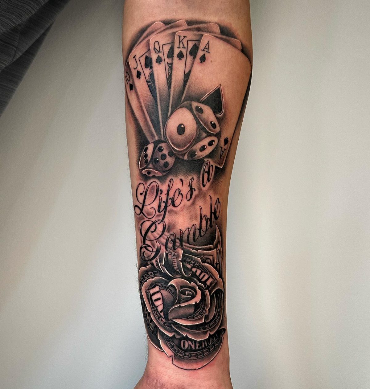
Cards, dice and cash spell out the gamble plainly. The script and rose balance each other, and the vertical format uses the bicep’s natural lines.
This one reads best if you’re comfortable with what it says.
The elements stack naturally, so the composition stays balanced without forcing symmetry. Sessions stay manageable since most of the work is in the card faces and lettering.
Healing follows the usual timeline. The text stays legible if the font is bold enough to age cleanly.